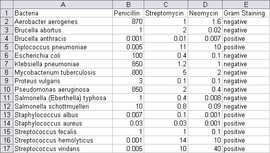
Chance Magazine is holding a data visualization contest. The objective is to produce a clear, insightful, succinct, original, and aesthetically appealing display of a set of comparative data on antibiotic effectiveness. The data is shown below: click on the picture of the data to download a CSV file if you want to play along at home.
The numerical data is Minimum Inhibitory Concentration (MIC), the smallest amount of an antibiotic required to prevent in vitro bacteria growth. Presumably it’s in units of mcg/ml, but I could not verify that. Gram staining indicates whether the bacteria picks up a dark blue or violet color (positive) or a faint pink (negative) when exposed to Gram stain. This is a quick-and-dirty way to separate bacteria into two classes.
The first step in any analysis is to plot the data. Here I’ve created a bar chart with MIC on a logarithmic scale.
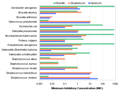
The larger the concentration, the less effective an antibiotic is at inhibiting bacteria growth, so the longer bars above indicate lower effectiveness, which is counterintuitive. My next step then was to reverse the direction of the log scale, so that longer bars correspond to higher effectiveness.
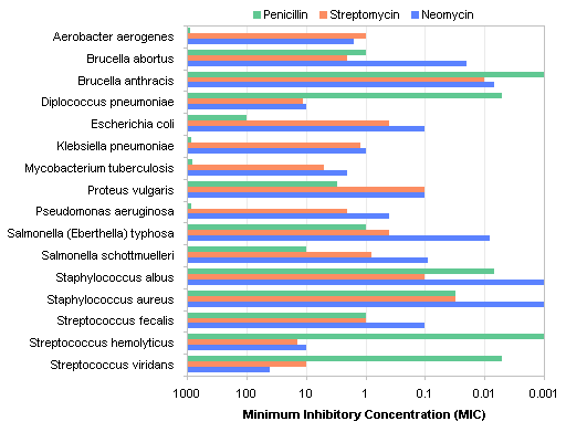
That’s better, but it’s still not very easy to read. With so many categories (bacteria species), the bars are too narrow to be clearly resolved.
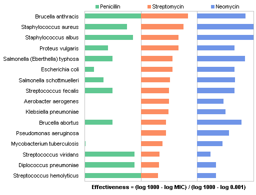
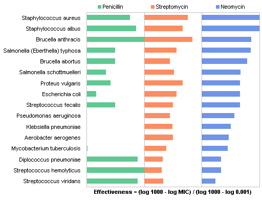
I decided to try a panel chart to separate the colors, with one panel for each antibiotic. Here is the first cut.
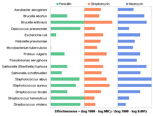
We see the alphabetical sorting issue in this chart. There are a number of ways we could sort the data, and probably the most arbitrary is by alphabetical order of the category labels. What if I sort by effectiveness of Penicillin? (Once the chart is created, the points are sorted by sorting the original data table by the desired column.)
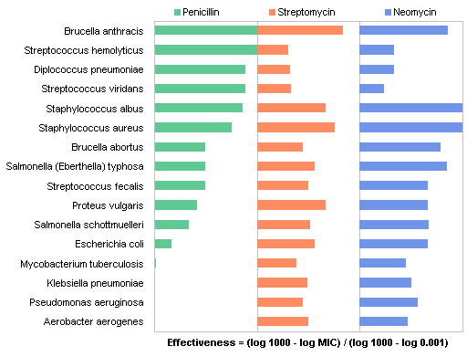
That’s more meaningful. Here is the data sorted by effectiveness of Streptomycin:
Now sorted by Neomycin effectiveness:
I thought the panel charts could be simplified by using the Overlapped Bar Chart – Longer Bars in Back approach of Robert Kosara of EagerEyes. This shows the data ranked by penicillin effectiveness.
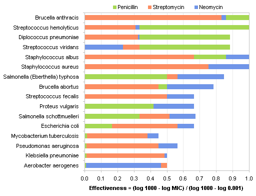
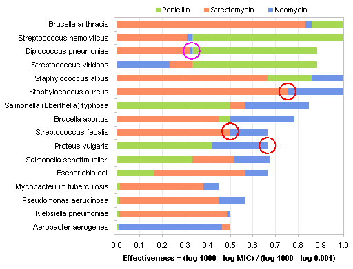
There are problems with this kind of chart. First, I had to choose an uglier green, because the original green was too hard to distinguish from the blue. Second, It’s difficult to get over the ingrained misunderstanding that the bars are not stacked, but shown shorter in front of longer. Also, there are several places, circled below, where two bars coincide (or nearly coincide), making it impossible to identify all three values for each microbe.
These attempts so far show the effectiveness of the antibiotics well enough, but they omit the Gram staining behavior. I decided to shade the rows next to Gram positive bacteria, and use a dot plot instead of a bar chart to show the data.
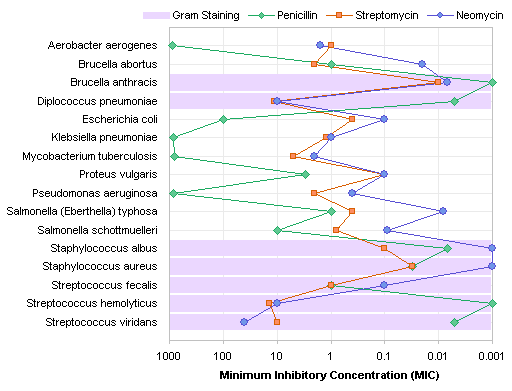
There’s that alpha sort issue again. With this arbitrary sort, it’s very hard to see any correlations in the data. But when we sort by Penicillin effectiveness, we see much more information. When sorted in this way, the Gram-positive bacteria are seen as those against which Penicillin is most effective.
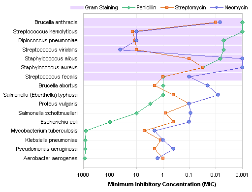
Sorting by effectiveness of Streptomycin and Neomycin (omitted to keep this post reasonably long) is good for comparisons among the antibiotics, but loses the impact of the correlation between Penicillin effectiveness and Gram staining.
This type of chart readily translates to a gray-scale version.

This is the chart I submitted to the contest. What could I have done better?


dbb says
Jon, I think you have done a great job. I can only suggest
1. repeating the labels on the right, or maybe narrowing the chart a bit, as the eye has to flick left and right to find the names for many of the values
2. possibly deleting the lines and increasing the size of the markers. Lines are for trends, which works for penicillin because it is sorted, but is distracting for the other antibiotics because they jump around so much.
Jon Peltier says
Dermot –
Thanks for the suggestions. I thought repeating the Latin labels on both sides of the chart would be overkill, but making the chart narrower seems to help. Increasing the height provides more space between labels, which hopefully improves their readability.
I don’t think I like the chart with the lines removed. This makes the markers too disconnected. I tried larger markers, but they looked like balloons.
I also rearranged the order of the series and swapped formats of Neomycin and Streptomycin to try to highlight Neomycin’s superiority.
Here I’ve added back the lines but made them lighter so they are more of a guide than a trend indicator.
SB says
I think highlighting the bacteria name instead of the grid in the chart might be cleaner.
Jon Peltier says
SB –
I’ve thought about how I might accomplish this highlighting. I suppose it would be easiest to format the text differently, i.e., using bold or italic styling or a different font color. However, this decouples the staining from the antibiotic behavior, and I think it would be harder to get the fact that the Gram-positive bacteria are also the one that penicillin is most effective against. This kind of relationship is what leads to insights about mechanisms of drug action. For example (and I’m speculating wildly, because I’m not a biochemist), perhaps penicillin is absorbed into the cell through a mechanism like that which absorbs the Gram stain.
JaemyungKim says
Dear Dr. Peltier,
I am just a junior student from some middle states. These illustrations are awesome. I will try this contest, but i don’t think I will make this clearly and intuitively.
I wanted to comment, right after your first chart, you added “The larger the concentration, the less effective an antibiotic is at inhibiting bacteria growth, so the longer bars above indicate lower effectiveness, which is counterintuitive.” and then, you reverse the direction of log scale. I hope you also commented that the longer bar would mean the better antibiotic with higher effectiveness.
and, that the chart would be easier, for beginner like me, if you added the description of “sort by” as part of the bar charts, on the 4,5, and 6th charts.
I haven’t learned many statistics, Excel, and graphic programs. Still you work look aesthetic for me. Hope you have a great result from the contest.
Jaemyung Kim
Jon Peltier says
Jaemyung –
Thank you for your comments. I have actually incorporated a couple sentences to help clarify things.
I think your question about sorting was really about how the data is sorted. There is no capability to sort data within the chart, but you can get the sorting you want in an existing chart by sorting the data upon which the chart is based. Since this specific article was less about the mechanics of making these charts, and more about how I approached the objectives of the contest, I left out a lot of the mechanical details. Other articles I write show these mechanics in much greater detail.
Xan Gregg says
Nice work. I usually try to avoid connecting points on categorical scales, but your plot shows another use for such lines. It allows the reader to see where the obscured data points are.
Yawar Amin says
I’m still not convinced that connecting lines between data points in categorical data is a good idea … just feels inherently wrong. Still, I’ll admit Xan Gregg’s point that it does make it easier to see obscured data points.
Jon Peltier says
I agree that in general it’s best to avoid the connecting lines, but the alternatives are less effective. Markers without the lines are more difficult to visualize, and I abandoned the various bar chart variations before moving to the line and marker approaches.
Anonymous says
My ignorance is showing, but can the author or anyone cognizant explain the use of the mic’s in culture and sensitivity reports at the hospital in terms of choosing one antibiotic over another.
For instance: the S means sensitivity, as opposed to R for resistant, but the S, or SS might have <.5 S and another antibiotic might have <4 S.
What is the difference say between two sensitive antibiotics where one has <.5 or 1 or 2, versus another that has
<4, or 5 etc etc in terms of efficacy etc. What does this numerical difference above mean in terms of efficacy or complications etc.
Thank You
Mark