 Mike Alexander of DataPig Technologies is a Microsoft Excel MVP who has written about using Excel for data analysis. Mike and I collaborated last month on the Excel Dashboard and Visualization Boot Camp, which went so well that we plan to offer it a few times a year.
 Mike has written Excel 2007 Dashboards and Reports For Dummies, which is among the most comprehensive Dummies books I’ve come across. The book is geared towards Excel 2007, but its principles and techniques are valid for any version of Excel. Mike takes his readers through dashboard principles, data preparation and chart creation, advanced data techniques including pivot tables and dynamic ranges, automation of dashboards using VBA, and designing interactive dashboards.
Like all Dummies books, Excel 2007 Dashboards and Reports For Dummies has a “Part of Tens” chapter, including Ten Chart Design Principles, which Mike will write about in this post. While Mike has written these principles, they are in agreement with principles that other graphing and visualization experts would have presented. Without further ado, Here’s Mike:
Ten Chart Design Principles by Mike Alexander
Excel makes charting so simple, it’s often tempting to accept the charts it creates no matter how bad the default colors or settings are. But I’m here to implore you to turn away from the glitzy lure of the default settings. You can easily avoid charting fiascos by following a few basic design principles:
- Avoid Fancy Formatting
- Skip the Unnecessary Chart Junk
- Format Large numbers where possible
- Use Data Tables instead of Data Labels
- Make Effective Use of Chart Titles
- Sort your data before Charting
- Limit the use of Pie charts
- Don’t be afraid to parse data into separate charts
- Maintain Appropriate Aspect Ratios
- Don’t be afraid to not use a chart!
1. Avoid Fancy Formatting
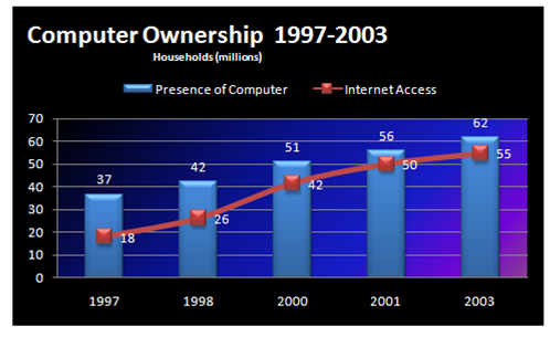
- Don’t apply background colors to the Chart or Plot Area. Colors in general should be reserved for key data points in your chart.
- Don’t use 3D charts or 3D effects. No one is going to give you an Oscar for special effects./p>
- Avoid applying fancy effects such as gradients, pattern fills, shadows, glow, soft edges, and other formatting. Focus on the data and not shiny happy graphics.
- Don’t try to enhance your charts with clip art or pictures. Not only do they do nothing to further data presentation, they often just look tacky.

2. Skip the Unnecessary Chart Junk

- Remove Gridlines
- Remove Borders
- Skip the Trend Lines
- Avoid Data Label Overload
- Don’t Show a Legend if you don’t have to
- Remove Axes that Don’t Provide Value
3. Format Large numbers where possible
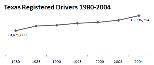
When plotting very large numbers on a chart, you should consider formatting the values so that they are truncated for easy reading.
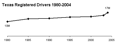
For instance, in this chart, I’ve formatted the values to be displayed as 10M and 17M instead of the hard-to-read 10,475,000 and 16,906,714.

4. Use Data Tables instead of Data Labels
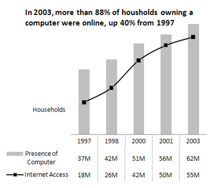
A data table allows you to see the data values for each plotted data point, without overcrowding the chart itself. Although data tables increase the space your charts take up on your dashboard, they respond well to formatting and can be made to meld nicely into your charts. Data tables come in particularly handy if your clients are constantly asking to see the detailed information behind your charts.
5. Make Effective Use of Chart Titles
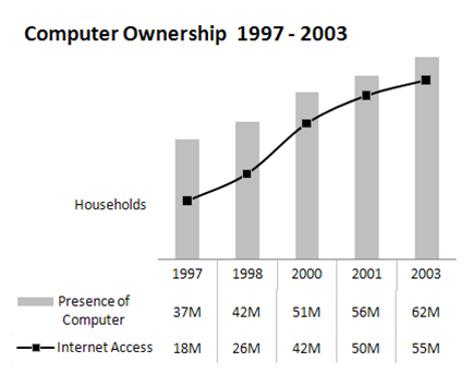
You can use chart titles to add an extra layer of information, presenting analysis derived from the data presented in the chart.
6. Sort Your Data Before Charting

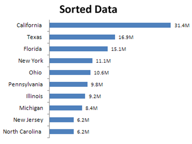
Unless there is an obvious natural order such as age or time, it’s generally good practice to sort your data when charting. By sorting, I mean sort the source data that feeds your chart in Ascending or Descending order by data value.
7. Limit the use of Pie charts
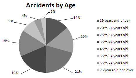
- Pie Charts typically take up more space than their cousins the line and bar charts.
- Pie charts can’t clearly represent more than two or three data categories.
- Bar Charts are an ideal alternative to Pie Charts.

8. Don’t be afraid to parse data into separate charts
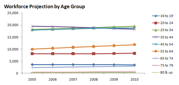
A single chart can lose its effectiveness if you try to plot too much data into it. Step back and try to boil down what exactly the chart needs to do. What is the ultimate purpose of the chart?

9. Maintain Appropriate Aspect Ratios


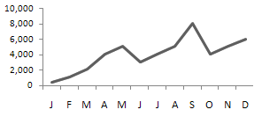
A skewed aspect ratio can distort your charts, exaggerating the trend in charts that are too tall, and flattening the trend in charts that are too wide.
Generally speaking, the most appropriate aspect ratio for a chart is one where the width of the chart is about twice as long as the height is tall.
10. Don’t be afraid to not use a chart!
You typically use a chart when there is some benefit to visually seeing, trends, relationships, or comparisons.
Ask yourself if there is a benefit to seeing your data in chart form. If the data is relayed better in a table, then that’s how it should be presented.

Jon’s comments on Mike’s top ten.
You didn’t think I could let this go, did you? As I noted in the introduction, I concur with all of Mike’s points, but there are a couple of things that would make Mike’s example charts even better.
2 and 3. The suggestions are spot-on, but the charts can be further clarified. Reduce confusion in the chart by maintaining a proportional axis scale (XY not Line chart), so the gaps between 2000 and 2003 and between 2003 and 2004 don’t look like the five year gaps earlier in the chart. This makes the upswing in the last few years even more striking.
6. This is a good practice. However, you should sort by category if it makes sense. The example in item 7 should be sorted in order of increasing age. In this kind of plot, it also is important that the bins (i.e., age ranges of each category) be of equal width. If this is age of drivers, then the first age range should be something like 16 to 24, which becomes by far the largest value in the chart.

7. Jorge Camoes showed the best collection of pie charts in The Best Pie Charts Come From Germany.
8. This is a nice example of the use of what Edward Tufte calls small multiples. Small multiples is part of the basis of panel charts.
9. Adjust the aspect ratio of the chart and its X and Y axis scales so the “average” slope is around 45°. This is described by Kelly O’Day in Banking to 45° to Enhance Visualization.
10. This was discussed by Tony Rose last week in Best Method for Illustrating a [Single] Data Point.

Among Mike’s other books are Pivot Table Data Crunching for Microsoft Office Excel 2007 (with Bill Jelen), Microsoft Excel and Access Integration: With Microsoft Office 2007, Microsoft Access 2007 Data Analysis, and Excel 2007 VBA Programmer’s Reference (with John Green, Stephen Bullen, and Rob Bovey).


Hadley says
Calling axes chart junk has got to be a new low in excel graphics!
Matt says
Regarding aspect ratios. I read somewhere that the best aspect ratio for a chart is the golden ratio ~1.6:1 rather than 2:1 as suggested above. I suppose what you actually choose has a lot to do with how you format the entire page. Any comments?
Also, what default aspect ratio do common chart generation programs (Excel, Origin, SigmaPlot) create?
Jon Peltier says
Hadley –
Mike’s suggestion is “Remove Axes that Don’t Provide Value”. The first and last points in the chart are labeled, and the data points show the trend clearly. This axis doesn’t add value, and it’s not needed to show values. In the interest of gaming your data to ink ratio, the axis has to go.
Matt –
I’ve read something like that too. I usually use a ratio of around 1.5:1 or maybe even closer to square, depending as you point out on the formatting of the surrounding page. In Excel 97-2003, the default chart freshly embedded in a sheet takes on roughly the aspect ratio of the usable part of the active pane. The chart is about half the height and width of the pane, and is approximately centered in the pane. In Excel 2007, a newly embedded chart is approximately centered in the active pane, and is 3″ tall and 5″ wide, W/H = 1.67, regardless of the dimensions of the pane.
greg says
I also must comment on the axis statement. This is a bad example for making your point. I have no clue if the y axis is a linear scale or log scale. What if I want to estimate the years in-between? If as you state the only two important numbers are the first and last years graphed, why even put in the other years? The non-linear x axis does not do the data justice as it does NOT show trends properly.
Just a poor example to make your point.
Jon Peltier says
Greg –
I appreciate your concern. If you note in my analysis under Mike’s article, I pointed out the non-uniform spacing of the years on the X axis. When this is addressed, the shape of the series changes; it still goes from 10 to 17 million, but the upturn at the end is shown more clearly.
It depends on the audience and the purpose of the chart. Numbers like this are not likely to be plotted on a scale other than linear. Maybe removing the axis is overkill, and maybe it removes the easy knowledge that the scale starts at zero. If the important takeaway is the increase in licensed drivers, this chart is fine. If you need to know more precisely how it changes year to year, you would probably draw a column chart showing the numeric or percentage increase from the prior year.
Tony Rose says
What’s wrong with #1??? I create all of my Xcelsius graphics like this…. :)
#1 – I would have put the description Households just below the title. I am definitely a fan of this chart though. I like the integration of table and graph (2 series) with minimal glitz and junk.
#2 – I have an issue with. The scale is off on the x-axis. The increments are in 5 years until you get to 2000 at which point it goes to 3 years and then 1. This was probably just an oversight. Also, why put the years in the title if it is self explanatory in the graph x-axis labels? In theory I like it, but I would have included a y-axis.
#3 – This is a good one. Too many times I have seen – 2,500,000.00 when all of the values are in the millions. This method is a lot cleaner.
#4 – As I stated in 1, very nicely done.
#5 – Be careful. You are drawing the conclusions instead of giving the reader a chance to make their own. Maybe they only care about 2000 to 2003.
#6 – This is a huge one. I agree with Jon’s comments that this can be done a lot, but not all the time; only when it makes sense. Sometimes people just need to forget about alpha sorts.
#7 – Love the bar chart. Forget the pies.
#8 – I really like the small multiples. I may have gone with a line instead of a fill/area chart. It’s a little bit cleaner and takes up less ink.
#9 – I can’t really add any that isn’t already said.
#10 – Obviously I strongly agree with Jon’s comments. Sometimes less is better.
Great job Mike!
Hadley says
The axes have got to go? No no no! Or at least be consistent and remove the x axis as well ;)
Labelling the first and last plots does NOT make up for removing the axes – you are taking Tukey’s maxims far too far. It is much much harder to read those plots. I understand that sometimes you want to remove everything extraneous to make your point, but these end up looking like tabloid graphics to me – punchy, but with no real meaning. Aesthetically, I don’t think they are very pleasing either – the data line floats disconnected from axis and there is nothing to tie the whole plot together.
Jon Peltier says
Hadley –
I give up. I was defending Mike’s formatting with an open mind, but you’ve convinced me that removing the value axis isn’t always justified, even on this simple chart. Sometimes a little non-data ink isn’t such a bad thing.
Tony –
Thanks for your comments.
Re #6 line vs area: it’s a matter of choice. This is a case where it’s probably okay to add a bit of color to break up the monotony.
Re #5 and letting the reader draw his own conclusions: don’t you remember the brouhaha about Seth Godin’s pie chart? He doesn’t trust the reader to draw the right conclusions.
Guillaume Marceau says
#6, If you are in a position to expect a bell curve from the phenomena you are observing, order your data so that the bell curve is apparent.
Instead of
Neither Approve nor Disapprove 50% : ##########
Approve 30% : ######
Disapprove 20% : ####
Do:
Approve 30% : ######
Neither Approve nor Disapprove 50% : ##########
Disapprove 20% : ####
Jon Peltier says
The point is, if there is any logical order to your categories, sort by the categories. If there is no particular order of the categories, don’t sort them alphabetically (the “Alabama Syndrome”), sort by the values.
Mike Alexander says
Thanks for posting this Jon. Sorry I missed the discussion so far.
I see my decision to include chart axes in the category of Chart Junk has met with some opposition. ; )
I do see the points you have all made in reference to Tip #2 where I say “Remove Axes that Don’t Provide Value”. I do not mean to suggest that any axis be thrown away cavalierly.
All I suggest here is that you should remove anything that does not contribute to the message in your chart. In some simple charts (such as my example), the data points, the x axis and general trend give you (I believe) the landmarks you need to not only determine the validity of the trend, but to garner the information presented without the need to refer to an axis. Axis labels are not sacred in my book and can be removed if not needed.
I remember reading somewhere that (paraphrasing here) a designer is not done when there is no more to add, but when there is nothing more which can be removed. Tip #2 comes to you in that spirit, nothing more sinister than that.
Colin Banfield says
Unfortunately, except for the charts with the date axes, all of the line chart examples are misleading. You cannot simply compare equal intervals for some data points and then switch to a different interval and expect the result to be a meaningful trend of the plotted data. The lines shown in #4 and #5 are particularly bad. For all we know, there might have been declines in the years 1999 and 2002 – the line chart constructed would mask this perfectly. Other than the interval problem, the tips are good.
BTW, I see that you’ve “conveniently” left out Mike’s Xcelsius book from the list, which is filled with examples that happily violate tip #1 :D
Jon Peltier says
Hi Colin –
Regarding the unequal intervals: I’ve already discussed using a different axis scale, such that the horizontal distance between points is proportional to the time between measurements.
Regarding the potential for missing observations: One can only hope that the chart was not distorted by omission of data that did not support the claim (i.e., that there are increasingly more drivers in Texas each year). Leaving out some years’ data because collecting it is a chore is not a crime; leaving out some years’ data because it would show a drop while other years show an increase should be.
Regarding omission of Mike’s Xcelsius book: It would seem that I’ve violated the rule in the preceding paragraph! Let me put forth these excuses:
1. I used Xcelsius for a couple projects several years ago, found it not to my liking, and ignore it now.
2. I would not like to mention the book and inadvertently cause some readers to purchase the book and apply its teachings.
But the real reason I omitted the Xcelsius book is that I simply forgot about it.
Bob says
Hi,
Great discussion here, as usual…
What about the chart on revenue and plan?
The data table is misleading. I don’t think there is a 95% variance, rather about 5% below plan.
Cheers,
Bob
derek says
I believe that chartjunk can be a complementary phenomenon, like the pictures that are an urn or a pair of faces, depending on how you look at it. If a graph has both a scale bar and gridlines, it may be that the gridlines are unnecessary junk. Or it may be that the scale bar is unnecessary, as long as the gridlines are labeled.
Similarly, when there are gridlines and zebra stripes together (the gridlines running neatly along the boundary between white and gray), then one of them is surely junk. But which one is a matter of taste.
Bonnie says
HELP!!!
I have a macro that creates 3 charts. One is a simple bar chart and the other is actually two I’ve combined so that I have a bar and line graph plotted together. My problem is that the placement of the charts fluctuates each time I run the macro. Sometimes the alignment is just right and at other times it seems a location artifact leaves residual information in the macro and has them all over the page.
I’m new at this and have been looking for ways to clear or reset the chart location. Any help would be much appreciated. Code is below:
Sub NBImac()
‘ Macro1 Macro
‘ CHART 1
‘
‘MSChart1.ToDefaults
ActiveSheet.Shapes.AddChart.Select
ActiveChart.SetSourceData Source:=Range(“‘NBI’!$A$3:$C$4”)
ActiveChart.ChartType = xlColumnClustered
ActiveChart.PlotBy = xlRows
‘ActiveChart.Axes(xlValue).Select
ActiveChart.Axes(xlValue).MinimumScale = 3.3
ActiveChart.Axes(xlValue).MinimumScale = 1
ActiveChart.Axes(xlValue).MaximumScale = 4.3
ActiveChart.Axes(xlValue).MaximumScale = 5
ActiveChart.Axes(xlValue).MajorUnit = 0.1
ActiveChart.Axes(xlValue).MajorUnit = 0.5
ActiveChart.Axes(xlValue).Select
ActiveChart.SeriesCollection(1).Name = “=””Newark Beth Israel-Psychiatry Mean”””
ActiveChart.SeriesCollection(2).Name = “=””NYCOM Class-Psychiatry Mean”””
ActiveChart.SeriesCollection(2).XValues = “={2009,2010,2011}”
ActiveChart.Legend.Select
Selection.Position = xlTop
ActiveChart.SetElement (msoElementChartTitleAboveChart)
ActiveChart.ChartTitle.Select
ActiveChart.SeriesCollection(1).Select
ActiveChart.SeriesCollection(1).Interior.ColorIndex = 41
ActiveChart.SeriesCollection(2).Select
ActiveChart.SeriesCollection(2).Interior.ColorIndex = 1
ActiveChart.ChartTitle.Text = “Newark Beth Israel Recommend This Rotation”
ActiveChart.ChartArea.Select
ActiveChart.Location Where:=xlLocationAsObject, Name:=”NBIChart”
ActiveSheet.Shapes(ActiveSheet.Shapes.Count).IncrementLeft -150
ActiveSheet.Shapes(ActiveSheet.Shapes.Count).IncrementTop -50
ActiveSheet.Shapes(ActiveSheet.Shapes.Count).Height = 250
‘ CHART 2
‘
‘
ActiveSheet.Shapes.AddChart.Select
ActiveChart.SetSourceData Source:=Range(“‘NBI’!$A$7:$C$11”)
ActiveChart.ChartType = xlColumnClustered
ActiveChart.PlotBy = xlRows
ActiveChart.Axes(xlValue).Select
ActiveChart.Axes(xlValue).MinimumScale = 0
ActiveChart.Axes(xlValue).MinimumScale = 1
ActiveChart.Axes(xlValue).MaximumScale = 5
Selection.TickLabels.NumberFormat = “@”
ActiveChart.SeriesCollection(1).Name = “=””meaningfully engaged”””
ActiveChart.SeriesCollection(2).Name = “=””Physicians committed to teaching”””
ActiveChart.SeriesCollection(3).Name = “=””DME Responsive”””
ActiveChart.SeriesCollection(4).Name = “=””Adequate supervision and feedback”””
ActiveChart.SeriesCollection(5).Name = _
“=””Perform procedures relevent to level of training”””
ActiveChart.SeriesCollection(5).XValues = “={2009,2010,2011}”
ActiveChart.Legend.Select
Selection.Height = 151.994
Selection.Height = 189.994
ActiveChart.SetElement (msoElementChartTitleAboveChart)
ActiveChart.ChartTitle.Text = “Newark Beth Israel (color bars)”
Range(“F10”).Select
ActiveSheet.Shapes(ActiveSheet.Shapes.Count).IncrementLeft -150
ActiveSheet.Shapes(ActiveSheet.Shapes.Count).IncrementTop 239
ActiveSheet.Shapes(ActiveSheet.Shapes.Count).Height = 275
ActiveSheet.ChartObjects(2).Chart.PlotArea.Height = 200
ActiveSheet.ChartObjects(2).Activate
ActiveChart.PlotArea.Select
With Selection
.Top = 150
.Height = 200
End With
ActiveSheet.ChartObjects(2).Activate
ActiveChart.Legend.Select
With Selection
.Top = 170
.Height = 212
End With
‘ CHART 3 – Linegraph
‘
Sheets(“NBI”).Select
Range(“A14:A30”).Select
ActiveSheet.Shapes.AddChart.Select
ActiveChart.ChartStyle = 1
ActiveChart.SetSourceData Source:=Range(“‘NBI’!$A$14:$A$30”)
ActiveChart.ChartType = xlLineMarkers
ActiveChart.Axes(xlValue).Select
ActiveChart.Axes(xlValue).MinimumScale = 3.6
ActiveChart.Axes(xlValue).MinimumScale = 1
ActiveChart.Axes(xlValue).MaximumScale = 4.3
ActiveChart.Axes(xlValue).MaximumScale = 5
ActiveChart.Axes(xlValue).MajorUnit = 0.1
ActiveChart.Axes(xlValue).MajorUnit = 0.5
ActiveChart.Legend.Select
ActiveChart.Legend.Select
Selection.Position = xlTop
ActiveChart.SeriesCollection(1).Name = “=””NYCOM class mean “””
ActiveChart.Location Where:=xlLocationAsObject, Name:=”NBIChart”
ActiveChart.ChartArea.Select
With Selection.Format.Fill
.Visible = msoTrue
.ForeColor.ObjectThemeColor = msoThemeColorBackground2
.ForeColor.TintAndShade = 1
.Transparency = 1
End With
ActiveChart.PlotArea.Select
With Selection.Format.Fill
.Visible = msoTrue
.ForeColor.ObjectThemeColor = msoThemeColorBackground2
.ForeColor.TintAndShade = 1
.Transparency = 1
End With
ActiveChart.ChartTitle.Select
Selection.Delete
ActiveChart.Axes(xlCategory).Select
Selection.Delete
ActiveSheet.ChartObjects.Select
Selection.Width = 190
Selection.Height = 209
Selection.Left = 72
Selection.Top = 400
ActiveChart.SetElement (msoElementPrimaryValueAxisNone)
ActiveChart.SetElement (msoElementPrimaryValueGridLinesNone)
ActiveChart.ChartArea.Border.LineStyle = xlNone
‘
End Sub
Jon Peltier says
Bonnie –
Instead of making two charts that must perfectly line up, make one chart, with all series as columns, and one by one change the ones you want as lines into lines:
ActiveChart.SeriesCollection(3).ChartType = xlLineMarkers
ezra abrams says
where is the
DATA
that shows that any of these ideas are more then opinions ?
I’m not exactly sure what the data would look like, but it would be something like splitting a group of random people into x groups, and showing them x versions of the same data, and then measuring how long it took people to grasp the point in the data.
without such an experiment, all these opinions are just that – and opinions don’t get better with credentials (MVP/author) or firmness of expression.
something to thinkg about: following the overrated tufte, people have abjured pie charts. Yet graphic designers – people whoose paycheck depends on graphics – often use pie charts. maybe they know something the experts don’t know
In any event, without the great work of people like peltier, it would be impossible to do decent charts in excel
PS: the panel chart is more commonly called a trellis plot ??
Jon Peltier says
Ezra –
There has been a great deal of work to determine what works best for visual display of information. Jacques Bertin and Bill Cleveland did much of this work. If you want a well written guide of visual information design which incorporates this work, check out any of Stephen Few’s books.
Why do graphic designers rely so heavily on pie charts? People are familiar with the ubiquitous pie chart: they learn about pies early in school and they see pies so frequently in graphic designs. They are so familiar that they don’t realize that they are being shortchanged. But people expect pie charts, so graphic designers provide them. Just like people expect shiny multidimensional graphics in their dashboards, so the less-informed dashboard software designers keep building more ridiculous features into their products.
The term “panel chart” was coined to avoid potential trademark issues with the related term “trellis chart”. These issues never materialized, but the two terms are both used.