A complaint about many charts in general, and Excel charts specifically, is that they look awful and are hard to understand. However, you have the power to make your charts clear and clean and easy to read. The way to improve your chart is to remove clutter and reduce the amount of ink used to print the chart. To do this you must keep asking: does the chart need this feature, and if so, does it need to stick out so strongly?
By “Simpler Chart Formatting”, I don’t necessarily mean easier ways to format the chart. Instead, I mean ways to make the formatting of a chart simpler, less cluttered, and easier to understand. The techniques are also pretty easy. At first, the hard part is just remembering to carry them out.
As we all know, the Excel defaults are pretty ugly. They are somewhat better in Excel 2007, but I still never use the defaults. Aside from this set of images, I will stick to “Classic” Excel, that is, Excel 2003 and earlier, but the general concepts hold true for any version of Excel, and any graphics package.
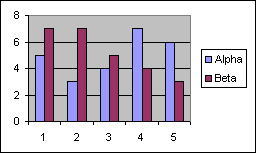
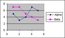
Default chart formats in Classic Excel (2003 and earlier).

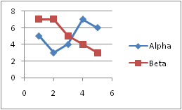
Default chart formatting in Excel 2007.
1. Backgrounds
The default charts in Excel 2003 and earlier feature a dull gray background (British and Canadian versions use dull grey instead). The first step to cleaning up your chart is to change this ugly background to white.
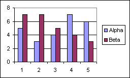
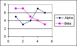
Removing the muddy background is a major improvement.
2. Borders
How important is the border around the plot area, around the legend, or around the entire chart? The legend never needs a border. Other borders can often be removed entirely, or at least lightened.


Removing the outer border and the legend border cleans up the charts.


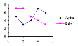
Removing the plot area border and gridlines makes the charts simpler.
Sometimes I use a light gray chart area border on embedded charts, so the chart border matches the gridlines between cells in the worksheet.
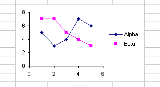
Sometimes a light border is okay.
3. Gridlines
If your chart uses gridlines, they should be the lightest features on your chart. The custom palette I use for my own work has a special gridline gray several shades lighter than the 25% gray on the default palette. But often gridlines are not even needed.

Above: Dark gridlines (left) and light gridlines (right).
Below: No gridlines and no plot area border.

4. Axes
De-emphasize the axis lines by using a light or medium gray instead of black. You could even use medium gray for the axis tick text, but I usually stick with black text. For a category X axis, you can eliminate tick marks.


If you are using gridlines, you may be able to remove the corresponding axis line, leaving only the tick labels.

You can often unclutter a chart by using fewer tick mark labels. As pointed out in the comments, keeping the unlabeled tick marks is useful.

5. Number Formatting
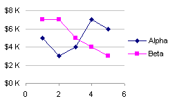
Use custom number formats to reduce the complexity of axis labels and other text in the chart.

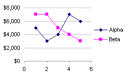
Above left: original cluttered axis labels.
Above right: remove unnecessary ‘cents’.
Below: replace thousands by ‘K’ suffix.
6. Chart Types
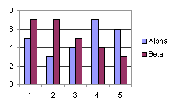
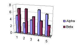
Replace every 3D chart with the corresponding 2D type.

Only use pie charts if there are three or fewer wedges. Use column or bar charts for more categories.


Cluttered pie (above left) and simpler pie (above right).
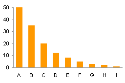

Unclutter a pie chart’s data by using a column or bar chart.
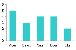
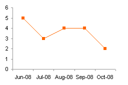
Use column charts to show values for discrete categories. Use line charts to trends over time.
7. Series Formatting
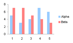
For column, bar, and area charts, remove the black outline. Use light to medium colors for fills, and don’t use patterns or gradients. Use darker, saturated colors for lines and markers. Use colors with appropriate contrast against the background and compared to other series colors. Avoid combinations that react with each other.
Too gaudy (left) and too faint (right).
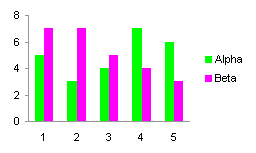

Better color combinations.

8. Horizontal Text
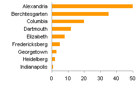
Vertical text is difficult to read, and inclined text on a monitor is bad because of distortion of the characters.
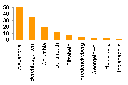
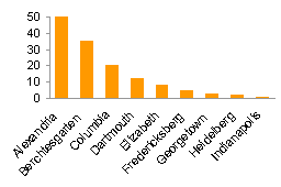
In a column chart, Excel will leave out some tick labels if they would overlap, but this leaves the readers guessing about the missing labels.
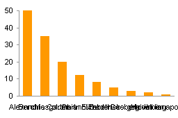
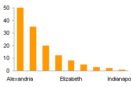
Turn the whole chart on its side.
9. Labels, not Legends
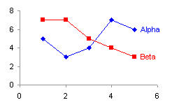
It is easier for a reader to identify series if they are directly labeled. Using a font color that matches the series formatting is also helpful. A legend takes up valuable space and makes the reader divert attention back and forth.


Top left: Ineffective Legend. Top right, bottom left and right: Effective Labels.



Doug Glancy says
Jon, thanks for the clarification on the Commonwealth background colors :). Seriously, this is a good reference.
I don’t do many charts but have worked on some lately for other people at work. They specified pie charts, but I had taken all the comments about the ineffectiveness of pie charts to heart, and designed some pretty clean bar charts. I stopped somebody in the hall and asked them what the charts meant. I then realized one critical fact about pie charts: people know immediately what they mean, i.e., that the slices are part of a whole. They don’t necessarily get that with bar charts. I’m sad to admit the finished product contains pie charts.
Anonymous says
You can often unclutter a chart by using fewer tick marks.
I definitely like to unclutter a chart with fewer tick mark labels, but I often find the ticks themselves to be harmless enough at the density chosen by Excel by default, so I reduce the labelled (long) ticks, then introduce unlabelled (short) ticks to restore the original density.
If I’m feeling particularly energetic, or the scale warrants it, I sometimes use dummy axis techniques to simulate a three level scheme, long labelled, long unlabelled, and short. I find this particularly useful for long horizontal axes where I don’t want labels overrunning each other, but don’t want to lose the accuracy of the scale.
You can easily mark multi-century-long time series this way, with labels every fifty years, long ticks every ten years (5:1), and short ticks every two years (5:1 again). Points are identifiable to the exact single year by whether they fall on a tick or between ticks.
Another item on my never-ending list of demands to MS is that they implement the three-level tick scheme as default to avoid the workaround. I’m also inclined to think that they should reference each lesser tick by how many there are to the next level up, instead of absolute size, since 99% of applications will involve the same simple small integer ratio.
ExcelPro's chart blog says
It ‘s quite great. thank you !
To my surprise, as a expert , a maestro of excel,you write these basic things yet. Is it a part of your new book?
Jon Peltier says
Anonymous –
Is that you Derek? Good point about the tick marks. I’ve adjusted that section of this post to reflect this.
derek says
Yes, well-spotted (it was the never-ending list of Excel wants that gave me away, no doubt). I don’t know my details weren’t automatically filled in that time.
Hadley says
“But usually gridlines are not even needed.” – I’d disagree. Usually tick marks aid in the assessment of patterns. See e.g. Section 3 of W. Cleveland. A model for studying display methods of statistical graphics. Journal of Computational and Graphical Statistics, 2: 323–364, 1993. URL http://stat.bell-labs.com/doc/93.4.ps. Tufte’s advice is generally good, but he often goes too far and removes things that actually are important. See e.g. W. A. Stock and J. T. Behrens. Box, line, and midgap plots: Effects of display characteristics on the accuracy and bias of estimates of whisker length. Journal of Educational Statistics, 16(1): 1–20, 1991.
Otherwise, great advice!
Jon Peltier says
Hadley –
Maybe I should have said “sometimes” instead of “usually”. I admit to using gridlines frequently, maybe about half the time.
I concur that Tufte sometimes goes too far towards minimalism with his data/ink philosophy, and he tends to blame the tool for the sins of the artisans. The tool does have some ill-advised defaults and capabilities that ought to be ignored, and there is no easy way for the craftsmen to learn the proper use of the tool.
This was originally going to be “10 Steps…”, but I only came up with nine good topics. Perhaps #10 should be something along the lines of “your mileage may vary” or “like all rules, these may be selectively and carefully ignored”.
Steve says
Great article, thanks for taking the time to write it. I have a question about labels vs. legends. I’d like to implement the label on the last point like your example shows, but I’m a bit confused about how to do this with excel 2002. Is it possible?
Thanks,
Steve
Jon Peltier says
Steve –
Select the series, then select the last point, right click and choose Format Data Point, select the Data Labels tab, and choose the Series Name option (I believe Excel 2002 introduced these options). If this option is not available, simply use any of the options, then edit the resulting label.
You can right click on the data label to bring up its distinct formatting dialog.
Tony Rose says
Number 8 is such a simple tip yet not done often enough. I see text at crazy angles so it fits (sort of), but you end up tweaking your neck trying to read it.
Number 9 is one that comes at a perfect time. In the next day or two I have a post that shows how to label line graphs instead of using a legend. Stay tuned.
Great list! And I like the fact that it’s a list of 9. Everyone uses a list of 10… and ten is overrated. Nine is the new ten.
JP says
I’m embarrassed to see how many of these I am guilty of, especially #6 (pie charts) and 8. But charting was never my strong point; I’m sure someday when I need to do it, I’ll figure all this out.
–JP
Steve says
Thanks for your reply John,
Using other tips on this site I have a chart that auto updates as new data is added. I want to use labels like your example 9, but see that as the chart auto extends to include the new data it automatically adds a new label meaning my last 2 values have labels and it all looks a bit ugly.
So I have some VBA that deletes all but the last label, I thought I’d share it.
ActiveSheet.ChartObjects("Chart 8").Activate
For i = 1 To ActiveChart.SeriesCollection.Count
    For j = 1 To ActiveChart.SeriesCollection(i).Points.Count - 1
            on error resume next
            If ActiveChart.SeriesCollection(i).Points(j).HasDataLabel Then
                ActiveChart.SeriesCollection(i).Points(j).DataLabel.Delete
            End If
            on error goto 0
    Next
Next
I’m not convinced by the “on error resume next” bit in there, but I’m seeing errors if I try to check for the existence of a label using the hasdatalabel property where I have empty cells.
Anyway, this might be useful for someone. Thanks again for your post.
Cheers,
Steve
Jon Peltier says
Steve –
Thanks for the code. I actually have a similar routine that labels the last point in a series:
Label Each Series in a Chart
derek says
Back when I did this sort of thing monthly, I knew even less VBA than I do today. I dealt with the “moving end label” problem by entering the data back-to-front, and graphing them backwards. Entering a new month meant copy-inserting the first row into a new second row, then changing the first row. Easier to do than to describe.
Jon Peltier says
Derek –
I was going to suggest this as an alternative, then I tried it with my sample data, and it didn’t work. I was using dates and a date axis, which Excel sorts internally before plotting, so the first point ends up being the last point, and the label doesn’t keep up with it.
However, one alternative I’ve used (maybe I should save it as another post) is to make a new series which plots hidden points using the X and Y values of the last point in each series. Through the magic of OFFSET and LOOKUP, these points always link to the last points in each series.
jenmoocat says
Huzzah!
Great post.
Now if I could only get everyone here at work to adopt these simple changes!
Jim Beckwith says
Jon
Thanks for your very helpful blogs. I have been trying to write code for re-formatting charts. I’ve been battling trying to work out how to change the font size of the axes numbers (xlValue and xlCategory). I would have thought that something like this might have worked:
ActiveChart.Axes(xlValue).Select
With Selection.Font
.Size = 8
End With
Have you got any ideas on how the font size can be changed?
Jim
Jon Peltier says
Jim –
Whenever I get stuck, or I’m too lazy to consult the object Browser, I record a macro:
Sub Macro1()
'
' Macro1 Macro
' Macro recorded 10/23/2008 by Jon Peltier
'

'
    ActiveChart.Axes(xlValue).Select
    Selection.TickLabels.AutoScaleFont = True
    With Selection.TickLabels.Font
        .Name = "Arial"
        .FontStyle = "Regular"
        .Size = 8
        .Strikethrough = False
        .Superscript = False
        .Subscript = False
        .OutlineFont = False
        .Shadow = False
        .Underline = xlUnderlineStyleNone
        .ColorIndex = xlAutomatic
        .Background = xlAutomatic
    End With
End Sub
This can be cleaned up:
Sub ResizeAxisTickFont()
' Macro cleaned up 10/23/2008 by Jon Peltier

    With ActiveChart.Axes(xlValue).TickLabels.Font
        .Size = 8
    End With
End Sub
Jim Beckwith says
Thanks again for your help, Jon. Very much appreciated!
Actually, I had tried to record the macro to format both axes. This is is how it turned out:
Sub Macro6()
‘ Macro6 Macro
ActiveSheet.ChartObjects(“Chart 1”).Activate
ActiveChart.Axes(xlValue).Select
ActiveSheet.ChartObjects(“Chart 1”).Activate
ActiveSheet.ChartObjects(“Chart 1”).Activate
ActiveChart.Axes(xlCategory).Select
End Sub
Is there a setting that I’ve got turned off that causes the macro recorder to miss internal operations once the Axes(xlValue) is selected? Or is this just a quirk of Excel 2007?
Best regards, Jim
Jon Peltier says
Jim –
Excel 2007 uses new shapes for the elements of its charts. Development of these new shapes was finished late in the process of finishing Office 2007, and there was not time to incorporate them into the macro recorder. When you record a macro involving shapes, the recorder misses everything, and when a recorded macro deals with charts, it misses almost all formatting. There is enough compatibility with previous versions that code recorded in 2003 will (mostly) work in 2007, and the formatting code in 2003 will still produce thee equivalent formatting in 2007.
Gordon says
Great tips there Jon, I’ve made this standard reading for all involved in creation of charts at my workplace.
George says
Great site–lot’s of good advice, and this article is no exception! Tip #8 concerns me, in that some scientists and engineers are taught to read a chart with the x-axis as the independent variable and the y-axis as the dependent. Flipping them willy-nilly may lead to false conclusions about what the author is trying to present. I suggest this one be included in the category of “consider when appropriate”.
Jon Peltier says
Hi George –
Even scientists and engineers should be flexible enough to get the swapping of dependent and independent axes, and in fact, they would probably understand more quickly that the vertical axis in a horizontal bar chart is the X axis in an Excel chart.
Of course, a bar or column chart is generally inappropriate for most scientific or engineering charts, eh?
Zakaria says
Hi John,
Just want to thank you for your great website. Keep up with the good work.
Del says
Definitelly, it’s a great example for those improve step by step. good job!
James says
Jon – firstly thankyou so much this site of yours helps me so much it ‘s untrue – everyone at work thinks I’m some sort of excel expert- and it’s mostly because of your simple easy to follow explanations. however I have run into some trouble that has me stumped.
I need some help as my VB is more basic than most. I have a page of graphs (52 of them to be honest – 26 line graphs and 26 bar graphs of the same data – my boos likes a choice!) I was having to update them on a monthly basis which was becomming painful as you can no doubt imagine. So I wrote a little macro to create a new lot of graphs based on dynamic ranges and another to clear out the previous graphs at the touch of a button – great! it worked almost first time too! – then I added a little bit more to get the line graphs and bar graphs to conform to the traffic light format the graphs display – a simple red, amber, green lines / bars and a grey for N/A’s. I used a custom templates and it seemed fine till I made it live and let others use it – now it seems to have switched axies on most of the graphs and is duplicating the first 2 graphs (both of which are always fine and formatted correctly, the duplicates and all the following graphs have their axies’s switched and I have no idea why. The duplication seems to be slightly perverse as well when I simply moved the graph titles to compensate for the duplicates it duplicates 3 times so my headings are still off – is it my code or is my computer just trying to wind me up?
See code below you may recognise the last bit for ordering the graphs it’s one of yours – thanks again.
Any ideas please
ActiveSheet.Shapes.AddChart.Select
ActiveChart.ApplyChartTemplate ( _
“c:\excel\templates\metrics excel graph templates\default.crtx” _
)
ActiveChart.SetSourceData Source:=Sheets(“data sheet”).Range(“Are_component_requirements_cht”)
ActiveSheet.Shapes.AddChart.Select
ActiveChart.ApplyChartTemplate ( _
“c:\excel\templates\metrics excel graph templates\bar default.crtx” _
)
ActiveChart.SetSourceData Source:=Sheets(“data sheet”).Range(“Are_component_requirements_cht”)
ActiveSheet.Shapes.AddChart.Select
ActiveChart.ApplyChartTemplate ( _
“c:\excel\templates\metrics excel graph templates\default.crtx” _
)
ActiveChart.SetSourceData Source:=Sheets(“data sheet”).Range(“Are_review_gate_meetings_cht”)
ActiveSheet.Shapes.AddChart.Select
ActiveChart.ApplyChartTemplate ( _
“c:\excel\templates\metrics excel graph templates\bar default.crtx” _
)
ActiveChart.SetSourceData Source:=Sheets(“data sheet”).Range(“Are_review_gate_meetings_cht”)
ActiveSheet.Shapes.AddChart.Select
ActiveChart.ApplyChartTemplate ( _
“c:\excel\templates\metrics excel graph templates\default.crtx” _
)
ActiveChart.SetSourceData Source:=Sheets(“data sheet”).Range(“Are_attribute_trades_cht”)
ActiveSheet.Shapes.AddChart.Select
ActiveChart.ApplyChartTemplate ( _
“c:\excel\templates\metrics excel graph templates\bar default.crtx” _
)
ActiveChart.SetSourceData Source:=Sheets(“data sheet”).Range(“Are_attribute_trades_cht”)
ActiveSheet.Shapes.AddChart.Select
ActiveChart.ApplyChartTemplate ( _
“c:\excel\templates\metrics excel graph templates\default.crtx” _
)
ActiveChart.SetSourceData Source:=Sheets(“data sheet”).Range(“Are_attributes_on_target_cht”)
ActiveSheet.Shapes.AddChart.Select
ActiveChart.ApplyChartTemplate ( _
“c:\excel\templates\metrics excel graph templates\bar default.crtx” _
)
ActiveChart.SetSourceData Source:=Sheets(“data sheet”).Range(“Are_attributes_on_target_cht”)
ActiveSheet.Shapes.AddChart.Select
ActiveChart.ApplyChartTemplate ( _
“c:\excel\templates\metrics excel graph templates\default.crtx” _
)
ActiveChart.SetSourceData Source:=Sheets(“data sheet”).Range(“Does_the_IPT_cht”)
ActiveSheet.Shapes.AddChart.Select
ActiveChart.ApplyChartTemplate ( _
“c:\excel\templates\metrics excel graph templates\bar default.crtx” _
)
ActiveChart.SetSourceData Source:=Sheets(“data sheet”).Range(“Does_the_IPT_cht”)
ActiveSheet.Shapes.AddChart.Select
ActiveChart.ApplyChartTemplate ( _
“c:\excel\templates\metrics excel graph templates\default.crtx” _
)
ActiveChart.SetSourceData Source:=Sheets(“data sheet”).Range(“Is_there_an_overall_cht”)
ActiveSheet.Shapes.AddChart.Select
ActiveChart.ApplyChartTemplate ( _
“c:\excel\templates\metrics excel graph templates\bar default.crtx” _
)
ActiveChart.SetSourceData Source:=Sheets(“data sheet”).Range(“Is_there_an_overall_cht”)
ActiveSheet.Shapes.AddChart.Select
ActiveChart.ApplyChartTemplate ( _
“c:\excel\templates\metrics excel graph templates\default.crtx” _
)
ActiveChart.SetSourceData Source:=Sheets(“data sheet”).Range(“Is_Intellectual_Property_cht”)
ActiveSheet.Shapes.AddChart.Select
ActiveChart.ApplyChartTemplate ( _
“c:\excel\templates\metrics excel graph templates\bar default.crtx” _
)
ActiveChart.SetSourceData Source:=Sheets(“data sheet”).Range(“Is_Intellectual_Property_cht”)
ActiveSheet.Shapes.AddChart.Select
ActiveChart.ApplyChartTemplate ( _
“c:\excel\templates\metrics excel graph templates\default.crtx” _
)
ActiveChart.SetSourceData Source:=Sheets(“data sheet”).Range(“Have_checks_for_infringement_cht”)
ActiveSheet.Shapes.AddChart.Select
ActiveChart.ApplyChartTemplate ( _
“c:\excel\templates\metrics excel graph templates\bar default.crtx” _
)
ActiveChart.SetSourceData Source:=Sheets(“data sheet”).Range(“Have_checks_for_infringement_cht”)
ActiveSheet.Shapes.AddChart.Select
ActiveChart.ApplyChartTemplate ( _
“c:\excel\templates\metrics excel graph templates\default.crtx” _
)
ActiveChart.SetSourceData Source:=Sheets(“data sheet”).Range(“Does_the_definition_cht”)
ActiveSheet.Shapes.AddChart.Select
ActiveChart.ApplyChartTemplate ( _
“c:\excel\templates\metrics excel graph templates\bar default.crtx” _
)
ActiveChart.SetSourceData Source:=Sheets(“data sheet”).Range(“Does_the_definition_cht”)
ActiveSheet.Shapes.AddChart.Select
ActiveChart.ApplyChartTemplate ( _
“c:\excel\templates\metrics excel graph templates\default.crtx” _
)
ActiveChart.SetSourceData Source:=Sheets(“data sheet”).Range(“Is_the_level_of_definition_cht”)
ActiveSheet.Shapes.AddChart.Select
ActiveChart.ApplyChartTemplate ( _
“c:\excel\templates\metrics excel graph templates\bar default.crtx” _
)
ActiveChart.SetSourceData Source:=Sheets(“data sheet”).Range(“Is_the_level_of_definition_cht”)
ActiveSheet.Shapes.AddChart.Select
ActiveChart.ApplyChartTemplate ( _
“c:\excel\templates\metrics excel graph templates\default.crtx” _
)
ActiveChart.SetSourceData Source:=Sheets(“data sheet”).Range(“Are_interfaces_suitably_cht”)
ActiveSheet.Shapes.AddChart.Select
ActiveChart.ApplyChartTemplate ( _
“c:\excel\templates\metrics excel graph templates\bar default.crtx” _
)
ActiveChart.SetSourceData Source:=Sheets(“data sheet”).Range(“Are_interfaces_suitably_cht”)
ActiveSheet.Shapes.AddChart.Select
ActiveChart.ApplyChartTemplate ( _
“c:\excel\templates\metrics excel graph templates\default.crtx” _
)
ActiveChart.SetSourceData Source:=Sheets(“data sheet”).Range(“Is_the_component_aligned_cht”)
ActiveSheet.Shapes.AddChart.Select
ActiveChart.ApplyChartTemplate ( _
“c:\excel\templates\metrics excel graph templates\bar default.crtx” _
)
ActiveChart.SetSourceData Source:=Sheets(“data sheet”).Range(“Is_the_component_aligned_cht”)
ActiveSheet.Shapes.AddChart.Select
ActiveChart.ApplyChartTemplate ( _
“c:\excel\templates\metrics excel graph templates\default.crtx” _
)
ActiveChart.SetSourceData Source:=Sheets(“data sheet”).Range(“Is_the_supply_cht”)
ActiveSheet.Shapes.AddChart.Select
ActiveChart.ApplyChartTemplate ( _
“c:\excel\templates\metrics excel graph templates\bar default.crtx” _
)
ActiveChart.SetSourceData Source:=Sheets(“data sheet”).Range(“Is_the_supply_cht”)
ActiveSheet.Shapes.AddChart.Select
ActiveChart.ApplyChartTemplate ( _
“c:\excel\templates\metrics excel graph templates\default.crtx” _
)
ActiveChart.SetSourceData Source:=Sheets(“data sheet”).Range(“Are_manufacturing_cht”)
ActiveSheet.Shapes.AddChart.Select
ActiveChart.ApplyChartTemplate ( _
“c:\excel\templates\metrics excel graph templates\bar default.crtx” _
)
ActiveChart.SetSourceData Source:=Sheets(“data sheet”).Range(“Are_manufacturing_cht”)
ActiveSheet.Shapes.AddChart.Select
ActiveChart.ApplyChartTemplate ( _
“c:\excel\templates\metrics excel graph templates\default.crtx” _
)
ActiveChart.SetSourceData Source:=Sheets(“data sheet”).Range(“Are_technology_readiness_cht”)
ActiveSheet.Shapes.AddChart.Select
ActiveChart.ApplyChartTemplate ( _
“c:\excel\templates\metrics excel graph templates\bar default.crtx” _
)
ActiveChart.SetSourceData Source:=Sheets(“data sheet”).Range(“Are_technology_readiness_cht”)
ActiveSheet.Shapes.AddChart.Select
ActiveChart.ApplyChartTemplate ( _
“c:\excel\templates\metrics excel graph templates\default.crtx” _
)
ActiveChart.SetSourceData Source:=Sheets(“data sheet”).Range(“Are_aftermarket_requirements_cht”)
ActiveSheet.Shapes.AddChart.Select
ActiveChart.ApplyChartTemplate ( _
“c:\excel\templates\metrics excel graph templates\bar default.crtx” _
)
ActiveChart.SetSourceData Source:=Sheets(“data sheet”).Range(“Are_aftermarket_requirements_cht”)
ActiveSheet.Shapes.AddChart.Select
ActiveChart.ApplyChartTemplate ( _
“c:\excel\templates\metrics excel graph templates\default.crtx” _
)
ActiveChart.SetSourceData Source:=Sheets(“data sheet”).Range(“Is_maintenance_policy_cht”)
ActiveSheet.Shapes.AddChart.Select
ActiveChart.ApplyChartTemplate ( _
“c:\excel\templates\metrics excel graph templates\bar default.crtx” _
)
ActiveChart.SetSourceData Source:=Sheets(“data sheet”).Range(“Is_maintenance_policy_cht”)
ActiveSheet.Shapes.AddChart.Select
ActiveChart.ApplyChartTemplate ( _
“c:\excel\templates\metrics excel graph templates\default.crtx” _
)
ActiveChart.SetSourceData Source:=Sheets(“data sheet”).Range(“Are_life__reliability_cht”)
ActiveSheet.Shapes.AddChart.Select
ActiveChart.ApplyChartTemplate ( _
“c:\excel\templates\metrics excel graph templates\bar default.crtx” _
)
ActiveChart.SetSourceData Source:=Sheets(“data sheet”).Range(“Are_life__reliability_cht”)
ActiveSheet.Shapes.AddChart.Select
ActiveChart.ApplyChartTemplate ( _
“c:\excel\templates\metrics excel graph templates\default.crtx” _
)
ActiveChart.SetSourceData Source:=Sheets(“data sheet”).Range(“Are_maintainability_cht”)
ActiveSheet.Shapes.AddChart.Select
ActiveChart.ApplyChartTemplate ( _
“c:\excel\templates\metrics excel graph templates\bar default.crtx” _
)
ActiveChart.SetSourceData Source:=Sheets(“data sheet”).Range(“Are_maintainability_cht”)
ActiveSheet.Shapes.AddChart.Select
ActiveChart.ApplyChartTemplate ( _
“c:\excel\templates\metrics excel graph templates\default.crtx” _
)
ActiveChart.SetSourceData Source:=Sheets(“data sheet”).Range(“Is_aftermarket_IPR_cht”)
ActiveSheet.Shapes.AddChart.Select
ActiveChart.ApplyChartTemplate ( _
“c:\excel\templates\metrics excel graph templates\bar default.crtx” _
)
ActiveChart.SetSourceData Source:=Sheets(“data sheet”).Range(“Is_aftermarket_IPR_cht”)
ActiveSheet.Shapes.AddChart.Select
ActiveChart.ApplyChartTemplate ( _
“c:\excel\templates\metrics excel graph templates\default.crtx” _
)
ActiveChart.SetSourceData Source:=Sheets(“data sheet”).Range(“Is_Aftermarket_strategy_cht”)
ActiveSheet.Shapes.AddChart.Select
ActiveChart.ApplyChartTemplate ( _
“c:\excel\templates\metrics excel graph templates\bar default.crtx” _
)
ActiveChart.SetSourceData Source:=Sheets(“data sheet”).Range(“Is_Aftermarket_strategy_cht”)
ActiveSheet.Shapes.AddChart.Select
ActiveChart.ApplyChartTemplate ( _
“c:\excel\templates\metrics excel graph templates\default.crtx” _
)
ActiveChart.SetSourceData Source:=Sheets(“data sheet”).Range(“Is_repair_technology_readiness_cht”)
ActiveSheet.Shapes.AddChart.Select
ActiveChart.ApplyChartTemplate ( _
“c:\excel\templates\metrics excel graph templates\bar default.crtx” _
)
ActiveChart.SetSourceData Source:=Sheets(“data sheet”).Range(“Is_repair_technology_readiness_cht”)
ActiveSheet.Shapes.AddChart.Select
ActiveChart.ApplyChartTemplate ( _
“c:\excel\templates\metrics excel graph templates\default.crtx” _
)
ActiveChart.SetSourceData Source:=Sheets(“data sheet”).Range(“Is_risk_management_cht”)
ActiveSheet.Shapes.AddChart.Select
ActiveChart.ApplyChartTemplate ( _
“c:\excel\templates\metrics excel graph templates\bar default.crtx” _
)
ActiveChart.SetSourceData Source:=Sheets(“data sheet”).Range(“Is_risk_management_cht”)
ActiveSheet.Shapes.AddChart.Select
ActiveChart.ApplyChartTemplate ( _
“c:\excel\templates\metrics excel graph templates\default.crtx” _
)
ActiveChart.SetSourceData Source:=Sheets(“data sheet”).Range(“Have_relevant_lessons_cht”)
ActiveSheet.Shapes.AddChart.Select
ActiveChart.ApplyChartTemplate ( _
“c:\excel\templates\metrics excel graph templates\bar default.crtx” _
)
ActiveChart.SetSourceData Source:=Sheets(“data sheet”).Range(“Have_relevant_lessons_cht”)
ActiveSheet.Shapes.AddChart.Select
ActiveChart.ApplyChartTemplate ( _
“c:\excel\templates\metrics excel graph templates\default.crtx” _
)
ActiveChart.SetSourceData Source:=Sheets(“data sheet”).Range(“Have_new_lessons_cht”)
ActiveSheet.Shapes.AddChart.Select
ActiveChart.ApplyChartTemplate ( _
“c:\excel\templates\metrics excel graph templates\bar default.crtx” _
)
ActiveChart.SetSourceData Source:=Sheets(“data sheet”).Range(“Have_new_lessons_cht”)
ActiveSheet.Shapes.AddChart.Select
ActiveChart.ApplyChartTemplate ( _
“c:\excel\templates\metrics excel graph templates\default.crtx” _
)
ActiveChart.SetSourceData Source:=Sheets(“data sheet”).Range(“Is_unit_cost_cht”)
ActiveSheet.Shapes.AddChart.Select
ActiveChart.ApplyChartTemplate ( _
“c:\excel\templates\metrics excel graph templates\bar default.crtx” _
)
ActiveChart.SetSourceData Source:=Sheets(“data sheet”).Range(“Is_unit_cost_cht”)
Dim iChart As Long
Dim nCharts As Long
Dim dTop As Double
Dim dLeft As Double
Dim dHeight As Double
Dim dWidth As Double
Dim nColumns As Long
dTop = 75 ‘ top of first row of charts
dLeft = 100 ‘ left of first column of charts
dHeight = 225 ‘ height of all charts
dWidth = 375 ‘ width of all charts
nColumns = 2 ‘ number of columns of charts
nCharts = ActiveSheet.ChartObjects.Count
For iChart = 1 To nCharts
With ActiveSheet.ChartObjects(iChart)
.Height = dHeight
.Width = dWidth
.Top = dTop + Int((iChart – 1) / nColumns) * dHeight
.Left = dLeft + ((iChart – 1) Mod nColumns) * dWidth
End With
Next
End Sub
Jon Peltier says
James –
Couldn’t you define the series data in each chart to use the named ranges in the worksheet, thus avoiding the deletion and creation of all those charts? For example, define Is_Unit_Cost_X and Is_Unit_Cost_Y for the last chart listed in your code, select the chart, go to the Select Data dialog, and instead of cell addresses for X and Y, enter these names. This will remove 98% of the code, probably more, because the last bit looks like it’s just positioning the charts, which wouldn’t have to be done with the existing charts.
James says
Jon, you’re a legend, thanks. That is deffinately the way to go with this.