In Overlapped Bar Chart – Longer Bars in Back I showed a fairly easy way to make a chart Robert Kosara developed to examine popular vote and Electoral College vote in US presidential elections. Stag Lee commented that Robert’s chart type was not intuitive, and suggested a slight modification, as shown here:
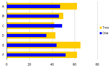
This example uses the same data from the previous post.

Start with a simple clustered column chart.
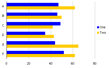
Select one of the series (in this case “One”), and move it to the secondary axis.
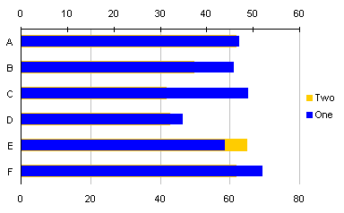
Remove the secondary Y axis, the axis along the top edge of the chart.
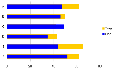
Change the gap width of the series in front to 200, and of the series behind to 50.

This is also a relatively clear way to show the two series, but it’s not as striking when the thin series represents a larger value than the wide series. Robert’s chart, reproduced below, more clearly shows the series with the smaller value, because the smaller series bar is visible all the way to the left axis of the chart.


Mrayo says
I am so gonna use this on my weekly report!
Thanks Mr. Peltier!
I always check your your site!
Anton says
This type of chart is exactly what I was looking for to compare Target Sales to Actual Sales. The instructions are easy to follow and the results are great!
Well Done
Muzammil says
Thanks for this tip, it’ll be very useful for me…
JohnCackalackey says
It seems this does not work on Excel for Mac 2008. When I changed the gap for the second series, it also changes the gap for the first series to 50. Pretty chart, though. I wish I could replicate it on my mac!
Thanks for sharing,
John
Jon Peltier says
If you move one series to the secondary axis, the gap width of the series can be set independently.
JasonG says
I have been looking for a good way to show total discount over spend for several catagories, and I think this is a great way to do it. The only piece that I have a problem with is I feel discount which would be the thin bar should show up first on the Legand since that is the primary thing they should be looking at. I know I could just make a legand myself by using labels and shapes but is there an easier way?
Jason
Jon Peltier says
Jason –
I used a data set like this, with a dummy series mimicking the secondary series on the primary axis:
This is the sequence I went through with the chart:
JasonG says
That is perfect thanks
RS says
Great post overall. However, I am trying to add an additional wrinkle into this setup by having 2 sets of bars for each tick on the Y-axis. Here is what I am trying to do:
For each month of the year, I will have 2 sets of things to track (receipts vs goal and backlog vs goal). I would like to have the goal bars for each in the background thicker than the receipts and backlog bars that would be in front.
Is there any way to make this happen in Excel? I am using Excel 2003.
Jon Peltier says
RS –

You want A (receipts) next to B (backlog), with blanks between A-B pairs, and blanks on the outside of the chart. So you have to stagger your data, as shown below. Make the chart top chart: (your defaults may look different, because I used Excel 2013, and they’ve done weird stuff with default overlaps and gap widths). Then move the two actual series to the secondary axis, so they appear in front of the target series on the primary axis (middle chart). Finally, for the primary series, change overlap to 100 and gap width to 50. For the secondary series, change overlap to 100 and gap width to 150. Then delete the secondary vertical axis so all data will be plotted on the primary axis. Also go back to the original data and clear the cells that said Blank.
MalcolmS. says
In constructing my overlap bar chart (thinner bars in front), I noticed that Excel had reversed the order of my bar chart categories. So I formatted the vertical axis to ‘categorises in reverse order’ and ‘horizontal axis crosses at max category’ *. This is fine. The categories revert to the order in my table. However, when I then move one series to the secondary axis, one series reverts to a non reverse order, whilst the other maintains the ‘categorise in reverse order’. It’s frustrating to say the least.
I have tried this with my own data and also repeating the data in the above example but with the same frustrating mix of ordered and reverse order data.
* I note that your screen shots for formatting the vertical axis refer to ‘vertical axis crosses at max category’ whilst I see ‘horizontal’. I don’t understand why this should be the case. I am using Excel 2007.
Jon Peltier says
Malcolm –
You will need to temporarily show the secondary category (vertical) axis, and check its Categories in Reverse Order box. This was not needed in Excel 2003, but apparently is in later versions.
There are no screen shots in this post that show settings for vertical or horizontal axis crossing. When formatting the vertical axis, it will be the crossing point of the horizontal axis that can be formatted.
Yuki says
This is great. How can I accomplish Overlapped Bar Chart in SSRS?
Jon Peltier says
I’ve never used SQL Server Reporting Services. Perhaps there is a forum covering charts in SSRS; you could combine basic knowledge of SSRS charting with the tricks you find here.
Clive says
Jon thank you kindly for the information.
I am using the overlapped thinner and wider bars in a graph in Excel 2003 and was wondering whether is it at all possible to add a target line to the graph? I have to add a physical drawing object line to the graphs that I am using but have found that very often the line will revert backwards in order in Excel on it’s own accord.
I have tried following your bar-line combination instructions but get an error telling me that some charts cannot be combined.
However It is possible to have a target line with the bars adjacent to one another on the same axis but I ahve found that this does not have the same effect as the overlapped thinner and wider bars for my users.
Jon Peltier says
Clive –
You need a line or XY type series if using error bars for the target, or an XY type if using the series line. The line or XY series cannot be on the same axis as the horizontal bars. This means the horizontal bars can only be on one axis, so you cannot use the thin/fat bar approach.
In a vertical bar chart (column chart), the line or XY series can be on the same axis as either the primary or secondary columns, so the target line is possible.
Sonu Jarwal says
I am new to visualization so can you help me with overlapped bar chart
can i get the source code.
Jon Peltier says
Sonu –
There is no “source code” per se. There are the instructions in this post, plus your attention to detail while learning them.
Esther says
Another way to do this is to overlap them 100% then add a wide border to the back series.
Sneha says
Hello Mr. Peltier!
Thank-you for the blog post.
I am unable to reproduce the very last plot in your post wherein you have showed a better way to plot when the thin series represents a larger value than the wide series. Please can you help?