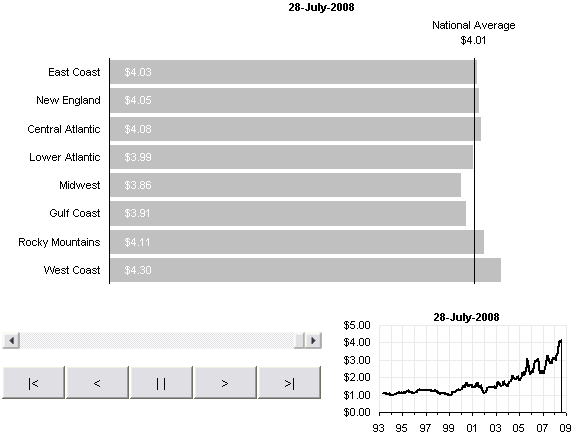
In Gas Prices – Animated Bar Chart for Excel, I duplicated Nathan‘s dynamic bar chart of gas prices in Excel.

It’s a pretty nice animation, but there is no sense of where the bar chart is along the date scale of the data. I made a small adjustment to the model above, drawing a small time line of the US Average, with a vertical line indicating the date of the bar chart.

The line chart contains two series. The first is a time series of the national average data. The second series contains only one potted point, the value of the national average at the selected date; an error bar for this point provides the vertical line. This data is in column L of the data sheet. The formula in cell L10 (the first row of price data) is
=IF(A10=A$2,J10,NA())
A10 contains the date for that row, A$2 contains the selected date, J10 contains the national average for that date. If the date for that row matches the selected date, then the formula returns the national average, otherwise it returns #N/A, which is not plotted in a line or XY chart. The vertical error bar applied to this series uses the negative Y option and a percentage of 100%. This formula is filled down to the bottom of the price data.
The VBA code in this new workbook is unchanged, and the bar chart is also unchanged, other than a lighter shade of gray filling the bars. Only the line chart and thee column of data for the vertical line in his chart have been added.
To try out the new animated chart, download this zip file. It is unlocked and unprotected, so you can see the code and watch how it works.
Update
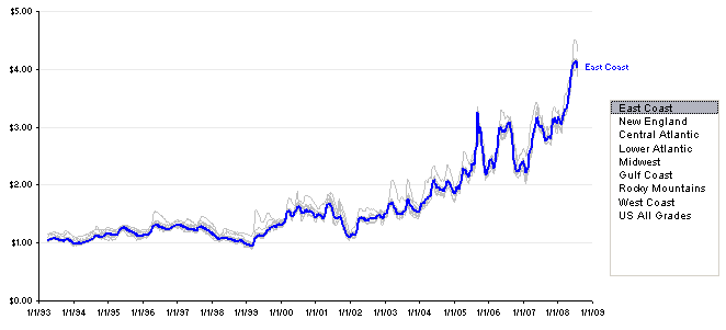
I showed the data in an intereactive time-series in Gas Prices – Interactive Time Series.


dermot says
Jon
I know you set out to reproduce the animation, but I think there are better ways to show this data.
I would average the data over periods of 3-6 months and show all the lines and dates on the same (static) chart, perhaps allowing the user to pick one series to highlight.
As it is, it takes far too long to run through all the weeks and all the patterns are lost.
Andy Cotgreave says
Excellent stuff, Jon. The line chart animation is really nice. But, as dermot says, and you probably agree, in the end, the line chart alone is the best way to show this data!
Thanks for showing a nice way to make this visualisation in Excel, though. Very useful.
Andy
Jon Peltier says
Dermot – I showed the data in an intereactive time-series in Gas Prices – Interactive Time Series.
DaleW says
Jon – Nice animation. Yes, your interactive time series chart is a much more efficient way to look at the data.