Nathan Yau of FlowingData asks Can You Improve this Mediocre Statistical Graphic?

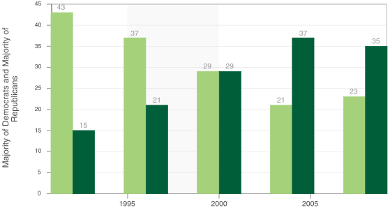
So what’s wrong with this chart?
1. Image Clarity. Nathan’s screen shot of the original chart was pretty fuzzy, so I went to the source and captured it again, and that’s what I show above. I don’t thing a sharper image of this chart is what Nathan was thinking.
2. Chart type? The data points are measured discretely every four years, so a line chart is less imperative than for most time series. If a line chart is used, it should have markers for the points to emphasize their discrete nature, and the lines should be straight, not smoothed. Otherwise the chart implies that the data series are continuous.
3. Horizontal Axis. The 5-year tick spacing along the horizontal axis is confusing and misleading. It must be redrawn to accurately label the years where the measurements were made.
4. Color Scheme. In recent campaigns, the colors red and blue have become synonymous with the Democrat and Republican parties, so the use of green shades in this chart misses an opportunity to add understanding.
5. Labeling. The chart title and axis titles were misleading or nonexistent. The series were unlabeled.
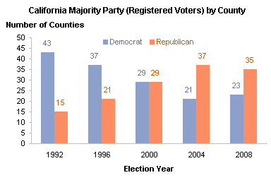
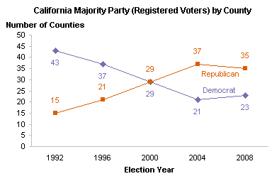
I’ve produced the following two charts, the first a clustered column chart, the second a line chart. These may not be perfect, but they are a substantial improvement over the chart Nathan wants to fix.


Update (7/18/2008):
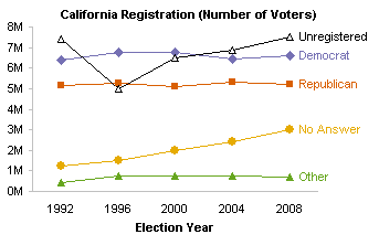
What else is wrong with the chart? National elections are not decided on a county-by-county basis. The statewide percentages of registered Democratic to Republican voters has not changed as much as the county weightings have changed, and the parties have not switched places in the ranks. Both parties have declined slowly, with Democrats always being around 8-10 percentage points higher. “Other” has remained essentially unchanged, and interestingly enough “No Answer” has doubled during the time period shown.

Update (7/19/2008):
What is wrong with the voters? A closer look at the numbers shows that in the majority of the years surveyed, more eligible voters were unregistered than were registered with any one party. The first chart shows actual numbers of voters, and we see that the raw numbers of voters who admit to being registered as either Republican or Democrat have held roughly steady over the five primary seasons. Those unregistered and those declining to answer have steadily increased. There must have been a voter registration effort before the 1996 primary season, when nearly 2.5 million people left the ranks of unregistered voters. (Part of the jump may also be due to a revision in the census of total eligible voters.)


Update (7/19/2008):
Jorge Camoes has proposed a sparkline chart to show the county majority party data. ![]() Jorge’s chart shows the difference between the percentage of Democrat-majority counties and 50%. I find his chart potentially confusing because (a) there’s no indication of vertical scale, (b) the difference from 50% requires extra mental processing, (c) mixing of colors for a single series makes in unclear, particularly when one of the colors (red) is often used to denote the party which is not the one shown in the chart.
Jorge’s chart shows the difference between the percentage of Democrat-majority counties and 50%. I find his chart potentially confusing because (a) there’s no indication of vertical scale, (b) the difference from 50% requires extra mental processing, (c) mixing of colors for a single series makes in unclear, particularly when one of the colors (red) is often used to denote the party which is not the one shown in the chart.
I made a simple stacked column sparkline, which works better for me. ![]() You get a sense of scale, at least, that the full height of the graphic is the full number of counties. The colors are also the conventional Democrat blue and Republican red. I would not want to stack more than two series, especially in a sparkline. Also, thee problem with a sparkline is that a more detailed analysis (as in my updates to this post) requires more series to explain.
You get a sense of scale, at least, that the full height of the graphic is the full number of counties. The colors are also the conventional Democrat blue and Republican red. I would not want to stack more than two series, especially in a sparkline. Also, thee problem with a sparkline is that a more detailed analysis (as in my updates to this post) requires more series to explain.


Andreas Lipphardt says
Jon – Well done ! Some minor improvements could be
– Removing the major tick marks on the category axis
– the axis could have some lighter Grey
– potentially you could even remove the value axis
Andreas
Jon Peltier says
Andreas –
Yes, I thought of a few adjustments like these, but then it would have taken me ten minutes instead of five to prepare this post! Thanks for the reminders, though.
Update: I had to redo the charts to correct a typo in the chart title, so I lightened the axes and removed the X axis ticks while I was at it.
Debra Dalgleish says
I agree with Andreas’ suggestion to remove the value axis. It’s distracting, and its label fights with the chart title.
The line chart does a better job of showing the change in each party’s county numbers.
Jon Peltier says
I agree, it’s cleaner without the value axis. Without the axis, the chart can also be made a bit smaller.
Jon Peltier says
There were a lot of other submitted revisions to this chart. My favorite is by David of Random Thoughts:
Jon Peltier says
A step chart is best used when data is set at certain time points, and it remains constant between steps. We know this data is subject to continuous variation, even though we only see it measured at long intervals. This makes a line chart with data points appropriate, to indicate that the data varies from one point to the other.
I saw your sparkline chart, but it didn’t really speak to me. Usually sparklines tell a story nicely, but this one was confusing. Red and
blueblack both refer to one series, even though red and blue are conventionally used for the two series (red=Republican). Also, although the two pieces add to 100%, somehow in this case I’m dissatisfied not to see both values in the chart.Jorge Camoes says
Jon, wouldn’t this data qualify for a step chart?
I took a different approach and suggest a sparkline to display the democrat results around the 50% mark.
Colin Banfield says
Hmmm. The tornado chart doesn’t work for me. Time data is best shown on the x-axis since the “flow” of time is more natural from left to right. Either of your last two charts (column and line) works best (depending on what you want to emphasize – trend or absolute value).
Jon Peltier says
Colin –
The aspect of David’s offset bars that I was concerned with was the implied vertical passage of time. I wondered whether time should increase downwards as in David’s chart, or upwards as I had visualized myself while first looking at the data. I’m not too concerned about a vertical time axis, though. The measurements are discretely spaced, so it really isn’t confusing, at least not to me.
Generally I think I like the clustered column chart better for showing two series (Democrat vs. Republican by county). As soon as more series are added to the chart, as in the charts shown in my updates, then line charts work best, and I didn’t even consider clustered or stacked columns.