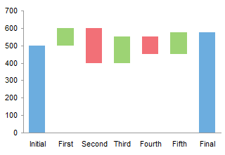
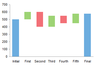
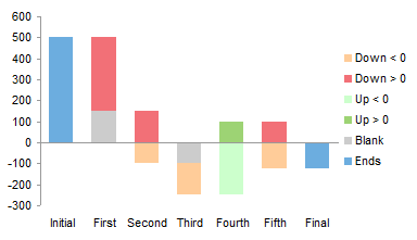
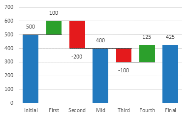
Waterfall charts are commonly used in business to show how a value changes from one state to another through a series of intermediate changes. For example, you can project next year’s profit or cash flow starting with this year’s value, and showing the up and down effects of changing costs, revenues, and other inputs. Waterfall charts are often called bridge charts, because a waterfall chart shows a bridge connecting its endpoints. A simple waterfall chart is shown below:
There is more than one way to create a waterfall chart in Excel. The first approach described below is to create a stacked column chart with up and down columns showing changes and transparent columns that help the visible columns to float at the appropriate level. Under some circumstances, this simple approach breaks down, and another approach is described.
These techniques for creating waterfall charts are not complicated, but they can get long and boring, and this resulting tedium can lead to errors. Peltier Tech Charts for Excel creates several types of waterfall charts, and many other charts not built into Excel, at the push of a button.
Floating Column Chart Data and Calculations
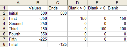
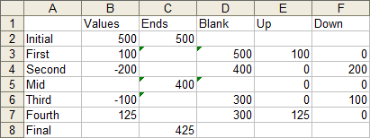
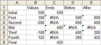
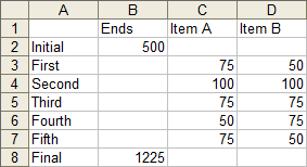
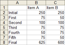
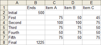
Here is some sample data showing how to construct a stacked-column waterfall chart. The left table has a column of labels, then a column with just the initial and final values, then columns with increases and decreases in value. This is the almost arrangement needed for making the chart, but I prefer to put these values into a single column as shown at right, and let the formulas sort it all out.
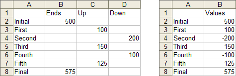
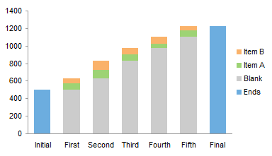
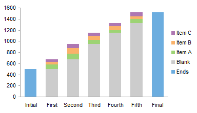
The first approach most people try is to use a floating column chart, that is, a stacked column chart with the bottom column in the stack hidden to make the others float. This range contains the calculations needed to make a floating column waterfall chart. After the two columns of labels and values, as in the top right table, there are calculated columns for the chart endpoints, the blank series that supports the floaters, and up and down values. Here are the formulas; the formulas in D3:F3 are filled down to row 7:
Cell C2: =B2
Cell C8: =SUM(B2:B7)
Cell D3: =MIN(SUM(B$2:B2),SUM(B$2:B3))
Cell E3: =MAX(B3,0)
Cell F3: =-MIN(B3,0)
The chart is pretty easy to make. Select A1:A8 (yes, include the blank top cell), hold Ctrl and select C1:F8 so both selected areas are highlighted, and create a stacked column chart.
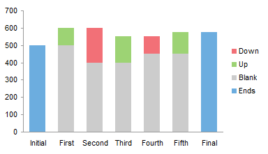
Finish up with a little formatting. Set the gap width of the columns to 75%: format the series and on the Series Options or Options tab, change the value for gap width. Hide the Blank series by giving it no border and no fill, use colors that invoke positive and negative for the audience (usually green and red, which makes it tough for those with color vision deficiencies), remove the legend.
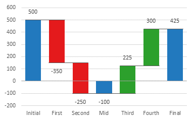
Data Crossing into Negative Territory: Breakdown with Stacked Columns
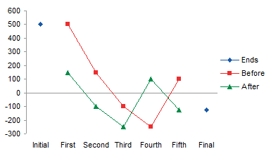
That seems just too simple to be true. And in fact, for data like the following, which has negative as well as positive values, the simple floating column chart approach fails.
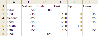
The green and red bars are the correct length, and as long as they are located completely above the horizontal axis, the chart is cool. But the formula computing the blank values is too simplistic, and Excel prohibits the floating bars from floating across the axis.
You can still use stacked columns, but you need to compute two sets of up bars and two sets of down bars, one set of each that lies above the axis, and one that lies below the axis. You also need to fix the formula for the blank series so it floats each column above or below the axis as necessary, or provides no float if the column spans the axis. Wow, so complicated.
But wait!
Approach Using Up-Down Bars
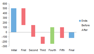
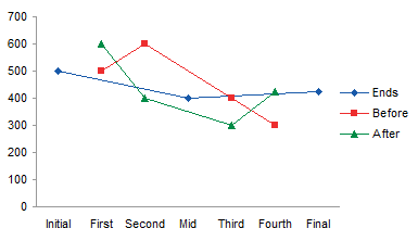
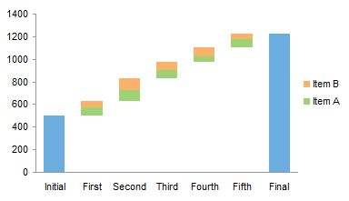
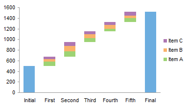
There is another approach which takes a bit longer to chart, but the formulas are easier, and the columns in this case are able to float anywhere, even across the axis. This approach is based on line charts and a line chart feature called up-down bars. Up-down bars connect the first line chart value at a category to the last, like the open-close bars in a stock chart. In fact, Excel uses up-down bars as open-close bars in its stock charts. The up bars and down bars can be formatted individually.
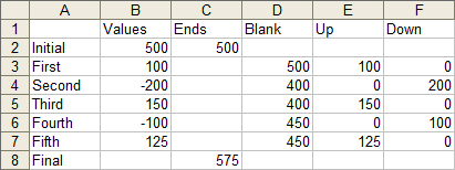
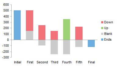
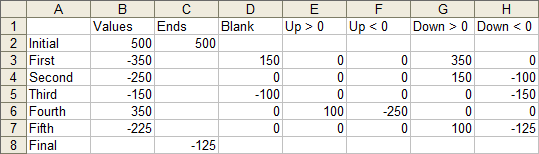
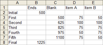
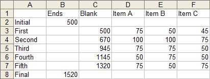
The range below contains the calculations needed to make an up-down bar waterfall chart. After the two columns of labels and values, as above, there are calculated columns for the chart endpoints, and the values before and after adding an item to the previous total. Here are the formulas; the formulas in D3:E3 are filled down to row 7:
Cell C2: =B2
Cell C8: =SUM(B2:B7)
Cell D3: =SUM(B$2:B2)
Cell E3: =SUM(B$2:B3)
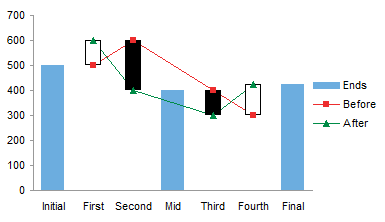
The chart-making process is a bit longer than for the floating column chart approach. Select A1:A8, hold Ctrl while selecting C1:E8, and create a line chart.
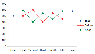
Select the Ends series and convert it to a column chart.
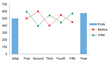
Select one of the line series, and add Up-Down Bars. In Excel 2007 and 2010, go to the Chart Tools > Layout tab, click the Up-Down Bars button, and select Up-Down Bars from the menu. In Excel 2003 and earlier, format the series, and check Up-Down Bars on the Options tab.
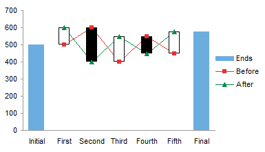
Hide the line chart series by formatting them to show no line and no markers, and format the up-down bar colors.
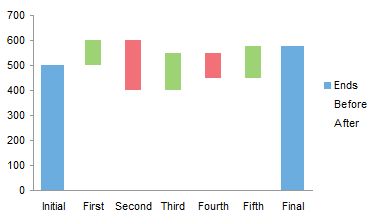
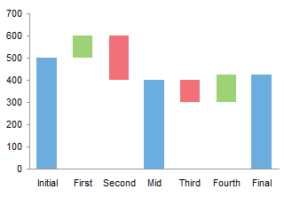
Remove the legend, and change the gap width of the column and the up-down bars to 0.75. This is easy for the column: simply format the series and on the Series Options or Options tab, change the gap width value. For the up-down bars in Excel 2003 and 2010, format one of the line chart series, and on the Options or Series Options tab, change the gap width value.
In Excel 2007 there is no way to change the up-down bar gap width from within the user interface, but you can do it with VBA. Press Alt+F11 to open the Visual Basic Editor. Press Ctrl+G (or go to View menu > Immediate Window) to open the Immediate Window. Type the following line of code into the Immediate Window (capitalization does not matter), then press Enter:
ActiveChart.ChartGroups(2).GapWidth = 75
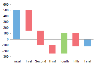
Indistinguishable from the floating stacked column approach.
Data Crossing into Negative Territory: No Problem with Up-Down Bars
This is the negative trending data set that messed up the floating columns. The up-down formulas work just fine.

Follow the same process. Create a line chart.
Change the Ends series to columns.
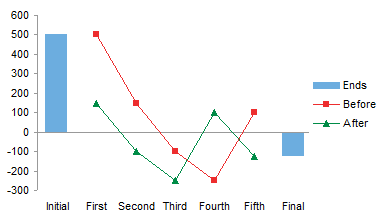
Add up-down bars to the lines.
Hide the lines and markers and format your colors.
Change the necessary gap widths, and delete the legend.
Perfect, no problem with spanning the axis with our floating columns.
Stacked Columns for Positive and Negative Data
Earlier I said that it’s possible to use stacked columns for mixed values, and for completeness I’m going to describe the protocol here. If you don’t care to read about it, feel free to skip ahead, or to visit some of the other tutorials on this web site.
Here’s the start of the calculations for the stacked-column-across-the-axis approach. Here are the formulas for blanks above and below zero in D3 and E3:
Cell D3: =MAX(0,MIN(SUM(B$2:B2),SUM(B$2:B3)))
Cell E3: =MIN(0,MAX(SUM(B$2:B2),SUM(B$2:B3)))
Since at most only one of these has a non-zero value, we can replace the two formulas by a single formula which adds them together:
Cell F3: =MAX(0,MIN(SUM(B$2:B2),SUM(B$2:B3)))+MIN(0,MAX(SUM(B$2:B2),SUM(B$2:B3)))
Let’s consolidate the Blank column, and compute the other values. Here are the formulas; those in D3:H3 are filled down to row 7:
Cell C2: =B2
Cell C8: =SUM(B2:B7)
Cell D3: =MAX(0,MIN(SUM(B$2:B2),SUM(B$2:B3)))+MIN(0,MAX(SUM(B$2:B2),SUM(B$2:B3)))
Cell E3: =MAX(0,MIN(SUM(B$2:B3),B3))
Cell F3: =-MAX(0,B3-E3)
Cell G3: =MAX(0,H3-B3)
Cell H3: =MIN(0,MAX(SUM(B$2:B3),B3))
Select A1:A8, hold Ctrl while selecting C1:H8 so both areas are highlighted, and create a stacked column chart.
Format the Blank series to hide it, format both Up series the same and both Down series the same.
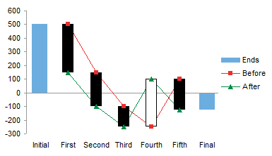
 The result is almost identical to the up-down bar version, except here the horizontal axis is not hidden by the bars that cross the axis.
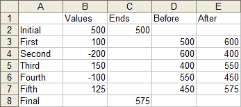
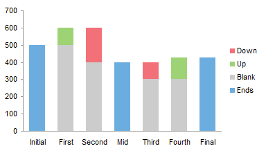
Waterfall Chart with Intermediate Cumulative Totals
It’s easy to accommodate intermediate totals in a waterfall chart. Adjust your formulas so the Ends series has a cumulative total and no red or green bars at the appropriate category. Construction of the charts is the same as without the intermediate totals.
Here is how the data and charts appear for a stacked column waterfall chart with intermediate totals:
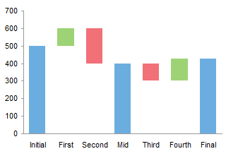
Here is how the data and charts appear for an up-down bar waterfall chart with intermediate totals:
Compound Floating Columns
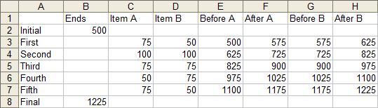
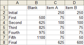
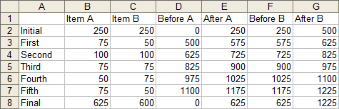
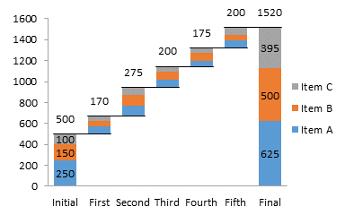
Sometimes a waterfall chart may have two or more items stacked within a floating column. In the data table below, we see that Items A and B both contribute to the accumulating value. This kind of illustration only makes sense if the Item A and B values are all positive or all negative. Otherwise the chart will be confusing.
This table contains calculated blank data for a stacked (floating) column waterfall:
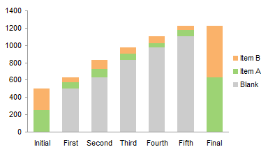
Select the data in column A, then hold Ctrl while selecting the data in columns C through E, and insert a stacked column chart as before.
Hide the blank series and the chart is complete.
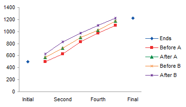
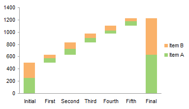
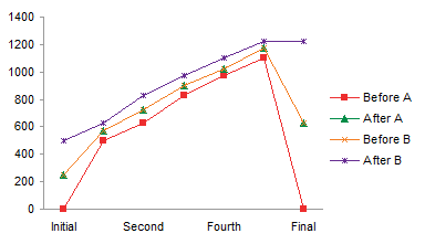
A compound waterfall chart with up to two elements can be made using the up-down bar approach. There can be only one set of up-down bars per axis, so one set is on the primary axis and the other on the secondary axis.
Here is how the data is arranged for up-down bar waterfall. Here are the formulas that generate the table, which are filled down as far as shown:
Cell E3: =SUM(B$2:D2)
Cell F3: =E3+C3
Cell G3: =F3
Cell H3: =G3+D3
Select A1:B8, then hold Ctrl while selecting E1:H8 so both regions are highlighted, and insert a line chart.
Move the Before B and After B series to the secondary axis.
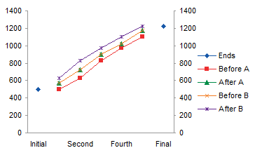
Select the secondary vertical axis (right of chart) and press Delete.
Convert the Ends series to a column.
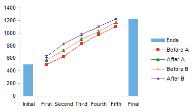
Select either Before A or After A and add Up-Down Bars.
Select either Before B or After B and add Up-Down Bars.
Format the up-down bars and adjust gap widths.
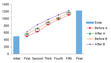
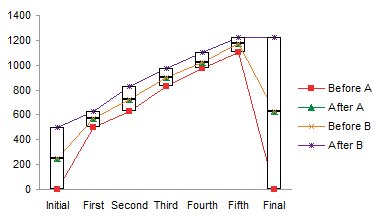
If the endpoints are also split by item, the data looks something like this.
Here the blanks have been calculated for floating columns:
Construction of the chart is the same as before, starting with a stacked column chart, except there is no Ends series.
Here is the finished chart with Blanks made transparent.
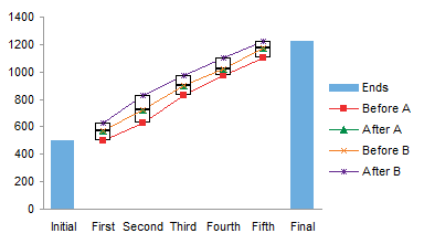
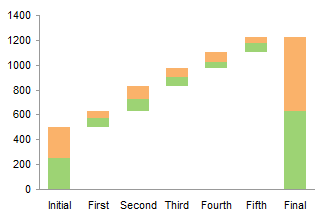
Here the Before and After A and B values have been calculated for up-down bars:
Construction of the chart is the same as before, starting with a line chart, except there is no Ends series which must be converted to columns. Before and After A stay on the primary axis, while Before and After B move to the secndary axis.
Add two sets of up-down bars.
Hide the legend, hide the lines and markers, and format the up down bars. The chart looks just like that using stacked columns.
Because there are only primary and secondary axes in an Excel chart, the up-down bar approach can only support a two-item per stack waterfall chart. The stacked column approach can support many more items: the limitation is imposed by the legibility of the resulting chart.
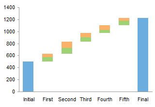
Here is data for a waterfall chart with three items per stack (you could add enough items to make your chart illegible).
The data has a calculated Blank column to float the three columns.
Select the data in column A, and hold Ctrl while selecting the data in columns C through F, and insert a stacked column chart.
Hide the Blank series, and hide the unwanted legend entries (click once to select the legend, and click a second time on the legend entry, and press Delete).
Waterfall Charts in Peltier Tech Charts for Excel
This tutorial shows how to create Waterfall Charts, including the specialized data layout needed, and the detailed combination of chart series and chart types required. This manual process takes time, is prone to error, and becomes tedious.
I have created Peltier Tech Charts for Excel to create Waterfall Charts (and many other custom charts) automatically from raw data. This utility, a standard Excel add-in, lays out data in the required layout, then constructs a chart with the right combination of chart types. This is a commercial product, tested on thousands of machines in a wide variety of configurations, Windows and Mac, which saves time and aggravation.
The program makes regular waterfall charts …
… waterfall charts with values that end up spanning the horizontal axis …
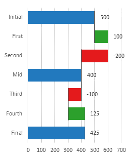
… rotated waterfall charts …
… stacked waterfall charts …
… and a couple obscure waterfall varieties as well.
Please visit the Peltier Tech Charts for Excel page for more information.


Joe Mako says
I always enjoy a good waterfall chart, thank you for these great examples.
I remade these in Tableau, and added a couple of other features, you can see them at:
http://public.tableausoftware.com/views/WaterfallExamples/Waterfall
(there are two tabs, and they are interactive, with values effected by the filters)
Bob says
Hi Jon,
Really like the up/down bar approach. Always learn something here.
Cheers,
Bob
Anonymous says
Correction: Am i missing something? It seems the issue with the up/down bar approach is that it does NOT show correct labelling for the change in value from one bar to another.
Jon Peltier says
Actually, the up-down bars cannot be labeled directly. You have to label one of the existing line chart series or add a new series, and the labels have to be custom, not a simple value.
What I do is add a line chart series. I use the labels I want to show as the X values, which Excel ignores, treating them as valueless categories. I use the vertical position as the Y values. I add the series, move it to the secondary axis, then delete the secondary X and Y axes. Then I label this series using the category labels option, and hide the markers and lines.
So you see, it’s still easier than stacked columns, especially when the bars cross the axis.
Maher says
Absolutely great tutorial.
GB says
Excellent
Cesar says
Jon,
Do you have a version that can “cluster” different data sets within each up and down bar, like having a stack bar within each up and down bar, allowing each element in the stack to be a different color?
My specific application is for a multi-location system. I want to show the growth each year at each location (up stack, unique color for each, say from a green palate), the new product declines from each location (a down stack, each location with a color from a blue palate) and the drop from legacy products (a down stack, each location with a color from a red palate).
The charting can get much more granular but the risk is having directors that may get lost in a busy chart.
Your thoughts?
From data-density man in Texas
Thanks.
Jon Peltier says
Cesar –
I’ve actually built something like this. It’s rather complicated. It uses the stacked column approach with several shades each for positive and negative changes. Instead of a pattern of one bar and one gap, there are two bars and one gap. If all items move in the same direction, the two adjacent bar stacks are identical, with the same values for the same shaded bars. It the items move in different directions, then the first bar shows the increases and the second shows the decreases.
Sicco Jan Bier says
Jon,
great chart, I will use the up-down bar.
For the labels, although you explain the method it was not so clear to me. For reference of other readers and possibly to include in the instruction: is the below how you’d do it for “Waterfall Chart with Intermediate Cumulative Totals”?
Column A-E holds the information as proposed in the second table of the paragraph
Column F holds my label information
Column G holds my Yvalue
Formula F2:F8=MAX(B2,C2)
Formula G2=F2/2
Formula G3:G8=MIN(D3:E3)+ABS(MAX(B3:C3))/2
This distributes the value of the initial,medium and end column and the change portion of the up down bar in the middle of all bars.
Is there an easier way that I am overlooking?
Kind regards, Sicco Jan
Jon Peltier says
Sicco Jan –
Yes, that’s a good way to do it, pretty much the same way that my commercial utility does it. Even though the added series is plotted on the secondary axis, you can delete the secondary Y axis (right of the chart) and all data will use the primary Y axis.
oscar says
Thanks!!! Very useful
leandro says
This Web is great.
Regards,
Leandro
(brazil)
Carlos says
This was super easy to follow and worked great. Thanks so much!
Mike C says
Thanks for your tips on building a Waterfall Chart with Intermediate Totals. One question. Only the Series “Up” Data Labels are shown with the proper value. The “Down” Data Labels all show “0”. How can I get the “Down” values to also show. Thanks, Mike
Mike C says
I figured it out. Thanks again!!
Karthik says
Hi Jon
Thanks for the great explanation. I was thinking that it was impossible in excel.
Thanks a lot
Michel says
THANKS a lot – great tutorial, and easy method to do it.
Thanks again.
Priyanka says
Thanks a lot for the tutorial. Am new to finance and this definitely will be of great help in a lot of business meeting.
Tina P. says
Great explanations and examples. I was looking for an easy updatable table that the charts could update automatically. Sweet.
Thank you
ITDC says
Hi Jon, great tutorial. Hopefully you can help me out.
I’ve used your up/down bar approach but would like to ‘rotate’ the chart by 90 deg so that it looks something more like this – http://www.dailydoseofexcel.com/blogpix/iswaterfall1.GIF.
Is it possible with the line chart using the up/down bar approach?
Thanks!
Jon Peltier says
Unfortunately, up-down bars only go up and down, not side-to-side. You need to modify the stacked column approach to stacked bars.
Randy says
Great tutorial, Jon. The only thing that I can’t figure out is how to add connector lines between the bars. I can easily determine the cell formulas, but as soon as I add each series, my up/down bars disappear completely and I can’t get them back. I assume that each series needs to be a line chart. Any advice or references?
Thanks again!
Jon Peltier says
The way I construct these lines is using XY points midway between the bars at the appropriate height, with horizontal error bars stretching from the point left and right to the adjacent bars.
You could use line chart series to draw these lines, but you need to put them on the secondary axis, so they do not interfere with the line series on the primary axis that produce the up-down bars.
Randy says
Thanks for the advice. I got them working. The chart looks great! Thanks again!
Randy says
Hi Jon,
Any idea how I can determine the width of the up/down bars? I know how to widen them using gap width, but I need to place a textbox above each bar, and the width of this textbox should match the width of the bar. I don’t think that there is a direct way to get the value (like downbars.width), but is there a way to calculate it or indirectly determine it?
Thanks!
Sirichy says
Thank you. This is very nice.
CM Wong says
Was looking how to go about it, then i was in YouTube, then with Excel F1, I am here.
Excellent tutorial ; I really give me a plenty of ways to go about this graph and its possible usage.
Thanks a lot! Really Appreciate it.
JP says
thank you for giving the knowledge to others by explaining it in a simple method ,
Aprreciated
Bea says
Hi, do you have instructions on how to show negative and positive values for multiple items in each column?
Jon Peltier says
Multiple items in each column? This type of chart ws designed to show only one item per column.
Bea says
In your last example you have three items stacked in one column. I need to do the same thing but some of my “items” have negative values.
Jon Peltier says
Bea –
I forgot that I’d included the example with multiple additive bars. It is difficult to stack positive and negative items in a stacked chart is a way that makes the values easy to comprehend. It’s probably better to split the multiple items into fewer single bars, which can accommodate positive and negative changes.
Maher says
THAAAAAAAAAANK you so much for the “Stacked Columns for Positive and Negative Data” tutorial. I thought it was hopeless to have the flying bars in our reporting system considering it has a very limited bar and line graph capabilities. My envisioned interactive reporting are now all possible with this tutorial. Thanks a lot.
By the way, i have managed to create macro codes which places the data labels right on top/below an up/down bar. If any one is interested you may just post here as per Jon.
Matt Osmundsen says
Hi John ~ I would like to add labels to my waterfall chart, which I created using up-down bars. You wrote above .. “What I do is add a line chart series. I use the labels I want to show as the X values, which Excel ignores, treating them as valueless categories. I use the vertical position as the Y values. I add the series, move it to the secondary axis, then delete the secondary X and Y axes. Then I label this series using the category labels option, and hide the markers and lines.”
But I am having a hard time following. How exactly do I add a line chart series after I have already created my chart?
Your help is much appreciated! ~ Matt
Jon Peltier says
Matt –
In another range of the worksheet, enter your labels in one column and Y values in the next. There have to be as many labels here as there are along the category axis of the chart. The Y values are chosen as follows: to put labels above the floating bars, use the maximum of the up and down values; to center labels in the bars, use the average of the up and down values. Copy the data, select the chart, and use Paste Special to add the data as a new series. Select the added series and change its chart type to line, and format it so it is on the secondary axis. Delete the secondary axes that Excel has drawn on the chart; the added series will remain in the secondary axis group, but will use the primary axes since there are no secondary axes. Add data labels to the added series, using the category labels option, and either the above or centered position. Finally format the added series so it has no line and no markers.
Matt Osmundsen says
Perfect. Worked like a charm. Thanks, Jon!
MAHER says
Dear Jon,
After your tutorial with Matt, i realized and since I am using “Stacked Columns for Positive and Negative Data”, there’s another way of putting labels right on top of the bar for positive and below the bar for negative, which I believe looks better than putting labels on the center. The label values is equivalent to SUM($firstvalue:currentvalue) + if(SUM($firstvalue:currentvalue) <0,-5,5). Then follow your instruction of creating it as secondary line graph. There's an important note though, there's a need to create exact replica of the line graph as primary this time, and should be hidden. This will ensure that both primary and secondary graphs will have the same minimum and maximum axis options and set to automatic. Thanks for this. Now, my macros are no longer needed.
Jon Peltier says
Maher:
“there’s a need to create exact replica of the line graph as primary this time”
No, as stated in my previous comment:
Delete the secondary axes that Excel has drawn on the chart; the added series will remain in the secondary axis group, but will use the primary axes since there are no secondary axes.
Farrukh Shehzad says
Lovely!!!!!!!!!
Please also share how did you add the black lines where a bar ends and the new one begins?/
Jon Peltier says
Farrukh –
Trade Secret.
Actually, I have a set of hidden XY points (no markers or lines) located between the bars, at the midpoint of the lines. The lines are horizontal error bars of the appropriate length.
Anonymous says
Hi,
This is the easiest way to make an efficient waterfall chart – ie crossing the zero line – that I have seen in years. Thank you for having put in on the web. I’ll come back and publicise your website !
Philippe
Mahesh says
Thanks Jon, amazing tutorial. I have one question – my data has some 1 or 2 zero values. The zero gets plotted in the up/down bars as well (as a flat bar). But ideally I’d not like to have a bar for the zero value at all, because the presence of a bar – however thin it might be – for a zero value is still misleading. Could you guide me please? Thanks!!
Jon Peltier says
I’m not sure I understand why plotting a zero-height bar for a zero value is misleading.
There’s no good automatic or semi-manual way to skip an entire category, because of the formulas used to generate plotting data. I’d have an intermediate data range linking back to the original data, but with the rows with zero values deleted. Then I’d make the formula-filled range and chart based on this data.
Stephanie @CopyKat.com says
I really liked this approach it is much easier than setting it up the way I was doing. It is very clear, and very easy to do. I think this tip here saved me hours of work.
Thank you!!!
Michael says
Thanks Jon. Great tutorial that really helps.
I was wondering if it was possible to use this approach in a Table. I have a Table with a couple of hundred rows where I need to deliver Waterfalls pr department, country, and manager. I’d llike to do it by using the filtering feature. But when applying the filter I see that the formula for the Base continues to utilize all rows in its calculation.
Formula in question: =MIN(SUM(F$2:F24);SUM(F$2:F25))
I’m using the ‘Floating Column Chart Data and Calculations’ approach as I won’t have to deal with negative values.
Any thoughts?
Cheers Michael
Jon Peltier says
Michael –
You can use the SUBTOTAL function with function number 109, which means sum only visible cells. So in my example, the formulas
=SUM(B2:B7)
=MIN(SUM(B$2:B2),SUM(B$2:B3))
become
=SUBTOTAL(109,B2:B7)
=MIN(SUBTOTAL(109,B$2:B2),SUBTOTAL(109,B$2:B3))
Here’s a simple example, implementing the SUBTOTAL formulas.
Here the filter only shows positive changes.
Here the filter only shows negative changes.
Michael says
Thank you so much Jon. You just made be able to provide these charts with a speed and agility I could only dream of. Really appreciate your tutorial and help.
Cheers Michael
Stephanie @CopyKat.com says
You have saved yet another financial presentation for me. Thank you for your very clear guidance on how to make these waterfall charts.
Milan says
Hi,
I am not sure if this wasn’t addressed already. I went quickly through the above posts and did not see it. If it was discused, sorry in advance :)
My Problem:
Let’s say you have three suppliers their account changes you want to show through a waterfall chart. Is it possible to make such a waterfall chart in the first place? I would like to have it all in one graph. The changes (negative and positive) happen at the same moment.
If my question is not clear, I will be happy to specify it in more detail.
Thanks in advance,
Milan
Jon Peltier says
You want to show the change in three values, not one, in a chart? If I had to do this in one chart instead of three, I would probably lay the three waterfalls end-to-end in a given chart, with a blank row in the data to leave a gap in the chart.
Vickie Robertson says
I use your Waterfall Chart Add-In and it’s wonderful. But I am having a problem when I update data – the data labels don’t change. Is there anyway to get them to update without manually changing them. I may just be missing a step?
Thanks.
Alex says
For the first example, it seems like the formula is wrong. When you use “Min(sum($B2:B2), Sum(B$2,B3)) it comes up with different numbers than the numbers that you have in the picture. The chart also doesn’t look the same.
Jon Peltier says
Alex –
You wrote “Min(sum($B2:B2), Sum(B$2,B3))”
My formula is “Min(sum(B$2:B2), Sum(B$2,B3))”
Note the placement of the $ in the first range being summed.
Alex says
Thanks for responding. I actually wrote it correctly in the spreadsheet, but not correctly on the comment. I am coming up with the following values in row D: 500,300,400,400,450 and you have in the picture 500, 400, 400, 450, 450. It appears to be off in the two rows where there are negative values. Help!!!
Jon Peltier says
Are the numbers exactly the same? If I add up the numbers in my head using the formulas shown, I get the values shown.
D3: =MIN(500,600) = 500
D4: =MIN(600,400) = 400
D5: =MIN(400,550) = 400
D6: =MIN(550,450) = 450
D7: =MIN(450,575) = 450
Susie says
Amazing! It helps me a lot. Thanks so much!
Sean says
Don’t think this has been covered… what would be the best approach to add value labels to the up/down bars that cross zero? For example, if my value column says -148 and 48 of that was down > 0 and 100 was down < 0 – I don't want to see (48) and (100)… I want to see (148) on the series. I hope that makes sense!
Any thoughts? I thought it could be achieve via VBA to assign a label from a cell reference but would prefer to avoid macros to allow easy chart refresh.
Jon Peltier says
Sean –
My commercial software does this by adding an XY series with no lines and no markers, but with data labels linked to a range of cells.
Rajiv says
How can we add label/values to up/down bars ? Especially, if I am doing compound bars…
Jon Peltier says
Up-Down Bars have no provision for labeling. You could add labels to the line chart data points at the top and botton of the up-down bars, or you could add an invisible series (no line, no marker) with labeled data points where you need labels.
You could use the stacked column approach and label the bars.
tiffany says
Thank you so much. This totally saved me this am. So appreciate you posting all this helpful information.
Kusum Mulani says
Actual 2012 sales 5,364,927 3,526,829 5,364,927
Japan 5,364,927 59,289 3,526,829 5,364,927 5,424,216
China 5,424,216 1,727,455 3,526,829 5,424,216 7,151,671
India 7,151,671 (285,493) 3,526,829 7,151,671 6,866,178
ASEAN 6,866,178 52,612 3,526,829 6,866,178 6,918,789
North Asia 6,918,789 25,117 3,526,829 6,918,789 6,943,906
ANZ 6,943,906 (217,627) 3,526,829 6,943,906 6,726,279
Actual 2013 Sales 6,726,279 3,526,829 6,726,279
Can you tell me what value 3526829 is constant.. Why?
Jon Peltier says
Kusum –
I have no context for those numbers.
Tom says
Thanks a lot. Your instructions were very detailed and helpful.
Nagendra Prasad says
Hi ,
Want to plot a graph in excel with positive & negative number.
in fact if there is -14 graph shows the value as -14 but if the value is +14 then the graph shows only 15 , i need it it display the actual +15 in graph.
Somebody can help?
Jon Peltier says
Nagendra –
You need a custom number format with a plus sign for positive numbers. Here are a couple suggestions:
+General;-General;General;@
+0;-0;0;@
Madhav Baiga says
Thanks for the Great learning ,,,, really very Helpful…
Richard says
Hi i want to create an interactieve waterfall chart, just like a pivot chart with slicers in order to select dates easily. Also to have a running total. In my job (production Engineer) i want to show the difference between the minimum amount of raw material and the actual amount. The difference between the two goes into buffer volumes. So the start point is the minimum amount (stoichiometric) end point is the actual amount and in between a bridge of buffer volumes and throughout the month i want to show the running total of all bars. Does anyone know how i should set this up. I’ve been trying for days now without any real progress.
Felipe Maier says
Hi Jon,
Is it possible to apply conditional formating for those Bridge Charts? I always face the same problem of changing the colours when they have a positive, negative or Intermediate Cumulative Totals, because I’m used to apply different formats for each of them.
For the Cumulative Totals: Collumn in Blue, Data Label in Center, bold and font in white.
For positive impacts (columns in green): Collumn in Green, Data Label in Outside End or Inside End, bold and font in black.
For negative impacts (columns in red): Collumn in Red, Data Label in Outside End or Inside End, bold and font in black.
Is it possible to automate that, so I don’t need to change it every time I have to include a new number to build the bridge?
Tks,
Felipe
NatPatBen says
THANK YOU! I looked at several google results on making a waterfall chart and after trying a few others that didn’t give me what I wanted, your first example here worked perfectly AND was simple. Really appreciate it.
Mani Singhal says
Hi Thankyou for demystifying Waterfall charts. You are a legend. Thanks again. Mani
Bhupendra says
Hello Mr. Jon..
Thanks for explaining the waterfall chart by easy calculations. In your examples of Item A & Item B…it has only +ve data. However i have tried to make the same break up bar chart with below data but chart seems not ok becoz of -ve value plotting on chart. ref below data…like in case of volume Unit 1 has -0.24 & unit 2 has +0.14. we i plot it, the +ve & blank is plotted above the X axis & -ve below. I want all such data should be plotted above the axis with in downward mode. I used same formula as you explained for blank cell. Can you pls help me on this.
Zone Blank Unit 1 Unit 2
Budget 4.07 2.87 1.20
Volumes (0.10) 3.62 -0.24 0.14
Realization (0.72) 2.01 -1.16 0.44
Raw Materials 2.54 2.01 1.15 1.38
Spending 0.72 5.63 -0.13 0.84
FX gain (loss) 0.09 6.56 0.01 0.08
Actual 6.59 2.95 3.77
Jon Peltier says
Bhupendra –
I don’t understand your numbers. What are the starting values in columns A and B, prior to calculations, as shown in the right-hand table near the top of this article?
Bhupendra says
Thanks for your reply. I have used “=” to separate below data in order to explain my data.
Column A=Column B=Column C= Column D=Column E.
Particulars=Zone=Blank=Unit 1=Unit 2…these are column heading. There are two units in a Zone =Unit 1 & 2 and each has different reason for variation in actual profit vs budget. In blank column (i,e Column C) the formula used is Min (Sum B$2:B2), sum(B$2:B3) like….
Profit- Budget=4.1=0=2.9=1.2….these are numbers in respective column.
Volumes=-0.1=3.6=-0.2=0.1
Realization=-0.7=2=-1.2=0.4
Raw Materials=2.5=2=1.2=1.4
Power Sales=-0.1=4.6=0.4=-0.6
Spending =0.7=5.6=-0.1=0.8
FX gain (loss)=0.1=6.6=0=0.1
Profit – Actual=6.5=0=3=3.8
Jon Peltier says
Again, your data is more complicated than this example allows for. If you just had the first two columns (the labels and “Zone”), you could use the approach here to make a simple chart. But it seems that you are trying to make a stacked chart, stacking Unit 1 and Unit 2. This will of course make Zone redundant. It also will raise issues if you try to stack positive and negative numbers, because there is no easy way to represent such an arrangement in a simple waterfall chart.
Jamie says
Hi John, I read the following comment about how to get the lines inbetween each collum but can’t work out how you do this – Are you able to explain the process in more detail?
Farrukh –
Trade Secret.
Actually, I have a set of hidden XY points (no markers or lines) located between the bars, at the midpoint of the lines. The lines are horizontal error bars of the appropriate length.
Jon says
Hi Jon. We’re working on an issue on my team and have exhausted our knowledge and were hoping that you could help. We are working with stacked column charts, and attempting to incorporate negative numbers (from an expenses viewpoint, our drivers can either increase or decrease overall spend). When using a single variable, we get great looking reports, but once we introduce multiple variables, showing negatives becomes difficult. Any insight that you can offer would be appreciated.
Jon Peltier says
Jon –
Read the section “Stacked Columns for Positive and Negative Data”. This describes how you can use formulas to determine whether and how to split bars between negative and positive parts.
Jon says
Jon, thanks for the prompt follow up pointing me to the positive / negative data section. I may have not fully explained my question (trying to write about it while working on it). What we are working with are two groups of expenses, Normal & Initiatives. Within those two groups are expense drivers (Salary, Projects, Rent). We’re looking to make a stacked waterfall (which we can make and understand) to display this data. Our issue is arising when Initiatives Salary is a negative driver, but Initiatives Projects is a positive driver. This is causing the negative piece to be shown below the axis, where we would like for it to still be a part of the stacked waterfall.
Jon Peltier says
Jon –
A bigger problem here is how you want to display the values when they move in different directions. You can’t show both positive and negative items in the same stack, so you have to decide whether to simplify the chart, or complicate it. I have two features in my Chart Utility that do this in different ways.
In the simpler Stacked Waterfall feature, if the contributions for a given category are mixed, a single bar is drawn in a neutral color, showing the net result for that category, but not showing the individual pieces.
In the more complicated Split Bar Waterfall feature, if the contributions are mixed, the bar is split vertically and turned into a mini-waterfall itself. The left half of the split bar shows the positive contributions, and the right half shows the negative.
Jon says
Jon,
Thanks for the advice. I figured that what we were trying to show necessitated some advanced knowledge. Hopefully I can convince management to purchase the add-in.
Thanks again,
Jon
Ryan says
Hey Jon,
Thanks for doing this. I have a problem in that one of my bars will not change colors. I’ve gone into the formatting and changed the fill to the color it should be. Do you have any ideas?
Thanks,
Ryan
Jon Peltier says
Ryan –
What kind of bar is it? (Up-down bar or floating/stacked column?)
Gareth says
Hello Jon,
Love the up/down bars on the waterfall chart.
I’m trying to build the chart in PowerPoint but when I come to the part where you use VBA to resize the down bars, I get an error. I’m not great with VBA but is there a way to make this work from PowerPoint?
I’m trying to avoid having to embed or link any charts from Excel.
Thanks
Gareth
Jon Peltier says
Gareth –
Which version of PowerPoint? Excel 2007 could barely do charts and VBA, and manipulating charts in PowerPoint 2007 with VBA was nonexistent until the first or second service pack. Plus PowerPoint uses a confusing bunch of syntax to deal with objects like the active chart, and it looks nothing like “ActiveChart”.
In Excel 2010 you don’t need VBA to fix the gap width, select and format one of the line chart series, and if it has up-down bars, it will have a gap width setting for you to adjust; I presume PowerPoint 2010 has this as well.
Gareth says
Yes perfect… I didn’t realise it was so simple. Glad I don’t have to delve into the murky world of PowerPoint VBA!
Lucy Arevalo says
Thank you!! This saved my life today. I followed your instructions, they were so clear, I will recommend your site to others.
Lee says
On an Up-Down chart where the two amounts are the same (i.e., no difference between BEFORE and AFTER), is there a way to suppress the very thin colored line that displays in spite of the no difference?
Rahul Arya says
Hi Jon,
Thanks for the detailed step by step guide for making waterfall charts. The examples shared and the explanation provided are breath of fresh air in the clutter of information available on wed. Thanks again, it was of great help at my work (and much appreciated too).
Cheers!
Rahul
Quick Quality Post says
[…] A great way to view this type of financial information is a “waterfall chart”. Excel guru Jon Peltier shows how to make one in Excel here. […]
Stan says
this is an absolutely fantastic resource – thank you so much!
Jamie says
Hi, I’m building a graph. The first column is stacked, then adding another item, then adding another item, then the last column is stacked. Can you help me build this?
Jon Peltier says
Jamie –
Could you link to an illustration of the chart you want?
Harry Flanigan says
Hi Jon,
Lovely resource, thanks. Is it possible to use multiple datasets in one waterfall chart? Using your example, the Values would have multiple columns … Values 1, Values 2, Values 3, etc. Column A would remain the same. Thanks!
Sudeendra Mattu says
WOW, excellent tutorials Jon Peltier. Thanks a lot for your help.
Angeline says
Thanks so much for detailed tutorial. I tried the waterfall for one of work item. However, I have to in my chart there are certain series which are very large in comparison to others. I would like to break down the bars for better visualization of small data series. However, I couldn’t find a way to do it for waterfall charts in excel.
Is it possible to achieve this in waterfall? If so, can you please guide me.
Thanks a lot!
Jon Peltier says
Angeline –
I’m not sure what you mean by breaking down the bars. Isn’t it enough to show that some values are too small to see? If you adjust the scale to enlarge the small values, won’t the larger values go off scale?
Would it make sense to show another chart that lets you compare the small values without the larger subtotals and totals? See Chart a Wide Range of Values for ideas.
Tina Chauhan says
This is very helpful! I was hoping someone can help me solve a mystery. A ex-colleague created a waterfall (using a stack chart). I notice that she applied colors to the shape of the Format Data Label. So, when the number is negative, the shape box is red. And when the number is positive, the shape box is green.
Jon Peltier says
Tina –
Do the colors change automatically when the values switch signs? Do you have any screenshots?
Kurt says
Thanks. Very helpful! The tutorial allowed me to create my desired graph in less than 5 minutes. Jon is a star!
Amith says
I think the Waterfall chart is easy to create in Google Sheets as it’s one of the chart options in it.
Jon Peltier says
A rudimentary waterfall chart is possible and even easy in Google Sheets, as well as in Excel 2016. However, these are both limited in their flexibility. The version in my tutorial is a regular full-featured Excel chart, which allows clever users to customize it as desired.
Chris Winter says
Hi,
when using Waterfall Charts (Bridge Charts) how to order the results up from high to low and down low to high only without modifying the initial or final.
in orther words based on the graph i would like to have the follwing:
initial, first, fifth, third, second, fouth, final
Thanks
Jon Peltier says
Chris –
To sort data in the chart, you need to sort data in the worksheet.
CJ Hathway says
Hello, is there a solution for a varying number of “drivers” in the waterfall? For example, lets say you have 6 lines of business you need to create waterfalls for and 1 of them has 4 drivers A, B, C, D, 2 of them have 5 drivers, A, B, C, D, E, 1 of them has 6 drivers, A, B, C, D, E, F, and 2 have 7 drivers, A, B, C, D, E, F, G – i’m creating a waterfall that I want to be visible across all 6 lines of business (i.e. use same graph regardless of how many drivers each LOB has). I’ve tried this with NA() and it leaves E, F, G not plotted where they do not exist but there is still a space for them in the overall chart. Is there a way to format the graph so it hides/collapses drivers when fewer than 7 are needed (i.e. so that E, F, or G are not on the x axis if values are NA())?
Jon Peltier says
CJ –
As a matter of fact, you can deal with this without too much hassle. The SUM formulas include all values in a range, even if those values are filtered or hidden. However, SUBTOTAL ignores filtered cells and can be made to ignore hidden cells as well. So for instance, in the first example in this page, change the formula in cell C8 to =SUBTOTAL(109,B2:B7), where the 109 tells SUBTOTAL what to do: the 9 means SUM, and 109 means SUM but ignore hidden rows. Likewise change the formula in cell D3 to =MIN(SUBTOTAL(109,B$2:B2),SUBTOTAL(109,B$2:B3)). Now enter the data in columns A and B, and for any rows that have no data, simply select the rows and hide them, either by right clicking the row headers and choosing Hide, or using the ribbon’s Home tab > Cells group > Format dropdown > Hide & Unhide > Hide Rows. When those rows disappear, the chart stops displaying them, since by default a chart does not show values from hidden cells.
Joel says
Hi Jon,
I am currently trying to employ your trick of adding error bars. I can’t see how you put the points between the bars however. Without having the hidden points BETWEEN the bars, you can’t make them even.
Jon Peltier says
Joel –
The hidden points are XY Scatter type. The bars are plotted along a horizontal text axis, and Excel plots XY points along this axis as if the bars are at positions given by whole numbers: the first bar is at X=1, the second at X=2, etc.
To get the XY points between the bars, I assign them X values of 1.5 (between the first and second bars), 2.5, 3.5, etc. I could plot the XY points on the secondary axes, but I purposely do not, as this would make the chart more complicated and means it would be harder to align everything.
You can see an illustration of this, plotting XY points on a column chart, in a recent post, Revenue Chart Showing Year-Over-Year Variances
Doaa says
Thanks alot! very helpful indeed :)
Wilbur Omar Chua says
Hello! This is very helpful indeed.
Thank you so much!
ParasJi says
Hi Jon
Thanks for the great explanation. I was thinking that it was impossible in excel.
Thanks a lot