|
Peltier Tech Chart Utilities


Excel Dashboards
Books at Amazon.com

Buy me a coffee
If this topic or the whole site has been helpful, please support further development by treating me to a cup of coffee.
|
|
Chart Formatting Techniques and Tricks
|

Set up conditional formatting for your chart. Change color and marker style depending on the value of a point.
Top of Page |
|

Set up conditional formatting for your column chart. Color a column blue between 0 and 2, green between 2 and 4, yellow between 4 and 6, orange between 6 and 8, and red above 8.
Top of Page |
|

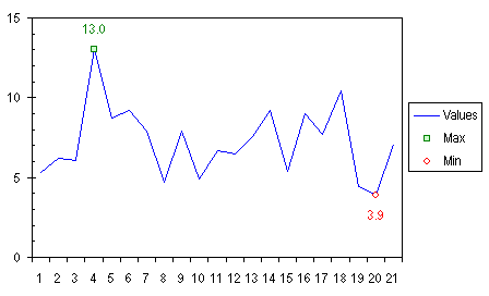
Ever want to apply special formatting to just a certain point? This example shows you how to highlight the minimum and maximum values of a series by using a different marker for each, and data labels. We'll accomplish this with two extra series in the chart, one for minimum and one for maximum.
Top of Page
|
|

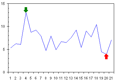
People often want to use an arrow or other symbol to indicate a point in a chart. If you draw an arrow, or any AutoShape, in a chart, it is not in any way tied to the data or to the chart axes, so it will not move to keep up with a point as the axes change or the chart resizes. Even if the chart does not change, an AutoShape is not guaranteed to be in exactly the same position the next time the file is opened. This technique shows how to attach an indicator (arrow) to a point by creating custom markers for the Min and Max series.
Top of Page
|
|

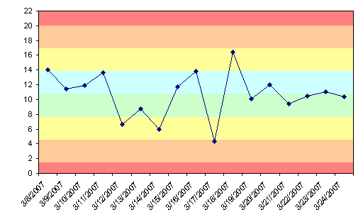
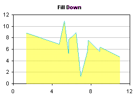
A chart could be made more informative by selectively shading regions of the background with different colors. For example, a run chart may show colored bands to indicate standard deviations of a process value from the mean. Excel only provides the ability to add one color to the background, but multiple colors can be added by creating a combination chart with added area chart series colored as desired. This tutorial shows how to construct such a chart.
Top of Page |
|

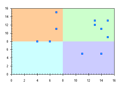
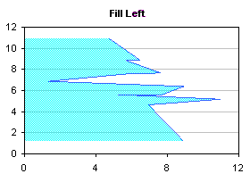
I was recently asked, "I have an XY scatter chart that gets divided into 4 quadrants and each quadrant needs a different color. Any ideas?" I love a good challenge, so I came up with the procedure in this page.
Top of Page
|
|

This page shows how to put a vertical band on a chart, highlighting a certain region. The technique can be used, for example, to highlight a certain time period in the background of a gantt chart.
Top of Page
|
|

Did you ever want to fill the area under an XY series? You tried an Area chart, but that didn't work; the X axis didn't scale properly, and you couldn't get the lines and markers you wanted. You can fill the area under an XY series by using a combination XY - Area chart, plus a little creative treatment of the X values of the Area series and of the scaling of the secondary X axis.
Top of Page |
|

Did you ever want to fill the area between two XY series? You tried Stacked Area charts, but that didn't work; the X axis didn't scale properly, and you couldn't get the lines and markers you wanted. You can fill the area between XY series by using a combination XY - Stacked Area chart, plus a little creative treatment of the X values of the Area series and of the scaling of the secondary X axis.
Top of Page |
|
One of the most commonly used chart types is the line chart. People often ask, "How can I fill the region between two lines with a particular color?" This article describes how to create a line chart with a shaded region between the lines.

Top of Page
|
|
Excel charts offer a wide variety of formats, but you can use Excel's drawing tools to enable even more formatting choices. It's possible to draw shapes on the chart to produce these formats, using the polygon drawing tool. This allows more line formats, by enabling more choices of line thickness and by making it easier to read dashed lines. More fill possibilities are made possible than merely filling below a series, as in an area chart: the fill can go below or to the side of the series, and in fact, an enclosed region in the chart can be filled. The fill can be made transparent too, allowing gridlines to show through the shape.
 
 
This article presents VBA procedures that automate the polygon drawing tool, and gives hints about the kinds of formatting which may be achieved. A sample procedure has been recently added to show how to use this technique for charts that have multiple series.
Top of Page
|
|
Excel charts offer a wide variety of formats, but you can use Excel's drawing tools to enable even more formatting choices. Line and Fill Effects in Excel Charts Using VBA shows how to draw shapes on an XY chart to produce these formats, using the polygon drawing tool. This allows more line formats, by enabling more choices of line thickness and by making it easier to read dashed lines. More fill possibilities are made possible, including transparent fills, allowing gridlines and series to show through the shape.

This article extends VBA polygon drawing procedures to radar charts.
Top of Page
|
|
In Microsoft Excel's bubble charts, bubble sizes are fixed according to the largest bubble in the chart. This is a problem when comparing multiple charts that have dissimilar bubble size data. This article shows an easy way to link the bubble size scales of charts with different bubble size data.
Top of Page
|
|

Suppose you want to chart the relative frequency of numbers in a list. Suppose further that instead of a bland column chart, you want to put an X in the histogram for every occurrence of a value. You can do this with a scatter chart, using a procedure offered by Excel MVP Debra Dalgleish in the Microsoft Charting news group.
Top of Page
|
|

In a column or bar chart in Excel, the columns or bars are generally all the same width. Sometimes, it helps to emphasize some data by changing the width of some of the columns. This example makes use of the Custom Series Formatting technique described elsewhere on this site.
Top of Page |
|

The pages listed here show how to make a more informative column chart, where the height of the columns indicates one value, and the width indicates another.
Top of Page |
|

Excel offers clustered column charts and stacked column charts among its standard options. How do you combine a stacked column chart with a clustered column chart?
Through careful arrangement of the data in your worksheet, you can make a stacked column chart that looks like a clustered-stacked column chart. In Clustered-Stacked Column Charts. I show how it is done with illustrated step-by-step instructions. This technique can also be applied to Clustered-Stacked Horizontal Bar Charts.
PTS Cluster Stack Chart Utility
In this page I have described a technique for constructing clustered and stacked column charts in Excel. The protocol required to create clustered-stacked charts is rather tedious, and the data layout is complicated, so I have developed the PTS Cluster Stack Chart Utility that allows the user to construct clustered-stacked column charts directly from the data. The utility inserts a new worksheet, adds a table with the appropriate data arrangement, and then creates and formats a clustered-stacked column chart from this table.
The utility allows the user to set up a simpler data range, and through a dialog select the clustering and stacking configuration.


The utility is designed to work in Excel for Windows versions 2000, 2002, and 2003, and 2007. The utility has not been tested in any Macintosh version or in Excel 97; it is not expected to work in these versions.
Read about the PTS Cluster Stack Chart Utility.
Top of Page |
|

Excel doesn't offer a built-in custom Columns On Two Axes chart type. Trying to construct your own from a regular column chart is unsatisfactory. In a column chart, the columns on a given axis are centered over each category. Hence the single column on the secondary axis has obscured the center column on the primary axis. You can get around this problem if you use dummy series in your chart.
Top of Page
|
|

If you create a clustered column chart that has some blank values, the blanks will result in gaps between columns in the chart. Excel doesn't allow you to squeeze the existing columns together, but you can rearrange your data and use dummy series to fix the category axis.
Top of Page
|
|

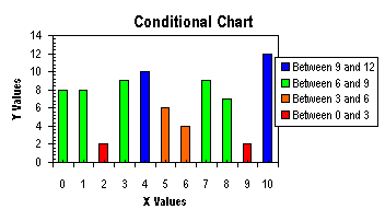
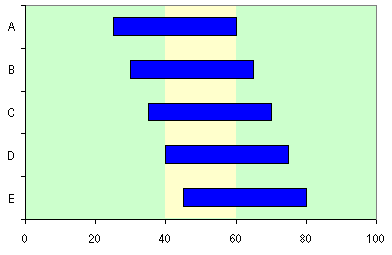
Some kinds of data look very nice and are easily understood in the form of a "floating" column or bar, in which the column floats in the chart, spanning a region from a minimum value to a maximum value.
Top of Page
|
|

A tornado chart is a bar chart commonly used to compare characteristics of two populations. A common use is to show the distribution of males and females among different age groups in the general population. Males would be shown in bars stretching to the left of the central line; females reaching to the right. This page shows how to make simple and more elaborate tornado charts.
Top of Page
|
|

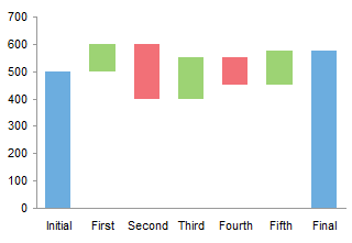
Waterfall charts are a special type of Floating Column Charts. A typical waterfall chart shows how an initial value is increased and decreased by a series of intermediate values, leading to a final value. An invisible column keeps the increases and decreases linked to the heights of the previous columns.
This page shows how to arrange your data and create a waterfall chart in Excel.
PTS Waterfall Chart Utility
In this page I have described a technique for constructing waterfall charts in Excel. I have also developed the PTS Waterfall Chart Utility that allows the user to construct waterfall charts charts directly from the data; the utility adds the necessary data to the table and then creates and formats the chart from this table. The utility is designed to work in Excel for Windows versions 2000, 2002, and 2003, and 2007. The utility has not been tested in any Macintosh version or in Excel 97; it is not expected to work in these versions. The PTS Waterfall Chart Utility dialog is shown below:

Read about the PTS Waterfall Chart Utility.
Top of Page
|
|

This page describes construction of a fancy Waterfall Chart. This chart shows how three classes of revenue increased from 2002 to 2003 because of Volume, Price, and other factors.
Top of Page
|
|

Waterfall charts are a graphical approach to show how an initial value is increased and decreased by intermediate values, to reach its final value. When the intermediate value drops below the X axis, the stacked column chart approach no longer accurately displays these values. This page shows how to combine the Waterfall Charts technique with the Stacked Column Charts that Cross the X Axis approach to correct the chart's appearance. The page has been updated to show how to add labels above the bars in the chart.
PTS Waterfall Chart Utility
In this page I have described a technique for constructing waterfall charts in Excel. I have also developed the PTS Waterfall Chart Utility that allows the user to construct waterfall charts charts directly from the data; the utility adds the necessary data to the table and then creates and formats the chart from this table. The utility is designed to work in Excel for Windows versions 2000, 2002, and 2003, and 2007. The utility has not been tested in any Macintosh version or in Excel 97; it is not expected to work in these versions. The PTS Waterfall Chart Utility dialog is shown below:

Read about the PTS Waterfall Chart Utility.
Top of Page
|
|

I was perusing the Sunday paper recently, and came across a chart which summarized the past month's temperatures. It's an informative chart, which compares each day's minimum and maximum temperature with the normal range and the historical minimum and maximum temperatures for each date. I've seen similar charts many times, including this same design in the local paper, but this time the chart called out to me, and I had to build it myself. This page has links to three versions of this chart.
Top of Page
|
|
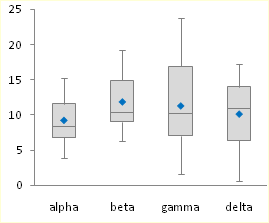
Box and Whisker charts (Box Plots) are commonly used in the display of statistical analyses. Unfortunately, Microsoft Excel does not have a built in Box and Whisker chart type. You can create your own custom Box and Whisker charts, using stacked bar or column charts and error bars, in combination with line or XY scatter chart series to show additional data. The procedures in these tutorials have been updated to show how to add additional series (means of other populations, perhaps, or sets of target values). This page also links to a utility which can be used to generate Box and Whisker charts directly from population data. The Box Plot utility has recently been upgraded to provide more professional output, to correct treatment of outliers in horizontally oriented charts, to run tenfold faster, and to fix a few small bugs. The utility was previously updated to provide additional chart styles, and to correct problems experienced by some non-US users.

PTS Box and Whisker Chart Utility
In this article I describe techniques for constructing box and whisker charts in Excel. I have also developed the PTS Box and Whisker Chart Utility that allows a user to construct box and whisker charts directly from the raw population data. The utility builds the intermediate summary table and then creates and formats the box plot from this table. This utility is designed to work in Excel for Windows versions 2000 through 2007. The utility has not been tested in any Macintosh version or in Excel 97; it is not expected to work in these versions. The Box and Whisker Chart dialog is shown below:

Read about the PTS Box and Whisker Chart Utility. Top of Page
|
|

Hate the way Excel mucks up your chart font sizes when you resize the chart? So do I, and here's how I counteract the default font scaling.
Top of Page |
|

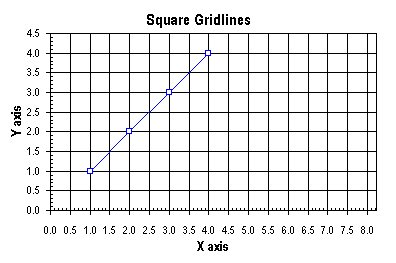
A common question people ask is "How do I format my chart so its gridlines make a square pattern?" Excel has no setting that forces equally spaced horizontal and vertical gridlines or horizontal and vertical axis ticks, but you can achieve this effect using VBA. Below is a chart after making the appropriate scale adjustment.
Top of Page
|
|
|