|
|
|
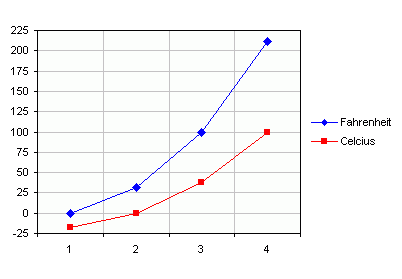
Plot an Equation in an Excel ChartA common question new users ask is "How can I plot an equation?" I think people expect that charts have a magical ability to accept an equation and spit out a graph of X vs. Y. Excel charts aren't that smart, though: they can only plot data values that you assign. To provide this data you need to enter X values into one column (or row), and calculate the corresponding Y values in the next column (or row). Then select this data and create an XY chart to show the relationship. Plot an Equation Using Worksheet DataSuppose for example you wanted to plot the relationship between the Fahrenheit and Celsius temperature scales. Enter descriptive headers into cells A1 and B1. Enter X values of interest into A2 through A5. Enter the following formula into cell B2, then copy the cell (Ctrl+C), select B3:B5, and paste (Ctrl+V). =(A2-32)*5/9 For this simple linear relationship, all that you really need are the lowest and highest X values of interest. And it's not necessary to use markers for the individual data points, unless you want to use the data markers to point out particular temperatures. Select the range A1:B5, or select a single cell in this range (Excel will figure out which data to use), and start the chart wizard. In Step 1 of the wizard select an XY (Scatter) Chart, and choose a subtype that connects points with line segments.
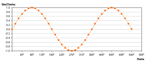
The following example plots a trig function, a nonlinear relationship between an angle and the sine of that angle. Column A contains angles, starting in cell A9. Cell B9 contains the following formula, which converts the angle from degrees to radians, then calculates the sine of the angle: =SIN(A9*PI()/180) The angles must be spaced appropriately so the plotted formula covers the intended range without sharp cusps; a 15� increment was found suitable for this exercise. The angles and calculated sines are filled down as far as needed. Only the first dozen or so rows are shown here, but the actual table extends to row 45, with angles up to 540�. As in the example above, the data is selected, and an XY chart is used to display the relationship between the two variables.
Plot an Equation Using Defined NamesSome people are disturbed by having to waste worksheet columns to calculate data when they really only want to plot a formula. It is possible to use defined names to hold these values and calculations, so no cells are harmed in the process of plotting a formula. In fact, this technique is pretty slick, but it can be tricky, and it's difficult to debug if the chart doesn't show what you want. This technique is described or used in the following places: Stephen Bullen, Charting a Formula - downloadable workbook that demonstrates the technique. Tushar Mehta, PLOT Manager - downloadable add-in that manages the technique for the user. Jan Karel Pieterse, Charting a mathematical equation using Excel and defined names - a web page tutorial with a link to a downloadable example workbook. |

Peltier Technical Services, Inc.Excel Chart Add-Ins | Training | Charts and Tutorials | PTS BlogPeltier Technical Services, Inc., Copyright © 2017. All rights reserved. |