|

|
|
Consolidate Text Data for Excel Charting
The Problem
| |
A |
| 1 |
More Likely |
| 2 |
Unchanged |
| 3 |
Less Likely |
| 4 |
More Likely |
| 5 |
Less Likely |
| 6 |
More Likely |
| 7 |
Unchanged |
| 8 |
Unchanged |
| 9 |
More Likely |
| 10 |
Unchanged |
| 11 |
Less Likely |
| 12 |
Unchanged |
| 13 |
Unchanged |
| 14 |
More Likely |
| 15 |
Less Likely |
|
|
You have a column of text values, such as the list at left. This is often the format of survey data.
You would like to plot these values, but an Excel chart cannot create a sensible chart from such a range.
You need to consolidate the text values and calculate the occurrences of each value, using a set of COUNTIF formulas, or a pivot table.
|
Formula Approach
| |
A |
B |
C |
D |
| 1 |
More Likely |
|
|
Responses |
| 2 |
Unchanged |
|
More Likely |
5 |
| 3 |
Less Likely |
|
Unchanged |
6 |
| 4 |
More Likely |
|
Less Likely |
4 |
| 5 |
Less Likely |
|
|
|
| 6 |
More Likely |
|
|
|
| 7 |
Unchanged |
|
|
|
| 8 |
Unchanged |
|
|
|
| 9 |
More Likely |
|
|
|
| 10 |
Unchanged |
|
|
|
| 11 |
Less Likely |
|
|
|
| 12 |
Unchanged |
|
|
|
| 13 |
Unchanged |
|
|
|
| 14 |
More Likely |
|
|
|
| 15 |
Less Likely |
|
|
|
|
|
To use formulas to consolidate the list of responses, first place the unique responses into a range, as shown in C2:C4 in the table at left. In cell D1, enter a descriptive label. In cell D2, enter this formula:
=COUNTIF($A$1:$A$15,C2)
Copy cell D2, select D3:D4, and paste to complete the consolidated table.
To create a bar, column, or pie chart, select this range or any single cell in the range, and run the chart wizard. Of the three types, a bar chart may be the best option, because the category labels can be fairly long without wrapping and without the need to incline them from horizontal. This is not a problem in the column chart below, because there are only three labels, and none contain much text. In general, however, the bar chart can contain more labels, and longer labels, without legibility issues.
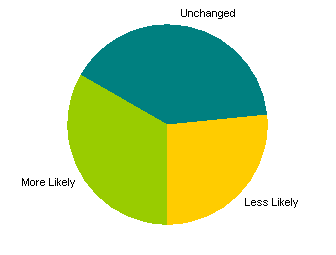
Pie charts are very widely used, and people are comfortable with them because of their wide use. For a number of reasons, however, pie charts are not as effective as bar or column charts. Their sole benefit is that they show each category's proportion of the total of all categories. Their disadvantages are numerous. While proportions are shown graphically in a pie chart, except for proportions of 25% or 50%, it is not easy to visually determine what these proportions are, unless data labels are used to show the percentages. It is harder to compare the areas (or angles) of wedges than the lengths of bars: in the pie below, for example, Unchanged and More Likely look about the same. If there are more than about five or six categories (wedges), pie charts become cluttered.
|


Pivot Table Approach
Insert a header, "Responses", at the top of the column of data. Select the range and create a pivot table (Data menu). In the sheet shown below left, the pivot table is located in cell C1 of the worksheet containing the data. Drop the Responses field label into the Rows area of the pivot table, and drop another copy of it into the Data area. The resulting pivot table is shown below right.


The pivot table will produce a pivot chart if you use it directly as the source data. Pivot charts allow the user to rearrange pivot fields right within the chart. They are not as flexible as regular charts, though. The pivot fields take up lots of space in the chart, and it is impossible to move or resize the elements in a pivot chart. You can hide the pivot field buttons: from the Pivot Table toolbar, click Pivot Chart, then Remove Pivot Chart Field Buttons. This increases the size of the rest of the chart elements slightly, but you still cannot move or resize them.


If you don't want a pivot chart, select a blank cell which is not touching the pivot table or any other data, and create a chart. In step 2 of the Chart Wizard, Source Data, click on the Series tab, click Add to add a series and enter a name in the Name box, click in the Category (X) Axis Labels range box, and select the range with labels in the pivot table (C3:C5), then click in the Values range box, and select the range with counts in the pivot table (D3:D5).

|
|


