|
|
|
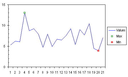
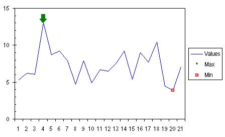
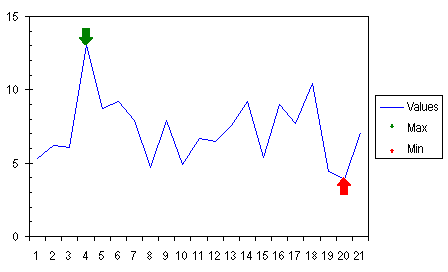
Use an Arrow to Indicate Special Points.People often want to use an arrow or other symbol to indicate a point in a chart. If you draw an arrow, or any AutoShape, in a chart, it is not in any way tied to the data or to the chart axes, so it will not move to keep up with a point as the axes change or the chart resizes. Even if the chart does not change, an AutoShape is not guaranteed to be in exactly the same position the next time the file is opened. This technique shows how to attach an indicator (arrow) to a point by creating custom markers for the Min and Max series. This example is based on the Special Format for Minimum and Maximum example. Start with the last chart in the Min/Max example, using small square markers, no lines, and no labels for the Min and Max series.
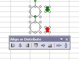
Make arrows of the size and format that you need, and circles of twice that size. The shapes will be aligned (and grouped) so that the point of the arrow will be in the center of the circle, and therefore centered on the point. In this example, the green and red arrows are one row tall, and the circle two rows in diameter.
The floating command bar is the Align or Distribute tear-away menu from the Drawing toolbar. The first step is to select the shapes.
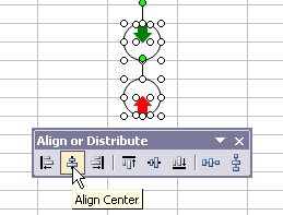
Align the shapes using the Align Center button on the menu.
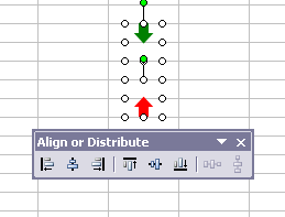
Select just the circles, and hide them by changing their formats to No Line and No Fill.
Select the green arrow and the corresponding circle, and group the shapes. Select the red arrow and its circle, and group them.
Copy the grouped shape with the green arrow, then select the Max series in the chart, and use Ctrl+V or Paste from the Edit menu, and the series will use the copied shape as the custom marker for the series.
Note: If you select a series before pasting the shape, the entire series takes on the shape as its markers. If you select just a point, only that point will use the shape. Copy the grouped shape with the red arrow, then select the Min series in the chart, and paste, to apply the copied shape to the series.
The purpose of the circle is further illustrated in the chart below. The circle used to make the custom markers now has a faint outline, so you can see how each entire marker is centered on its point, even though the arrows are offset.
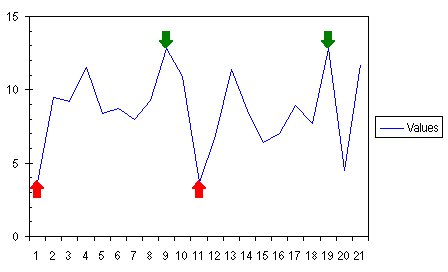
The arrows are ineffective as legend keys, because the arrow/circle shape is shrunk to fit in the space of the original marker. Remove each legend entry from the legend by clicking once to select the legend, then clicking again to select the individual legend entry, and pressing Delete (click to select the text label, not the marker, or you will delete the entire series). As with the data labels in the earlier example, if the data changes, the markers still highlight the maximum and minimum points.
|
Peltier Technical Services, Inc.Excel Chart Add-Ins | Training | Charts and Tutorials | PTS BlogPeltier Technical Services, Inc., Copyright © 2017. All rights reserved. |