|
|
|
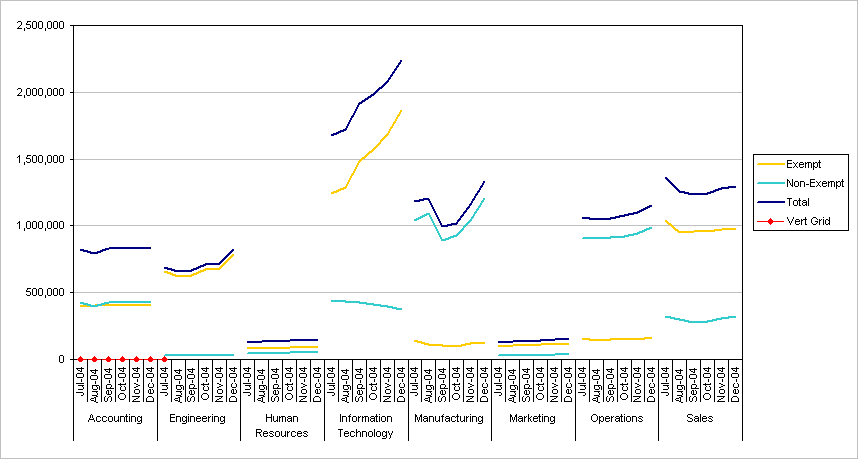
Excel Panel Chart Example - Chart with Vertical PanelsPanel Charts are charts that have multiple regions which compare similar data sets side by side (in separate panels) rather than right on top of each other. Essentially a single chart is repeated across a grid, with different data sets in each instance of the chart. Panel charts utilize Edward Tufte's principle of "Small Multiples", and have been named "Trellis Charts" by visualization expert William S. Cleveland. In 2005, DM Review held the DM Review 2005 Data Visualization Competition, a four-scenario challenge designed “to discover and recognize best practices for data visualization”. The first challenge was based on the data in scenario1.xls and was introduced by: This scenario involves the display of departmental salary expenses. It is used by the VP of Human Resources to compare the salary expense of the company’s eight departments as they fluctuate through time, in total and subdivided between the exempt and non-exempt employees. In July 2005 the winning entry of Scenario 1 of the contest was described in Data Visualization: Visualizing Multidimensional Data Through Time. The winning chart, submitted by Tableau Software and shown below, was a panel chart consisting of eight individual panels for the departments being tracked, with three simple line chart series in each panel.
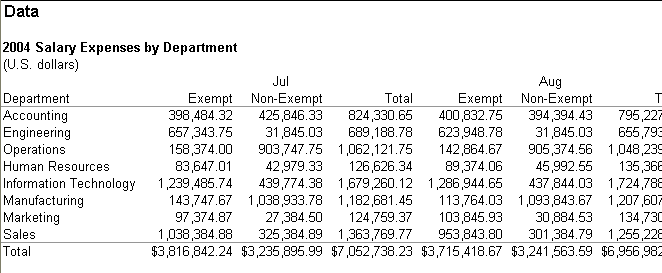
Three additional entries in the contest were described: a 3D column chart, a 2D grid of color coded pie charts, and a polychromic stacked area chart. I leave the reader to follow up with the discussion in the article cited above; suffice to say that these three entries are fine examples of why these chart types should NOT be used. This tutorial shows how to manipulate the data in Excel to produce a panel chart much like the winning contest entry above. The corresponding zipped workbook PanelChart1.xls can be downloaded here: PanelChart1.zip. The procedure for making this chart in Excel utilizes pivot tables and regular charts made from the data in the pivot tables, see Pivot Tables and Pivot Charts for a tutorial on pivot tables, and TechTrax article Pivot Tables, Pivot Charts, and Real Charts) for a discussion of charting pivot table data. The DataThe original data was laid out in a typical financial table, partially shown below.
In the original arrangement, the data was not very useful for further analysis. In preparation for use as the source data range for a succession of pivot tables, it was rearranged into the list format shown below and also available in the Data worksheet of PanelChart1.xls. Column E, Stagger, will be explained later in the tutorial.
The original data layout above can be reconstructed using a pivot table, as shown below (partially) and in the Original Layout worksheet of PanelChart1.xls. When constructing the pivot table, put the Dept field into the Rows area of the pivot table, the Month and Class fields into the Columns area, and the Salary field into the Data area. The pivot table headers need to be rearranged slightly to match the original data table. This is most easily done by copying the pivot table, selecting a blank worksheet region, pasting the copied data as values, changing the labels as required, and applying the desired formatting.
Standard Line ChartThe pivot table for this exercise was created by dragging the Month field into the Rows area of the pivot table, the Dept and Class fields into the Columns area, and the Salary field into the Data area, as shown below and on the Chart Page 1 worksheet in PanelChart1.xls.
A line chart was constructed using the data in this pivot table. The months in the first column were used as the chart's category labels, and each column to the right of that became a distinct line series in the chart. The monthly salary figures were used for the Y values of each series, and the two cells above these figures were used for the series name. The series were formatted such that each department's three series shared a line color, while the line style distinguished between Exempt, Non-Exempt, and Total.
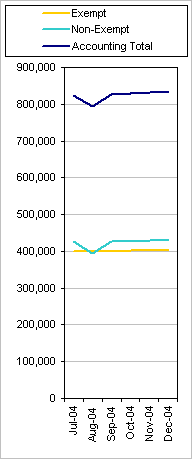
The line chart above is so cluttered as to be basically unreadable. The different line styles are confusing, not clarifying, and the colors do not effectively distinguish among different departments. If the data for a single department is plotted in its own line chart, however, it is much easier to read. If we hadn't already seen the winning contest entry at the top of the page, this simpler chart might have provided the inspiration to put several of them together.
The first step in combining several charts, if one were to actually make separate charts and arrange them together, is to make each individual chart thinner. This not only reduces the space needed for each chart, it also helps to show variations in the data. In the chart above, the monthly data points were spread too widely to distinguish much month-to-month variation, but the same monthly changes induce a more pronounced gradient in the thinner chart below.
If we create more of these thin charts, unify their vertical scales, and place them together, we can see that this will be an effective way to display the data.
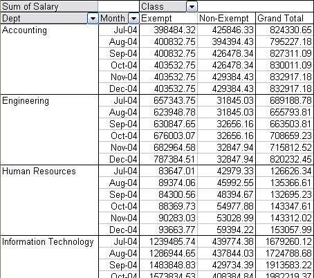
Panel Chart (almost)To get the data to spread along months and departments on a category axis, the pivot table is rearranged as shown below (also shown on the Chart Page 2 worksheet in PanelChart1.xls), with the Dept and Month fields in the Rows area, the Class field in the Columns area, and the Salary field in the Data area.
A pivot chart made from this pivot table is shown below. No pivot chart was shown from the previous pivot table because it would have been too cluttered to be useful. Here it is useful to show the general appearance of the data.
A few shortcomings of pivot charts are evident.
Nevertheless, for quickly reviewing the data, a pivot chart is useful, because it is easy to create from a pivot table, the chart updates with changing pivot table configuration, and in fact the configuration of the pivot table can be changed by dragging the pivot field buttons around on the chart. A regular chart is more tedious to set up, because series must be added individually, and when the pivot table is pivoted, the regular chart is not likely to remain linked to logical series ranges. However, when the data has been pivoted into a final orientation, a regular chart provides needed flexibility. With this flexibility as an objective, the following line chart was made from the pivot table. The first two columns, with Dept names and Months, were used for the category labels, the salary data was used for Y values (one column for each series, including the total column), and the Class field names were used for the series names.
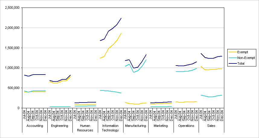
The line chart looks a lot like the pivot chart above, without the pivot field buttons. It also includes the Total series (Exempt plus Non-Exempt) which was not available in the pivot chart without creating calculated pivot fields. The data is displayed as desired, with one critical flaw: The lines from one department connect directly to the lines from the next department. It is possible to manually remove each undesired line segment (two single clicks: select the series, then select the particular segment, double click to bring up the Format Point dialog, then format the point to display no line), which is tedious and prone to error, and it is possible to write a macro to do this for you. But in the next section I will describe a simpler technique to eliminate these lines. Another shortcoming of this line chart is the lack of vertical gridlines between departments. A category axis such as this one allows vertical gridlines, but if you select them, they will appear between every category label; you will get a vertical line not only between departments, but also between each two dates within a department's section of the chart. In the next section I'll describe a technique for adding the vertical gridlines only between departments, for moving the department labels to the top of the chart, and for showing neater category labels at the bottom of the chart (such as the one-letter J-A-S-O-N-D month abbreviations in the winning chart entry). Column Chart VariationsThe chart below is a clustered column chart showing the same data as the line chart above. The most important observation about this chart is that the vertical colored bars accentuate their "vertical-ness", and obscure the time trends which were made clear in the line chart above. I also find myself distracted by the blending of colors: the yellow Exempt and cyan Non-Exempt bars merge into a greenish color. In all, there are too many vertical bars, too many categories, and the taller bars interfere with observations of the shorter ones. This is not a proper use for a clustered column chart.
The data is presented below in a stacked column chart. This is a popular chart type, and it is cleaner than the clustered column chart above. But the variable offset of upper items in a stack by lower items makes it difficult to compare any values higher than the lowest items in the stacks. For example, this chart does not clearly show the change in non-exempt salary for the Information Technology department (it steadily declines by 15% over the six-month period). Nor is it easy to compare the relative non-exempt salaries for the Information Technology and Sales departments (Sales is 13% to 35% lower, a substantial difference). These effects are clear in the line chart.
The main takeaway from this discussion of column charts is that column charts should be used with care, and should not be used when a line chart is more appropriate. Panel ChartBy default, empty cells are not plotted in an line chart in Excel. We will use this behavior and introduce a helper field in the source data of the pivot table. This field is named Stagger, and consists of the values 1 and 2; each department has the same Stagger value for all of its records, such that alternating Departments have unmatched Stagger values. Create the pivot table with the Dept and Month fields in the Rows area, the Class and Stagger fields in the Columns area, and the Salary field in the Data area. It should look like the screen shot below (also shown on the Chart Page 3 worksheet in PanelChart1.xls).
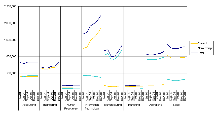
Note that the first department, Accounting, has its summary data under Stagger 1, The second department, Engineering, is summarized under Stagger 2, with departments alternating to the bottom of the table. If you don't get perfectly alternating blocks, simply adjust which departments have 1 or 2 for their Stagger values and refresh the pivot table. Again I've started with a pivot chart of this data; which I've converted from clustered column to a line chart. Note that there are two Exempt series (one each for Stagger 1 and Stagger 2), and two Non-Exempt series; I've formatted the pairs identically. This chart looks much like the previous pivot chart, without lines connecting adjacent departments, but also without the Total lines (Exempt plus Non-Exempt). It does assure us quickly that the data is properly aligned, and that we can proceed with our regular chart.
Note again how well the line chart illustrates the time series nature of the data, especially compared to the column charts dissected above. The next chart is the regular line chart made from the pivot table data. Note the absence of line segments connecting adjacent departments. Note also the paired legend entries for Exempt, Non-Exempt, and Total, which were produced by the Stagger 1 and Stagger 2 pivot fields. These are formatted identically; the viewer doesn't need to know how we achieved this effect.
Duplicate legend entries can easily be removed: for each duplicate legend entry single click on the legend, then single click again on the duplicate entry (on the text, not on the colored line), and press Delete. This chart is essentially done, and it could stand alone, except for some additional minor decoration.
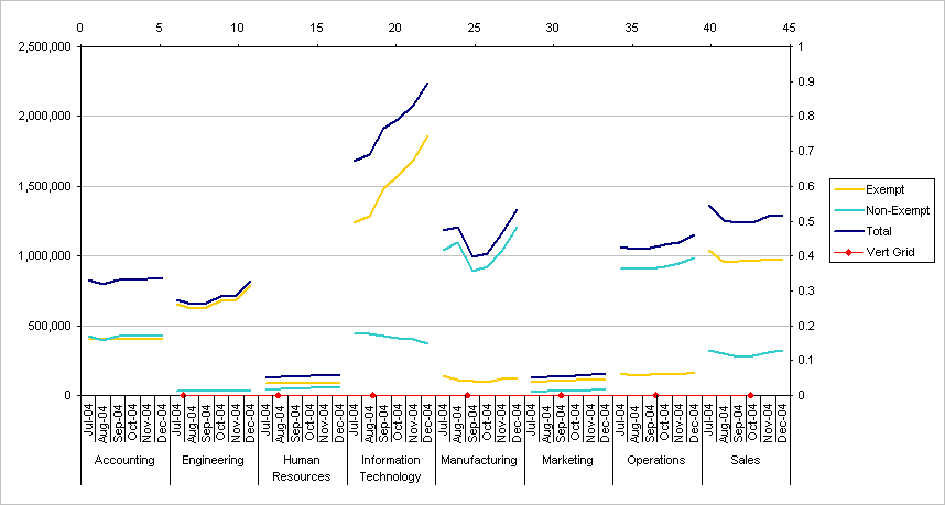
Add Vertical Gridlines (Use Dummy XY Series with Vertical Error Bars)The technique for adding the vertical gridlines between each department's section of the chart, creating separate panels, is an application of the technique shown on the Arbitrary Gridlines and Add Vertical Lines pages of this web site. The data required to construct these gridlines is shown below, and can be added to any convenient range of the workbook. The X values are determined as follows: each category in the chart has a numerical value, starting with 1 for the first category. The Y axis crosses the category axis at category number 0.5 (between categories, so half a category below the first). Each department contains six categories (six dates), so the vertical line between Accounting and Engineering is at category number 6.5 (between categories 6 and 7), and additional lines occur at intervals of six as needed. The Y value for each point is zero, corresponding to the minimum of the Y axis, and the error bar value is 1, which will be clear shortly.
Copy the green cells in this data range, select the chart, and use Paste Special from the Edit menu to add the data to the chart as a new series, with series in columns, series names in the first row, and category labels in the first column. The new Vert Grid series appears as shown below (though I've formatted the series using red lines and markers for visibility). Because all other series in the chart are line chart type, this series is added as a line series, with one data point per existing category in the chart (the carefully calculated intercategory values are ignored).
Convert the new Vert Grid series to an XY chart type series. Select it, choose Chart Type from the Chart menu, and choose an appropriate XY type. Note that Excel places the series onto secondary X and Y axes, which are added to the chart.
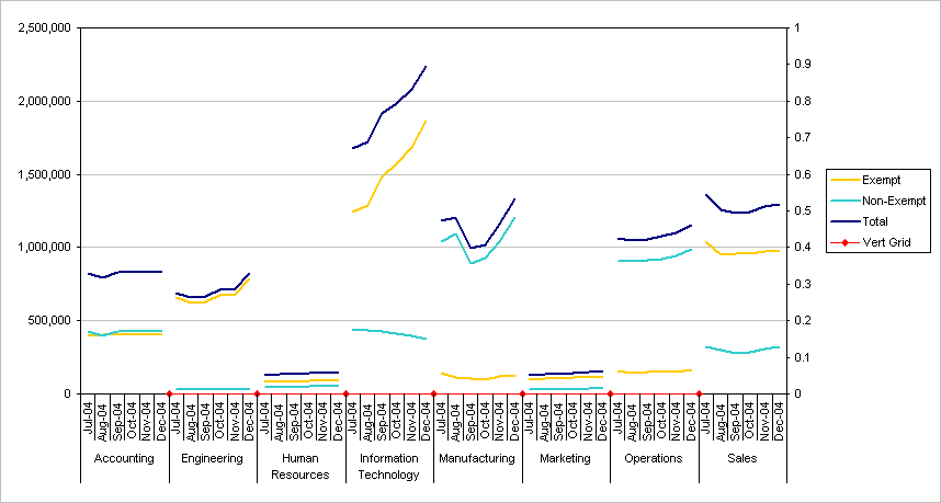
Link the Vert Grid series to the original category axis. On the Chart menu, choose Chart Options, and on the Axes tab, uncheck the box for Secondary X Axis. The secondary axis disappears, and the Vert Grid points now appear exactly at the X values we carefully calculated above. The Vert Grid series could have been completely moved to the primary axes by double clicking to open the Format Series dialog, and choosing Primary on the Axis tab. This would have also removed the secondary Y axis, which is used in this example for the error bars in the next step. If the error bars were tied to the primary Y axis in this way, we could no longer allow the primary axis scale to vary automatically with the data. The secondary Y axis is not needed for any other features, so the approach being taken below is easiest.
Add Y error bars to the Vert Grid series to serve as vertical gridlines that divide the chart into separate panels. Double click on the Vert Grid series, and on the Y Error Bars tab, click in the Custom + box, then select the blue cells in the Vert Grid data range we added above. This assigns the values in these cells to the error bars for the Vert Grid series. The same effect could be obtained by simply clicking on the Plus error bar icon and entering 1 in the Fixed Value box. However, for many charts I need different values for different points, so I invariably set up Custom error bar values.
Adjust the secondary axis scale to fit the error bars. Double click on the axis, and on the scale tab, uncheck the Auto checkbox before the Minimum (locking in zero), then enter a 1 in the Maximum data entry box (which unchecks the Auto checkbox in front of Maximum).
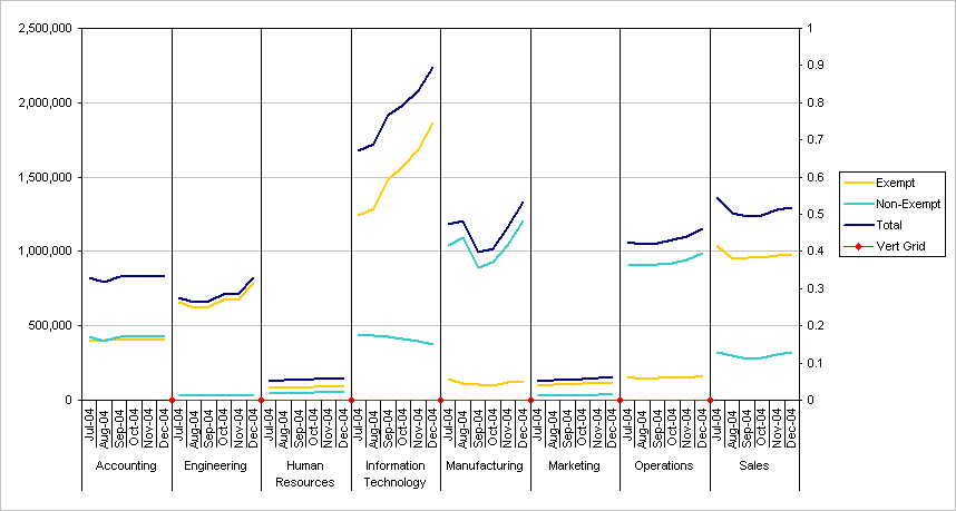
Almost done. Hide the secondary Y axis: double click on the axis, and on the Patterns tab, choose None wherever possible to hide the line, tickmarks, and labels. Hide the Vert Grid series: double click on the series, and on the Patterns tab, choose None wherever possible to hide lines and markers. Hide the Vert Grid legend entry: single click on the legend, then single click on the legend entry (the text, not the space where the marker would appear), and press the Delete key.
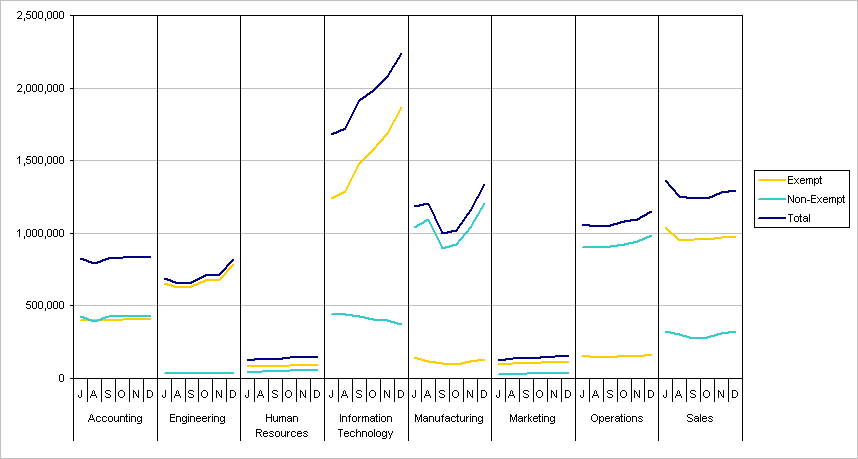
This chart is perfectly acceptable now, but we can clean up the category axis by replacing the month-year abbreviations with one-letter month abbreviations. Copy the category columns of the pivot table (the columns with Dept and Month), select a cell in an empty region of the worksheet, and use Paste Special from the Edit menu to paste the values into the new range. Replace the month-year labels with the single letters, so it looks like this:
This could also have been done by changing the Month-Year entries in the original data range, or inserted another column into the data range, much as we did for Stagger, filled this range with the one-letter abbreviations, and included this field in the pivot table. But if your data included January, June, and July, the pivot table would lump these values together. Select the chart, choose Source Data from the Chart menu, click on the Series tab, and replace the range in the Category (X Axis) Labels box with the two-column range created above, which contains the department names and month abbreviations.
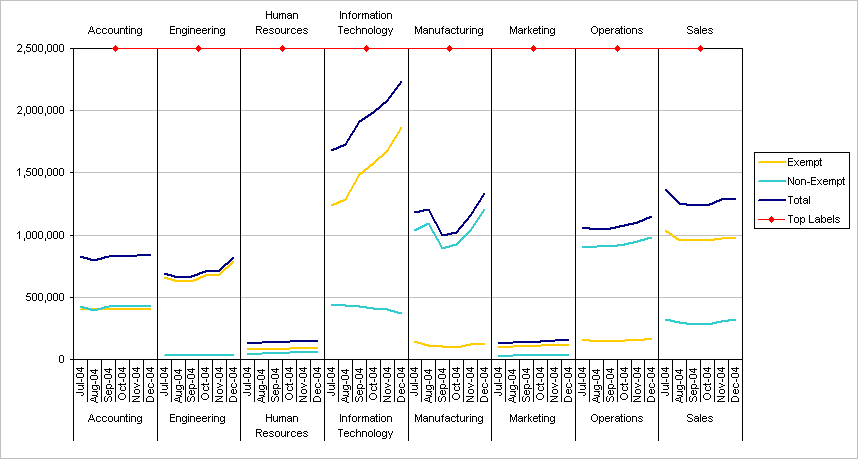
This is almost identical to the prize winning chart, except that the department names grace the top of the panels. We can add labels at the top, and remove department names from the category axis at the bottom. As with the Vert Grid series, we need to add a range with data for the Top Labels series. The X values correspond to the category numbers over which the labels are centered, the Y values are 1 corresponding to the maximum of the secondary Y axis scale (which is hidden but still present), and the labels are the department titles.
Copy the green shaded region, select the chart, and use Paste Special from the Edit menu to add the data to the chart as a new series, with series in columns, series names in the first row, and category labels in the first column. Excel remembers that the last series was added to the chart and converted to an XY series, so the Top Labels series is automatically added as an XY series, saving us some work. It is shown as red markers with red lines in the chart below (which has the original category axis).
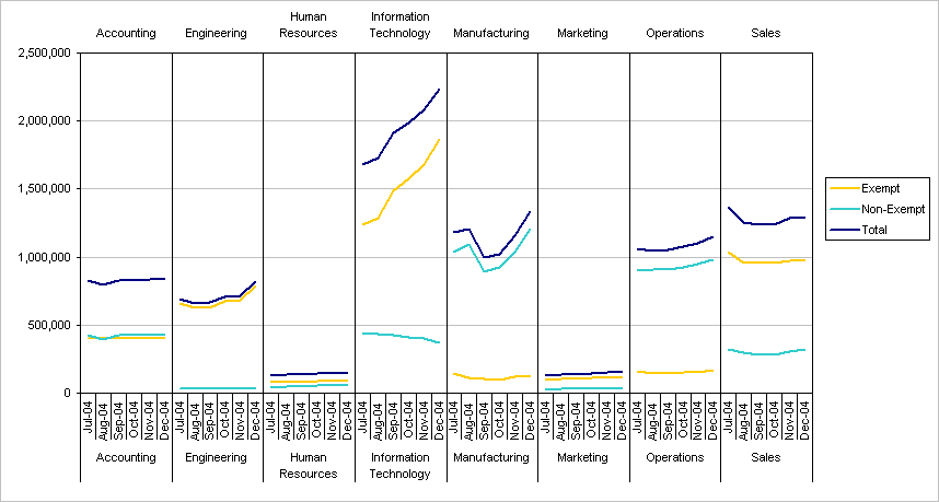
You can add data labels to the Top Labels series, then one by one edit the labels so they contain the department names. But this rapidly becomes a tedious task, and there are two excellent and free utilities that do this for you. These are Rob Bovey's Chart Labeler and John Walkenbach's Chart Tools. Both are Excel add-ins which are easy to download, install, and use. Not only do they add the labels you want, but they add links from the labels to the worksheet cells, so you can change a label by changing the linked cell. Rob's Chart Labeler also copies the cell formatting (font name, size, color, and bold or italic setting) to each label. The following chart shows the appearance of the chart with labels added to the Top Labels series, using the blue shaded cells in the recently added table. The top edge of the plot area has been dragged downward to provide room for the labels. Note that to prevent label overlap, the longer labels Human Resources and Information Technology have manual line breaks in the source data range. To insert a carriage return within a cell, place the cursor within the text, then hold Alt while pressing Return.
Hide the Top Labels series: double click on the series, and on the Patterns tab, choose None wherever possible to hide lines and markers. Hide the Top Labels legend entry: single click on the legend, then single click on the legend entry (the text, not the space where the marker would appear), and press the Delete key.
The department names along the category axis are now redundant. Use the procedure described above to apply the category labels from the new range with department names and one-letter month abbreviations to the category axis. Select only the second column, however, to use only the one-letter abbreviations as category labels.
The panel chart is now finished. It was rightly selected as the winner in Scenario 1 of the last year's DM Review 2005 Data Visualization Competition for its superior display of the monthly departmental salary budget data. |

Peltier Technical Services, Inc.Excel Chart Add-Ins | Training | Charts and Tutorials | PTS BlogPeltier Technical Services, Inc., Copyright © 2017. All rights reserved. |