|
|
|
Bubble Charts in Microsoft ExcelBubble charts are one way to show three dimensions of data in a flat 2D chart. In addition to the points being located on a grid according to X and Y values, the size of the marker is proportional to a third set of values. Making a bubble chart is easy: select a data range with three columns (or rows) of data, run the chart wizard, and choose one of the bubble chart types. Three columns of data, appropriate for a bubble chart
You can choose to relate either the bubble area or the bubble diameter to the third range of data (the bubble values).
You can also define your bubbles as a proportion of the "default" bubble size; this multiplier can be any number between 0 and 300%. This default size, which specifies the largest bubble in the chart, appears to be about 25% of the smaller of the height or width of the plot area. This multiplier changes the bubble sizes for only the one chart. If you are comparing data on more than one chart, the largest bubble on each chart will be the same size, even if the bubble values are different. I show a technique in Control Bubble Chart Bubble Sizes that puts bubbles in multiple charts on the same size scale.
Bubble charts can accommodate data labels and error bars. You can add multiple series to the chart, and plot them on primary or secondary axes. Unlike most Excel chart types, bubble charts cannot be used in combination charts. You are not limited to the circular markers provided by default in bubble charts. You can use the technique described in Custom Chart Series Markers to use any shape you want for the markers.
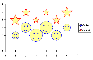
The markers scale themselves according to the values of the bubble size variable. You may have to adjust the relative size of the markers in your chart. For example, a star doesn't look as large as a smiley face with the same diameter, because of the open space between the arms of the star. Unfortunately the appearance of the legend leaves something to be desired. I generally don't use a legend in this type of chart, I use data labels instead. Bubble Charts and VBABubble charts can be automated using VBA, like any other charts. There is an issue you will encounter with your recorded macros, which we'll get to in a minute. Turn on the macro recorder (Tools menu > Macro submenu > Record New Macro menu item), select a range, and use the Chart Wizard to create a bubble chart. To review the code, return to The Tools menu, select Macro, then Macros. Select the macro from the list, and click on Edit. You can also get to the code if you press Alt+F11 to open the VB Editor, and find the file in the Project Explorer (press Ctrl+R if this window isn't visible). Each open workbook, including hidden workbooks and add-ins, can be found in this list, and each has its objects arranged in a tree view, with Excel Objects (charts and worksheets), Modules, Userforms, and Class Modules. Navigate the tree down to Module1, and double click on it to open the code module.
However you open the code module, you'll see a macro very much like this:
Now you have some code to start with. But when you try to run the recorded macro, you'll find that it sometimes crashes on the ActiveChart.ChartType = xlBubble line, with the following message. I tried to figure out which conditions caused the code to crash, but all I could find was "it depends". It depends on what is selected when the macro is run, on what other code you've included with this code, and on factors I couldn't identify.
If you selected the source data range before starting the macro recorder, you'd get the following code from the recorder. This code will always crash.
Microsoft describes a workaround for this problem here: How to Use a Visual Basic Macro to Create a Bubble Chart. In this article, they don't make a true bubble chart. Instead they make a scatter chart, and the VBA procedure draws circles on the worksheet of the appropriate size, and pastes them onto each point of the chart. In fact, I show how to use this technique in a different context on this web elsewhere on this web site: Custom Chart Series Markers. While this is a cool workaround, it has problems, mostly because it isn't dynamic; once drawn and pasted onto the data points, the circles must be completely redrawn to reflect changes in the data. There is an easier way, however, which the author of the Microsoft article must have overlooked. Simply by reversing the order of the ActiveChart.ChartType and the ActiveChart.SetSourceData lines, you can prevent the code from crashing. Apparently the chart is programmed to wait patiently for X and Y data, but when it changes to a bubble chart and realizes it needs an additional range of data, it freaks out. The same bug occurs in stock chart macros, which require at least three values to plot (Open is optional, while High, Low, and Close are mandatory). Stock chart macros are also fixed by reversing the order of the recorded lines. To assure that the X and Y values are assigned correctly, it helps to temporarily assign an XY Scatter type to the chart, prior to assigning the source data. This code will work as expected:
Using a recorded macro as the basis of your procedure is fine, as long as you consider certain factors, described in Quick Chart VBA. For example, it is good practice to declare a ChartObject variable for the chart (for reference later in the procedure), and to create the chart object directly in the worksheet, rather than create the chart as a chart sheet, then change its location to the worksheet.
When adding a series to a bubble chart, don't forget to assign three ranges: the X values, the Y values, and the bubble sizes. Note: the X and Y values take actual range variables, while the bubble size takes a range address.
|

Peltier Technical Services, Inc.Excel Chart Add-Ins | Training | Charts and Tutorials | PTS BlogPeltier Technical Services, Inc., Copyright © 2017. All rights reserved. |