|
|
|
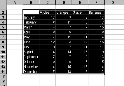
Charting 101 - Making Your First Chart in Microsoft ExcelGetting StartedOf course, charting is all about displaying data. Here is some sample data I made up for this exercise, to illustrate features that facilitate charting.
The first step to making our chart is to select the range of data to be charted. Excel is pretty good about detecting header rows and columns in a selected range, especially if the upper left cell is kept blank. I know it's hard for us compulsive types to leave a header cell blank, where our natural impulse is to fit in a nice descriptive label, but if I can learn to leave it blank, so can you.
If you need to chart a discontiguous range, e.g., to chart just the Grapes and Bananas data by month in the sample data above, it is possible to do so. Select B2:B14 with the mouse (remember to include the blank cell), then hold down the Ctrl key while selecting E2:F14. As long as there are matching ranges that can be shrunk into a single apparently contiguous range by hiding rows and columns, this technique will be successful. By default, if you construct the chart with the entire data range, then hide the rows and columns you want to hide, Excel will not chart data from the hidden data. If only one cell in a populated worksheet range is selected, Excel expands the selection to include the entire contiguous range of cells connected to the one selected cell, stopping when it detects empty rows and columns. If a blank cell away from a populated range is selected, Excel will create a blank chart. I find it's better to select the specific area I want, however, rather than let Excel select what it thinks I want. The sample data has been selected as a first step to making our chart. From here we will run the Chart Wizard. |

Peltier Technical Services, Inc.Excel Chart Add-Ins | Training | Charts and Tutorials | PTS BlogPeltier Technical Services, Inc., Copyright © 2017. All rights reserved. |