|

|
|
Introduction to Charting in Microsoft Excel
Making Charts in Microsoft Excel.
Introduction
Before embarking on a journey through Excel charting, it is important to do some thinking and planning first. Know what you want to show and why. Keep it simple and clear. Target your audience. Here are a few suggestions I've made in the past.
- Keep in mind the message you want to get across, don't be distracted by all the data at your disposal or all the fancy chart types Excel provides.
- Try to avoid 3-D style charts, because these styles can truly distort the data... unless that's your intention. <g> The 3D effects introduce parallax that make it hard for the reader to judge the values being plotted, even with pencil and ruler on a hard copy. 3D pie charts become elliptical, so that it is hard to judge the relative size of the wedges. In the sample shown here, all five wedges are the same size.
3D Exploded Pie Chart
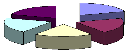
"The Trailer Trash of Charting"
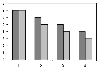
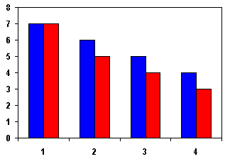
- Stick to black & white and readily reproducible shades of gray, if the chart is going to be photocopied, and especially if it is going to be faxed. If you decide to use colors, keep it simple: pick a few colors that go well together, maybe the basic primary colors. Stay away from gradient fills and vibrating color combinations. The first bar chart below is an artist's reconstruction of an actual chart I received from an engineering school post-doc. Her thesis committee should have beaten this antisocial behavior our of her.
Is That a Chart, or Is Your Dog Ill?
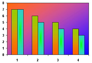
Some don't think Excel's palette has enough colors!
|
Fax-Friendly Chart
| |
Simple Primary Colors Are Best
|
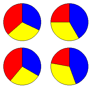
- KISS - Keep It Simple (Stupid). Don't make a chart too cluttered. Limit the number of series and categories. Make labels clear and concise. Maybe two simpler charts will be more clear than one complex chart. If you have lots of things to put in a pie chart, try the pie-in-pie or bar-in-pie options.
- Know your audience. A roomful of engineers will understand a log scale axis without any problem and could probably handle greater complexity in a chart. If the chart is in a prospectus for potential investors, it should have only a few series and categories, and labels should be short and free of jargon and acronyms.
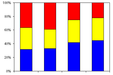
- Two simple charts might be more informative than one. Two charts can get across paired ideas with less clutter than one complex combination chart. On the other hand, combining data onto a single chart may have advantages: rather than placing four pie charts on a page, a stacked bar chart allows easier comparison among several categories.
Doesn't the column provide for easier comparisons?
- Print quality - If it's for the public, you can't cut corners here. Laser printer, not ink jet. Good bond paper, or even glossy, especially with color output.
|
|