|
|
|
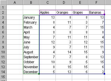
The Excel Chart and its Data RangeYou may notice that when a chart is selected, its source data range in the worksheet is highlighted (see the previous few screen shots and the larger view below). The Y values in the chart are within the blue outlined range. The Category (X axis) values are outlined in purple, and the Series names (legend entries) are outlined in green. Each outline has a handle -- a small square of the same color -- at its lower right corner. The source data range of the chart can be enlarged or contracted by dragging these handles. The source data can be moved by dragging one of the colored outlines.
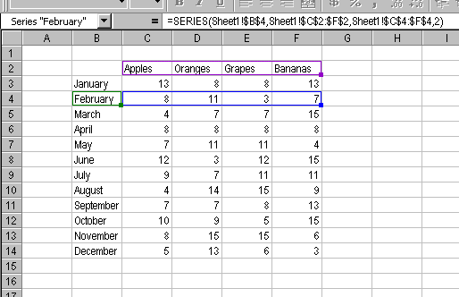
In the same way that a chart's source data is highlighted when the chart is selected, an individual series' data ranges are highlighted when that series itself is highlighted (see below). These data ranges can be moved or resized by dragging these outlines or handles, in the same way that the chart's source data can be adjusted.
|

Peltier Technical Services, Inc.Excel Chart Add-Ins | Training | Charts and Tutorials | PTS BlogPeltier Technical Services, Inc., Copyright © 2017. All rights reserved. |