|
|
|
X Axis: Category vs. ValueIn Microsoft Excel charts, there are different types of X axes. While the Y axis is a Value type axis, the X axis can be a Category type axis or a Value type axis. Using a Value axis, the data is treated as continuously varying numerical data, and the marker is placed at a point along the axis which varies according to its numerical value. Using a Category axis, the data is treated as a sequence of non-numerical text labels, and the marker is placed at a point along the axis according to its position in the sequence. The sample below illustrates the difference between Value and Category Axes. Our sample data is shown in the simple table below. The first column contains our X axis data, which can be treated as Categories or as Values. Note that the numbers are not equally spaced, nor do they even appear in numerical order.
We will display this data on two types of chart: a Line Chart, and an XY Scatter Chart; these charts look the same but behave differently.
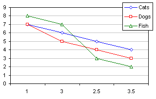
Combo Chart: X as Category AND Value AxisYou can put both a Line Series and an XY Series onto the same chart. This mixing of chart types on the same chart results in a Combination Chart. Excel provides a short selection of Combination Charts in the Chart Wizard, but you can create them in almost any combination you want. (For a demonstration of Combination Chart creation, see Roll Your Own Combination Charts elsewhere on this site.) In this case, I built the chart with two line series, then selected the Cats series and used Chart Type on the Chart menu to change the series to an XY type. Excel notices the chart types are different, and adds secondary axes to the chart to accommodate the XY series (below left). The two series can be plotted on the same set of axes. Double click the Cats series, and on the Axis tab, change the option from Secondary to Primary. The result is shown below right. Excel considers the X axis as a Category axis, but it plots the XY series as if Category 1 has a value of 1, Category 2 has a value of 2, etc.
In the right-hand chart, the first point of the XY series "Cats" is plotted above the first category listed (i.e., "1"), because its X value is 1. It is merely coincidental that the category label and the X value are both 1. The second point is plotted above the third category ("2.5"), because its X value is 3. The third point is plotted between the second and third categories, because its X value is 2.5, between 2 and 3. The fourth point is plotted between the third and fourth categories, because its X value is 3.5. The four points of the Line series "Dogs" are plotted in order above the first through fourth categories, because they are listed in that order. The different treatment of category data is important if you need to add an additional series for any reason, such as adding a reference line to the chart. This also is how you would work around a line chart using the categories from the first series for all series; an example later in this article shows how to plot time series with different date values for each series. Line Chart: X as Time-Scale AxisThere is one exception to a Line Chart having evenly spaced categories. This is the case of dates as X axis values. Excel calls this a Time-Scale axis, but it is more accurately called a Date-Scale axis. Consider a Line Chart constructed from the sample data below.
According to the scenario described earlier, Excel should stick the dates in the first column into equispaced category labels, as in the left hand chart below. If Excel recognizes the labels as dates, however, it will actually provide a Time-Scale (Date-Scale) axis, and space the points according to the date, as shown below right. And it is a smart axis scale; if the Base Unit of the axis scale is set to days, you would see slight differences in the spacing between months. While thirty days hath September, October hath 31.
This type of axis is not super smart, however. If you add a series that had different values for these dates, Excel would still use the dates from the first series' X values (see workaround below). In addition, even though it is called a 'Time' Scale axis, it is really a 'Date' Scale axis: all times from a given date are treated as integers, that is, they are plotted at midnight at the start of that date. No partial days (i.e., times) are considered.
Date-Scale Chart for Series with Different DatesExcel's line charts do not acknowledge different category data for different series. Instead, the chart uses the category values from the first series for all series. Excel's XY charts allow each series to have distinct category values, but do not provide the nice Date-Scale axis scaling that line charts provide. This example illustrates the problem with multi-series line charts, and it uses the combination chart approach described above to allow multiple sets of dates for multiple series.
Select the data for the first series in columns A and B, and create a line chart with a Date-Scale axis (it will look like the example above). Add the data in columns C and D to the chart as a new series: Copy the range, select the chart, and use Paste Special from the Edit menu to add the data as a New Series, with Series Names in the First Row and Categories in the First Column. The result is showm below left. Although the second series has completely different dates in its source data, and you explicitly indicated these when you copied the range, the line chart ignores these and uses the dates from the first series for both. To enable multiple date ranges, convert the chart to a combination chart as described above. Keep the first series as a Line series, and change each additional series to an XY series: Select the series, choose Chart Type from the Chart menu, and select an appropriate XY chart type. You should be able to use the F4 function key shortcut to repeat this last action on more series. As above, Excel adds secondary axes for the XY series, so double click on the first XY series, and on the Axis tab of the dialog, select Primary; use F4 to repeat for any additional XY series. As shown in the chart below at right, the series now reflect independent date scales. After changing an added series to an XY series, subsequent series added to the chart will be added as XY series.
Order of Points for Axis TypesAn interesting behavior of Date-Scale charts is illustrated with the data below. The points are the same as in the previous section, but rearranged out of sequence. Charts with the three axis types shown above are repeated here with the rearranged data.
The Category Axis chart simply plots the out of sequence dates across the X axis in the order they appear in the worksheet, regardless of the order of the dates. Both the Date-Scale and Value Axis charts display the points from left to right in date order, spaced proportionally to the duration between dates. The two charts show different behavior of the connecting lines: the XY chart with the Value axis connects the points in the order that the points appear in the worksheet, while the Line chart with the Date-Scale axis connect the points from left to right, ignoring the order of the points. Which Type of X Axis Should You Use?If you require the precision of a Time Scale axis, or if your data used non-numeric categories for the X values, you should use a Line Chart. For almost any other application, you should use an XY Scatter Chart, with its Value axis. You can format the lines and markers of either type of chart identically, but you have greater flexibility using the Value axis. Data points are located along the X axis according to their X values, not the order they are listed in the worksheet. In addition, if you need a logarithmic scale on your X axis, you can only get it with a Value axis. For further discussion about axis types and chart types, see my article, Scatter Chart or Line Chart?, in the TechTrax web magazine. |

Peltier Technical Services, Inc.Excel Chart Add-Ins | Training | Charts and Tutorials | PTS BlogPeltier Technical Services, Inc., Copyright © 2014. All rights reserved. |