|

|
|
VBA Charting Techniques
|
This zipped Excel file contains a handy little utility that labels the last point in each series of a chart with the name (legend entry) of that series. Convenient for labeling your charts.
Top of Page |
|
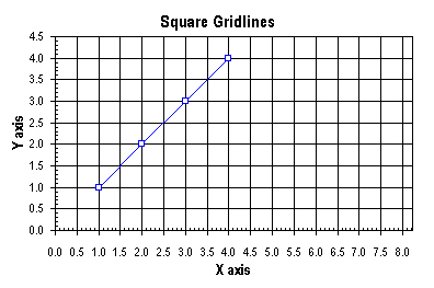
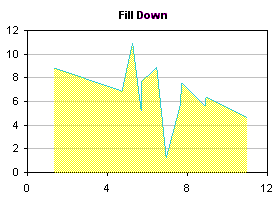
A common question people ask is "How do I format my chart so its gridlines make a square pattern?" Excel has no setting that forces equally spaced horizontal and vertical gridlines or horizontal and vertical axis ticks, but you can achieve this effect using VBA. Below is a chart after making the appropriate scale adjustment.
Top of Page
|
|
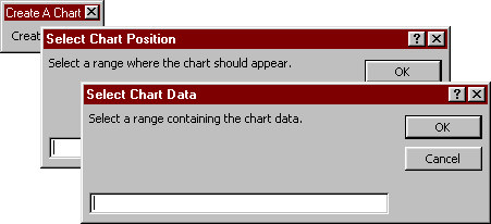
Choose on-the-fly where you want your chart to be drawn, and where to find the data you want to plot.
Top of Page
|

There are occasions when you may want to break the link between a chart and its underlying data. Maybe you copied the chart and pasted it into another workbook, and opening the other workbook brings up the dialog box asking whether you want to update the links to another workbook. This page describes ways you can make a copy of a chart that is not linked to the parent data.
Top of Page
|
|
Ever make a copy of a chart, and all you want is do is change the worksheet containing the source data? Or change the X values of all series from column A to column B? The series formula is a simple text string, but there's no Search and Replace feature in Excel that can access these formulas. But you can use some very simple VBA code to make wholesale changes to chart series formulas.
The utility was upgraded on 1 August 2007 to avoid a VBA error that occurs when a defined name is used for the X values in the series formula.
Top of Page
|
|
Excel offers two ways to scale chart axes. You can let Excel scale the axes automatically; when the charted values change, Excel updates the scales the way it thinks they fit best. Or you can manually adjust the axis scales; when the charted values change, you must manually readjust the scales. Wouldn't it be great to be able to link the axis scale parameters to values or, even better, formulas in the worksheet? This page shows how to use VBA to accomplish this.
Top of Page
|
|

Bubble charts are one way to show three dimensions of data in a flat 2D chart. In addition to the points being located on a grid according to X and Y values, the size of the marker is proportional to a third set of values. Making a bubble chart is easy: select a data range with three columns (or rows) of data, run the chart wizard, and choose one of the bubble chart types.
Top of Page
|
|
Excel charts offer a wide variety of formats, but you can use Excel's drawing tools to enable even more formatting choices. It's possible to draw shapes on the chart to produce these formats, using the polygon drawing tool. This allows more line formats, by enabling more choices of line thickness and by making it easier to read dashed lines. More fill possibilities are made possible than merely filling below a series, as in an area chart: the fill can go below or to the side of the series, and in fact, an enclosed region in the chart can be filled. The fill can be made transparent too, allowing gridlines to show through the shape.
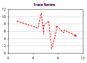 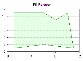
This article presents VBA procedures that automate the polygon drawing tool, and gives hints about the kinds of formatting which may be achieved. A sample procedure has been recently added to show how to use this technique for charts that have multiple series.
Top of Page
|
|
|


