|

|
|
Chart Axes and Axis Tricks
See also Dummy Series and Combination Charts
|
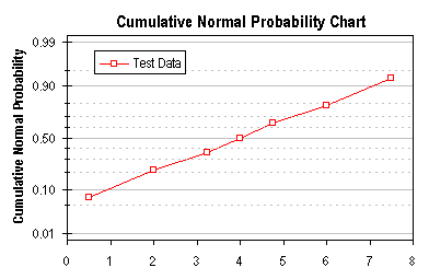
In Microsoft Excel charts, there are different types of X axes. While the Y axis is a Value type axis, the X axis can be a Category type axis or a Value type axis. Using a Value axis, the data is treated as continuously varying numerical data, and the marker is placed at a point along the axis which varies according to its numerical value. Using a Category axis, the data is treated as a sequence of non-numerical text labels, and the marker is placed at a point along the axis according to its position in the sequence. This page illustrates the difference between Value and Category Axes, and describes some of the unique behavior of Date-Scale Category Axes.
Top of Page
|
|
How do you arrange your chart so the categories are displayed along the Y axis? The method involves adding a dummy series along the Y axis, applying data labels to its points for category labels, and making the original Y axis disappear.
You may also want to check out the page on Dot Plots.
Top of Page |
|
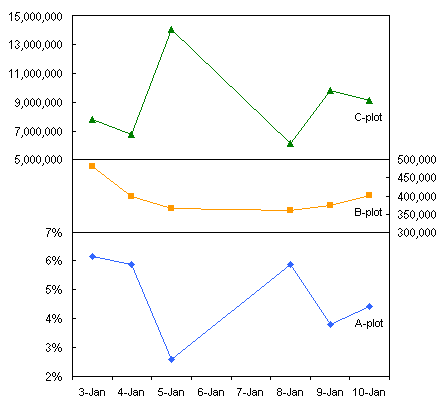
I once had a page on this site that showed how to generate additional axes in a chart. With the technique you could go beyond primary and secondary axes, to tertiary and quaternary axes, and even more.
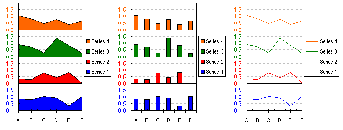
Given that charts with just primary and secondary axes can be confusing, a tertiary axis is just overkill. Multi-axis charts can be cluttered and confusing, even when using a custom color scheme to help identify each series with its corresponding axis.
I propose using Panel Charts as a substitute for charts with confusing multiple axes. Here are some tutorials and examples of panel charts:
|
|
A common question is: I have a chart with data on the primary and secondary Y axes, and both axes range from negative to positive numbers. How do I make the X axis cross each Y axis at X=0?
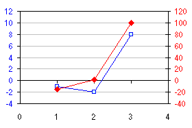
This page describes the relatively simple algebra required to accomplish this task, and provides a VBA procedure to do this easily.
Top of Page
|
|
Microsoft Excel does not offer a built in capability to chart probability data, but the technique described here allows you to simulate a probability scale along a chart axis.
Top of Page
|
|
An Arrhenius equation gives the following relationship between some measure of reaction rate or chemical solubility and temperature:
K = A exp (-Q/RT)
where K is the rate or solubility, A is a constant, Q is an activation energy, R is the gas constant, and T is the absolute temperature. The equation above can be restated to:
log (K) = A' - Q/RT
A chart can be constructed with log(K) on the Y axis and reciprocal temperature (1/T) on the X axis; the slope of this line indicates the activation energy (actually -Q/R) and the intercept is the new constant A'. This page describes the construction of one variation of this type of chart.
Top of Page
|
|
The way most computer programs render numbers in scientific notation is not particularly attractive, for example 1.23E-04. Most of us learned true exponential notation in high school, and many publications require the use of this notation, rendered with a true superscripted exponent, for example 1.23x10⁻⁴. Here is a technique to add exponential notation axis labels to your chart.
Top of Page |
|
Sometimes the labels of a category axis are too closely spaced, and either Excel inclines the labels, or it will not render them all. Unfortunately Excel offers no built-in method for staggering axis labels, but there is a simple trick to achieve the same result.
Top of Page
|
|
Excel offers two ways to scale chart axes. You can let Excel scale the axes automatically; when the charted values change, Excel updates the scales the way it thinks they fit best. Or you can manually adjust the axis scales; when the charted values change, you must manually readjust the scales. Wouldn't it be great to be able to link the axis scale parameters to values or, even better, formulas in the worksheet? This page shows how to use VBA to accomplish this.
Top of Page
|
|
|