|
|
|
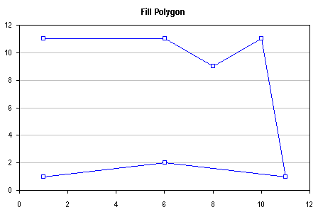
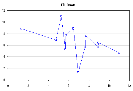
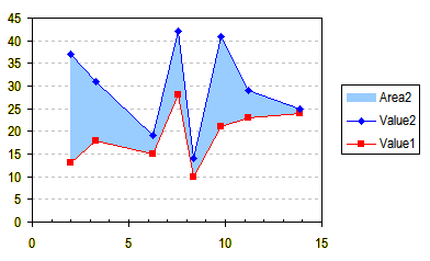
Line and Fill Effects in Excel Charts Using VBA.Excel charts offer a wide variety of formats, but you can use Excel's drawing tools to enable even more formatting choices. It's possible to draw shapes on the chart to produce these formats, using the polygon drawing tool. This allows more line formats, by enabling more choices of line thickness and by making it easier to read dashed lines. More fill possibilities are made possible than merely filling below a series, as in an area chart: the fill can go below or to the side of the series, and in fact, an enclosed region in the chart can be filled. The fill can be made transparent too, allowing gridlines to show through the shape. Click on an image to go to the relevant description. This article presents VBA procedures that automate the polygon drawing tool, and gives hints about the kinds of formatting which may be achieved. Enhancing the Lines in a Scatter ChartThe table below shows the sample data used for several examples, and a simple XY Scatter chart which will be used in the first example.
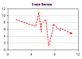
Select the chart and run the TraceXY procedure below. The drawn line (red) and plotted series (blue) are both shown for comparison. Hide the XY series: before running the macro, double click on the series, and on the Patterns tab, select None wherever possible.
The line shape can be double clicked to open the formatting dialog. In the following chart, the line has been made thicker (1.5 pt) and given a dashed pattern.
In this version of the chart, a more intricate dashed line patter was selected, and arrowheads were defined for the endpoints of the line. Notice how the pattern continues around nodes. In the lines in a scatter chart, the pattern resets at each point, so closely spaced points may not display any of the dashed pattern at all.
Modified Procedure to Connect XY Series with Arrows A modified version of this procedure that connects corresponding points of two XY series with arrows has been posted in my blog at Connect Two XY Series with Arrows (VBA).
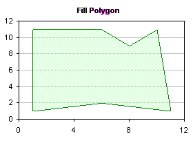
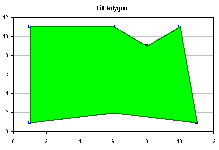
Fill the Region Enclosed by a Scatter ChartBelow are sample data and a simple XY Scatter chart used for the next example. To fill in the polygon, the procedure uses all of the points in the XY series, repeating one of the endpoints so it starts and stops at the same location.
Select the chart and run the DrawFilledPolygon procedure below. The drawn polygon (green) and plotted series (blue) are both shown for comparison. Hide the XY series: before running the macro, double click on the series, and on the Patterns tab, select None wherever possible.
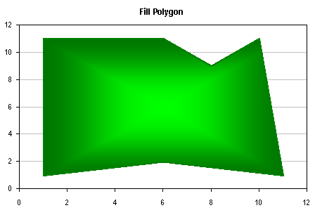
The shape is formatted by double-clicking on it. You can choose any colors, including fancy gradients like this. You can use textures or pictures to fill the shape. You can also use transparency to let hidden features show through the shape.
Imagine the possibilities....
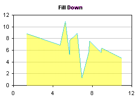
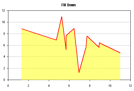
Fill Below a Scatter ChartThis chart uses the same data as the first example.
Select the chart and run the ShadeBelow procedure below. The drawn polygon (yellow) and plotted series (blue) are both shown for comparison. Hide the XY series: before running the macro, double click on the series, and on the Patterns tab, select None wherever possible.
This chart has been embellished by using a transparent fill, and by running the TraceXY procedure to create a heavy red line for the series (using the border of the polygon would result in a line around the entire periphery of the shape, not just where the data is plotted).
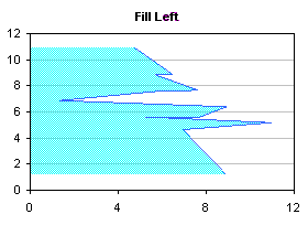
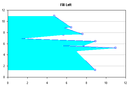
Fill to the Left of a Scatter ChartThis chart uses the same data as the first example, except X and Y have been switched.
Select the chart and run the ShadeLeft procedure below. The drawn polygon (cyan) and plotted series (blue) are both shown for comparison. Hide the XY series: before running the macro, double click on the series, and on the Patterns tab, select None wherever possible.
This chart has been embellished by using a transparent fill, and by running the TraceXY procedure to create a heavy dashed blue line for the series (using the border of the polygon would result in a line around the entire periphery of the shape, not just where the data is plotted).
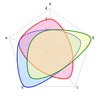
Other Chart TypesLine and Fill Effects in Excel Radar Charts Using VBA shows how to apply these techniques to Excel's radar charts.
Related Non-VBA Chart Fill TechniquesTo fill the area below or between two XY series, you can also use the following techniques. They have advantages over the VBA techniques, since they don't use VBA, and the filled regions are behind any data in the XY series, but they also require more work in setting up additional series and secondary axes.
To fill the area between two line series, you can use the following technique.
The VBA ProceduresThese procedures draw polygonal shapes, using each point in the series as a node. The first procedure merely draws a polygonal line from the first point to the last point, while the other procedures add additional points, closing the polygon to produce a filled shape. The X and Y coordinates of each point are converted from the axis scale to the chart's coordinate system, so the polygon accurately traces the series. These procedures are designed to work on the first series in the active chart. The TraceXYMulti shows how to expand the TraceXY example to all series in the chart). The VBA procedures below do not have any error-checking built into them. If a chart is not selected, the procedure will crash. If the active chart is not a Scatter chart, the shape will not be correctly drawn, and the procedure may crash before drawing any shape. If the axes display the values in descending order, the shape will be a mirror image of what it should be. The procedures draw shapes with predetermined colors. The VBA code could be adjusted to produce shapes of any desired color scheme, but it may be just as easy in most cases to run the macro, then double click on the shape to open the formatting dialog. Shapes on a chart are drawn in front of other chart features. Plotted points, labels, and other elements will be obscured by the shapes. The shapes can be made transparent, but this is not as good as allowing it to be drawn behind other objects. If the axis scales of the chart change, or if the chart is resized, the shapes will no longer match the XY series properly. In this case, the existing shapes must be deleted and redrawn. TraceXY: Draw Polygon that Traces XY Series
TraceXYMulti: Draw Polygons that Trace Each XY Series in ChartThe TraceXY procedure above traces the first series in the chart, following this line of code: Set mySrs = myCht.SeriesCollection(1) To trace a different series in the chart, change the 1 in this line. To trace every series in the chart, run the following TraceXYMulti procedure, which loops through all series in the chart. The same looping technique can be used like this in the other procedures in this tutorial.
DrawFilledPolygon: Draw Filled Polygon that Traces XY Series
ShadeBelow: Draw Polygon that Traces XY Series and Fills Area Below Series
ShadeLeft: Draw Polygon that Traces XY Series and Fills Area to Left of Series
|

Peltier Technical Services, Inc.Excel Chart Add-Ins | Training | Charts and Tutorials | PTS BlogPeltier Technical Services, Inc., Copyright © 2017. All rights reserved. |