Peltier Technical Services, Inc.
 

Custom Solutions | Commercial Utilities | Training | Charts and Tutorials | PTS Blog


Peltier Tech
Chart Utilities

PTS Waterfall Chart Utility
PTS Cluster-Stack Column Chart Utility
PTS Box and Whisker Chart Utility
PTS Marimekko Chart Utility
PTS Dot Plot Utility
PTS Cascade Chart Utility


Excel Dashboards


Books at Amazon.com


Buy me a coffee

If this topic or the whole site has been helpful, please support further development by treating me to a cup of coffee.


Tertiary Y Axis.

I once had a page on this site that showed how to generate additional axes in a chart. With the technique you could go beyond primary and secondary axes, to tertiary and quaternary axes, and even more.

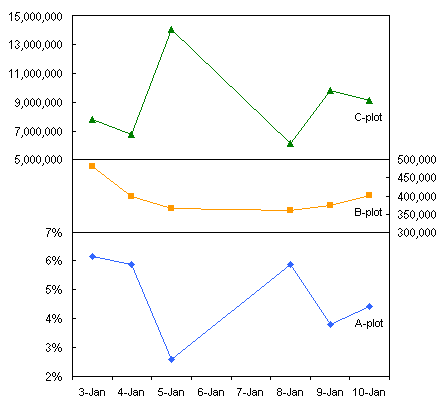
Given that charts with just primary and secondary axes can be confusing, a tertiary axis is just overkill. The chart shown above is cluttered and confusing, even using a custom color scheme to help identify each series with its corresponding axis. You can read further rationale in the following articles, for removing secondary axes from charts and leaving the user with simple primary axes, in the following articles:

I propose using Panel Charts as a substitute for charts with confusing multiple axes. Here are some tutorials and examples of panel charts:


Page copy protected against web site content infringement by Copyscape


PTS Waterfall Chart Utility PTS Cluster-Stack Column Chart Utility PTS Box and Whisker Chart Utility PTS Marimekko Chart Utility PTS Dot Plot Utility PTS Cascade Chart Utility


Create Excel dashboards quickly with Plug-N-Play reports.


Peltier Technical Services, Inc.

Custom Solutions | Commercial Utilities | Training | Charts and Tutorials | PTS Blog

Peltier Technical Services, Inc., Copyright © 2009. All rights reserved.
You may link to this article or portions of it on your site, but copying is prohibited without permission of Peltier Technical Services.

Microsoft Most Valuable Professional

Microsoft Most Valuable Professional

My MVP Profile