|
|
|
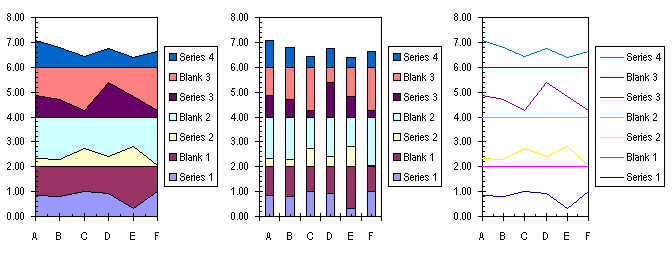
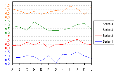
Stacked Charts With Vertical Separation.Want to place multiple series on a chart, but separate them vertically so you can visualize all at once? Here is an example of a four-high stack with offsets built into the series, plus formatting tricks to dress it up. This can be done with with Area, Column, or Line Chart styles. It isn't exactly four independent charts stacked up, but that's our secret. This is an extension of the Stacked Line Chart example that used to reside on this site. Malcolm Coull liked that example, but wanted a column chart type, so he made some modifications that resulted in the examples below. I extended his work further to the area chart type, and to another way to get the line chart type which may be easier than my original method. The sample data I want to plot in this example is shown below (A1:E7 in my worksheet). Keep cell A1 blank to ensure proper operation of the Chart Wizard.
    Series 1   Series 2   Series 3   Series 4
A     0.84       0.35       0.88       1.07
B     0.81       0.30       0.72       0.79
C     1.01       0.75       0.27       0.43
D     0.92       0.43       1.37       0.75
E     0.34       0.81       0.81       0.38
F     1.02       0.06       0.26       0.62
We need to insert columns into the data range, as shown below. This stretches the range to A1:H7. Select C2:C7, and hold down the Ctrl key while selecting E2:E7 and G2:G7, so three areas are selected. Type =2- (equals two minus) and press the left arrow key to insert the address of the cell to the left of the active cell, then hold Ctrl and press Enter. The resulting formula in cell C2 is =2-B2. The value 2 was selected based on each pair of series stacking up to a height of 2.
    Series 1   Blank 1   Series 2    Blank 2   Series 3    Blank 3   Series 4
A     0.84      1.16       0.35       1.65       0.88       1.12       1.07
B     0.81      1.19       0.30       1.70       0.72       1.28       0.79
C     1.01      0.99       0.75       1.25       0.27       1.73       0.43
D     0.92      1.08       0.43       1.57       1.37       0.63       0.75
E     0.34      1.66       0.81       1.19       0.81       1.19       0.38
F     1.02      0.98       0.06       1.94       0.26       1.74       0.62
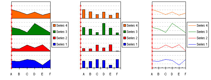
First chart the data. Select A1:H7, start the chart wizard, and make a Stacked Area, Stacked Column, or Stacked Line chart. Select the "Series in Columns" option.
Select the Y axis, press Ctrl-1 (numeral "one") to format it. On the Scale tab, make the scale go from 0 to 8, with a major spacing of 2 and minor spacing of 0.5 (these values were selected for the gridline spacings). On the Patterns tab, select your favorite tick style for both major and minor (I used "Inside" for both), and select "None" for tick labels. Click Okay. Format the Series X series any way you like; format the Blank X series with no border and no fill, or no line and no marker for the stacked line chart. Add a Y axis title if you want.
If they are not there by default, go to Chart menu > Chart Options, and select Major Y Gridlines and Minor Y Gridlines. Press Okay. Double click on each set of gridlines to format them. I've selected a thin, solid black line for the major gridlines, and a thin, dashed gray line for the minor gridlines. Select the chart's plot area, and drag the left edge to the right to give more room for the axis labels we're going to add.
Now you need a dummy series for your custom Y axis labels. The points of this series will be lined up along the Y axis, and each point will have a label representing the Y values for each of the series we plotted already. In K2:K17, enter a column of zeros (the X values for the dummy series). In L1 enter "Labels" and in L2:L17 enter the series 0.0, 0.5, 1.0, 1.5, . . . 7.5 (the Y values for the dummy series). In M2:M5 enter 0.0, 0.5, 1.0, 1.5 (one set of Y axis labels). Make sure the number format here has one decimal digit showing, so the ".0" shows. Copy M2:M5 and paste it into M6:M9, M10:M13, and M14:M17 (the labels for the other three series). The dummy series data in K1:M17 looks like this:
     Labels
0       0     0.0
0     0.5     0.5
0       1     1.0
0     1.5     1.5
0       2     0.0
0     2.5     0.5
0       3     1.0
0     3.5     1.5
0       4     0.0
0     4.5     0.5
0       5     1.0
0     5.5     1.5
0       6     0.0
0     6.5     0.5
0       7     1.0
0     7.5     1.5
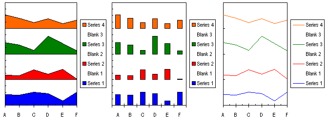
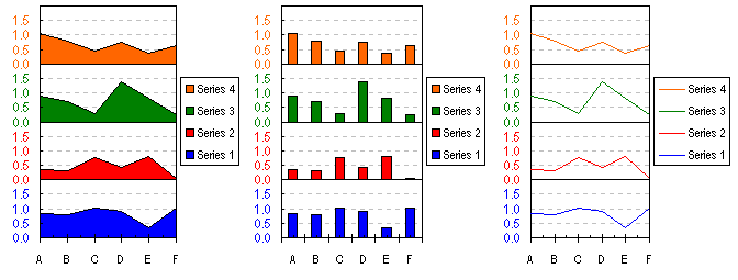
Select K1:L17, copy it, select the chart, go to Edit menu > Paste Special, and select the options to Add a Series, By Column, Categories in First Column, and Series Names in First Row. This adds the series to the chart. It looks like we've just royally demolished the chart, but we'll fix that in a minute.
Right click on the new series ("Labels"), select Chart Type from the pop up menu, and select an XY Scatter Chart (not a Line Chart). The series will change, and secondary axes will appear along the top and right side of the chart. Right click on the chart (not on any series), select Chart Options from the pop up menu, and on the Axes tab, uncheck the Secondary Value (Y) Axis. Double click on the secondary category (X) axis, along the top of the chart to format it. On the Scale tab, set a Minimum of 0 and a Maximum of 1. On the Patterns tab, select None for Major Tick Mark Type, Minor Tick Mark Type, and Tick Mark Labels. The new series now lies along the Y axis, shown here as a series of red crosses with a red connecting line. Clear the extraneous legend entries. Single click twice on each unwanted legend entry, once to select the legend, then again to select just the textual name of the series. Don't select the legend key, the graphical object that matches the series format. Press the delete key.
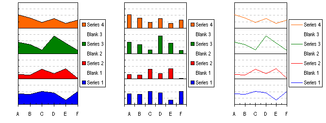
Now we're going to need a little help. Go to http://www.appspro.com and download Rob Bovey's XY Chart Labeler, a free addin that's very useful to spice up your charts. It labels data points, and not just on XY charts, either. Install the addin and then continue. Select the chart. Go to the Tools menu, and select the new XY Chart Labels command, Add New Labels. Select "Labels" from the list of series, click in the Range box, and select M2:M17 with your mouse, and under Label Position, choose Left. Click Okay, and the series we added along the Y axis now has labels. Readjust spacing as needed. Format the dummy series' Pattern so it has no line and no markers.
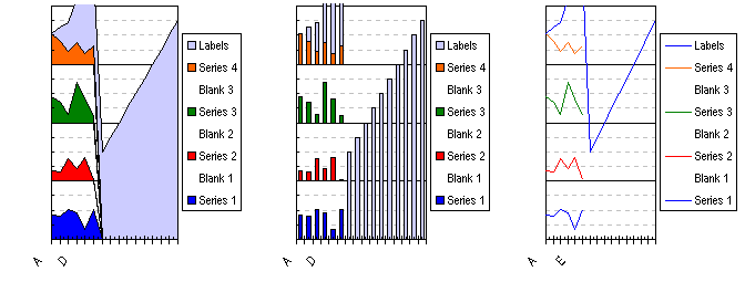
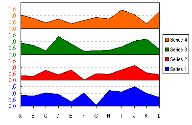
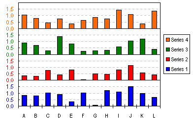
One neat thing that Rob's Labeler does is to copy the font formatting of the cell containing a data label to the label itself. The labels in these charts were colored in the worksheet to match the series colors, and when the labels were applied, they took on these colors. Formatting such as bold, italics, font, color, and size are copied in this way. The cells must be formatted prior to assigning the labels, and if the formats of the cells change, the formats of the labels do not change. Here are the resulting charts one-by-one:
Panel Charts with Different Scales extends this technique further, to uneven axis scales in the separate panels, and even to panels with different sizes.
|

Peltier Technical Services, Inc.Excel Chart Add-Ins | Training | Charts and Tutorials | PTS BlogPeltier Technical Services, Inc., Copyright © 2017. All rights reserved. |