|
|
|
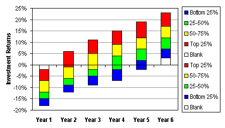
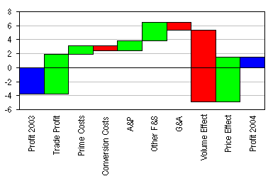
Stacked Column Charts that Cross the X Axis.Stacked column and stacked bar charts are handy chart types. And with invisible columns (no border and no fill in the column), you can get columns that float above the X axis of your chart, or that sink below the X axis. But what if you want to show columns that span the X axis? How can you make a bar start below the axis and end above it? Excel has no built in Stacked ± Column chart type. And in fact you can't span a column across the axis. But you can draw each bar in two parts, the above zero part, and the below zero part. Format the pair identically, and nobody will be the wiser. I'll show an example that uses worksheet formulas to determine which of the columns spans the X axis, or whether all of the stacked columns are above or below the axis. The following data shows steadily improving investment returns among the stockbrokers of a fictitious trading firm. In year one, 100% of the accounts have a negative return. In year two, the upper quartile of the accounts range from below zero to above zero. And each year the next quartile also reaches above zero, until in year six, all of the accounts are making money.
For each band we depict in the chart, we actually need two series, positive and negative. We also need two blank series, for the space between the axis and the nearest point, in case all points are above or below the axis. I've placed the formulas in the range just below the original data, with the positive series in the top of the table and the negative series in the bottom; this placement isn't too important. The order of the rows within the positives and within the negatives is important, because as Excel works its way down the rows of the data range, it starts next to the axis and each stack is further from the axis.
The magic of the formulas is what makes the numbers come out right. The formulas are not even very difficult; it just takes a little effort to keep them straight. Here are the formulas from column B. These can be copied and pasted into the rest of the columns.
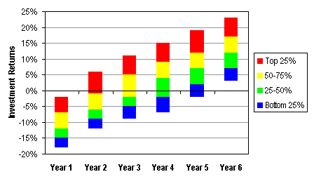
The hard part is done, now let's make our chart. Select the range A9:G19, and start the Chart Wizard. Create a stacked column chart, and make sure Excel plots its series in rows. Here's how the chart looks after I've changed only a small amount of the formatting.
I cleaned up the plot area and gridlines, then I formatted the series one by one. In a case like this, where multiple series share the same formatting, you can format one the way you like, then select another, and press the F4 key to repeat the previous action. In some cases you may have difficulty selecting a series to format it. You can select a different series and use the up and down arrow keys until you get to the right one. Or if you just want to format the series, you can select the corresponding legend key (the little colored square next to the legend text). Click once on the legend, then again on the legend key. The F4 key works here too. I've left the border on the blank series to illustrate how it works.
Well, that's not bad, but there's still more work. I removed the borders around all the columns in the chart, which I should have done in the previous step. Then I removed all the extraneous legend entries. Click once on the legend, then again on the text of the legend. You could format the text of the individual legend entry here if you wanted, but we're going to press Delete to remove the extras. Don't select the legend key (the colored box), because pressing Delete would remove the series from the chart.
This technique can be used to correct a Waterfall Chart that Crosses the X Axis.
| ||||||||||||||||||||||||||||||||||||||||||||||||||||||||||||||||||||||||||||||||||||||||||||||||||||||||||||||||||||||||||||||||||||||||||||||||||||||||||||||||||||||||||||||||||||||||||||||||||||||||||||||||||||||||||||||||||||||||||||||||||||||||||||||||||||||||||||||||||

Peltier Technical Services, Inc.Excel Chart Add-Ins | Training | Charts and Tutorials | PTS BlogPeltier Technical Services, Inc., Copyright © 2017. All rights reserved. |