|
|
|
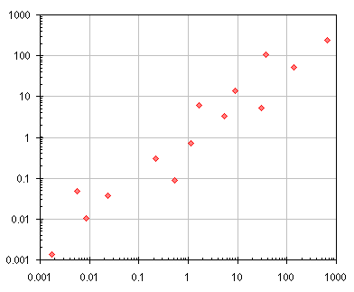
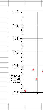
Creating Exponential Notation Axis LabelsThe way most computer programs render numbers in scientific notation is not particularly attractive, for example 1.23E-04. Most of us learned true exponential notation in high school, and many publications require the use of this notation, rendered with a true superscripted exponent, for example 1.23x10⁻⁴. It is possible with today's applications to produce superscripted text, but it can be a difficult task. In addition, there seems no way to superscript characters within an axis label. Because Excel doesn't offer such labels off the shelf, it is often overlooked for purposes of scientific and engineering charting. In our test chart, the X and Y scales are logarithmic, ranging from 0.001 (10-3) to 1000 (103). Using the "General" number format, these numbers look fine, in fact they are somewhat symmetrical.
But this was a special case. In general, the axis limits will not lead to a pleasing visual experience such as this. And even our nice chart axes look rather ugly in Excel's scientific notation. Not only are they unattractive, they take up more space, squeezing out valuable plot area real estate.
We'll use a helper series ("dummy" series) to build our own custom axis labels, following the Arbitrary Axis technique from elsewhere on this web site. The first step is to hide the built in axis labels. Double click on one axis, select the Patterns tab, and select None for Tick Mark Labels. Leave the tick marks themselves; I like to use "inside" minor ticks and "cross" major ticks on a log scale. If you change the first axis, you can immediately select the second axis and press the F4 key, and Excel will repeat your actions on the second axis. You'll have to shrink the plot area to make room for the new labels. When the original labels were removed, Excel took away the space for them.
Now construct the ranges for the fake X and Y axes. Each uses three columns: one for the X values for the axis ticks, one for the Y values, and one for the labels. In my worksheet, the X axis data were in A18:C25 (below left) and the Y axis data were in A27:C34 (below right). I used formulas to construct the labels. The formula in C19 is ="10"&LOG(A19), and it is filled down through C25. The formula in C28 is ="10"&LOG(B28), and it is filled down through C34.
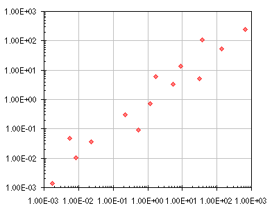
Let's walk through construction of the Y axis. The easiest way to add a series is to copy the data and paste it onto the chart. Copy the range with the X and Y data for the Y axis (not the labels), A27:B34. Select the chart, and choose Paste Special from the Edit menu, and add a new series, with categories in the first column and series names in the first row. The new series is shown by the blue squares and lines along the Y axis of our chart, below.
Now add the data labels. The following is the manual process; at the end of this page I have a macro that adds and formats the labels for you, making use of the X and Y axis label text in column C above. Even if you plan to use the macro, it's useful to understand how the procedure works, so read on. Double click on the new series, click on the Data Labels tab, and select the Value or Category option. It doesn't matter which, because we aren't using either. The default label position for an XY Scatter series is to the right of the points. Double click on a label, click on the Alignment tab, and choose the Left option for Label Position. Then one by one, select each single label, and type in the desired label text.
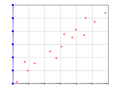
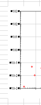
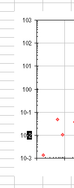
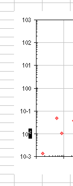
This is as good a place as any to hide (not delete) the helper series. Double click on the series, and on the Patterns tab, select None for Marker and None for Line. The sequence below illustrates how we convert our labels to exponential notation. The chart is selected in pane A. Pane B shows the data labels for the entire series selected after a single click on any of the labels. Pane C shows a single data label selected after a second single click on the label. Pane D shows text within the label selected using the mouse. Finally, Pane E shows the selected text superscripted using the Format menu or the shortcut CTRL+1 to open the Format Font dialog.
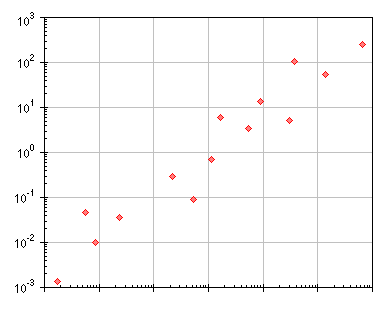
That's a pretty simple, if tedious, process to follow, and it results in the following chart, with exponential notation in the Y axis labels. In addition to superscripting the exponents, I increased the font size by a point, compared to the labels in pane E above. Change the font size of the individual characters while they are selected, at the same time that you add the superscript format.
I put together the following macro, which applies labels to the points, and superscripts all but the first two characters. It is called from the VB Editor's Immediate Window, but can be called from another sub. The syntax is: AttachLabelsToPoints myChart, mySeries, myOffset where myChart is either the index of the chart's parent ChartObject or zero for the active chart, mySeries is the index of the series to be labeled, and myOffset signifies the number of columns between the series' X values and the labels. Selected the chart, and run this for the first extra series (the Y axis):
AttachLabelsToPoints 0, 2, 2 Add the X axis helper series as above (copy the range, select the chart, Edit > Paste Special > New Series) and run this for the second extra series (the X axis): AttachLabelsToPoints 0, 3, 2 After running the macro, all that is required is to position the labels. Double click on the labels for the Y axis, and on the Alignment tab, select Left. Double click on the labels for the X axis, and on the Alignment tab, select Below. The final result is a professional chart:
|
Peltier Technical Services, Inc.Excel Chart Add-Ins | Training | Charts and Tutorials | PTS BlogPeltier Technical Services, Inc., Copyright © 2017. All rights reserved. |