|
|
|
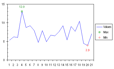
Custom Format for Chart Minimum and Maximum.Ever want to apply special formatting to just a certain point? This example shows you how to highlight the minimum and maximum values of a series by using a different marker for each, and data labels. We'll accomplish this with two extra series in the chart, one for minimum and one for maximum. The DataThe example uses a simple data set, a series of values in A2:A22, formulas to indicate the maximum and minimum values in B2:C32, and headers in A1:C1. The formula in B2 is: =IF($A2=MAX($A$2:$A$22),$A2,NA()) and the formula in C2 is: =IF($A2=MIN($A$2:$A$22),$A2,NA()) Enter the formulas in B2:C2, select the range B2:C22, and press Ctrl-D to fill them down into the entire selected range.
Columns B and C contain #N/A error values except for the maximum and minimum values from column A, thanks to the clever formulas used in the range. Excel will only chart the numerical values, not the error values. If we had used "" to fill the range instead of NA(), we would get apparently blank cells, which the chart would treat as zeros, and plot along the horizontal axis. Constructing and Formatting the ChartSelect the three columns of data, including the top row with headers, and construct a line chart, with lines and no markers. The chart has three series, but Min and Max don't appear, because there is only one point in each, and a line is the shortest distance between TWO points.
Click on the legend, then click on the legend key for the Max series (the short green line segment). Press F1 to bring up the Format Series dialog. On the Patterns tab, select an appropriate marker (if you want to show a marker), and set the line to None. Repeat this with the Min series.
Double click the Max series, and on the Data Labels tab, select Show Values, and press Enter. Double click on the label, and on the Alignment tab, select Above for Label Position. On the Font tab, apply any desired formatting to the label's font. Repeat for the Min series, except select Below for Label Position on the Alignment tab.
These custom labels and markers adjust when the data changes, and if there are multiple points that have the same Max and Min values, each point will share the custom formatting.
An alternative symbol (a large unfilled circle) and label indicates extreme points by encircling them.
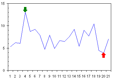
A variation on this technique (Use an Arrow to Indicate Special Points) uses custom markers to point an arrow at the extreme points.
|
Peltier Technical Services, Inc.Excel Chart Add-Ins | Training | Charts and Tutorials | PTS BlogPeltier Technical Services, Inc., Copyright © 2017. All rights reserved. |