|
|
|
Dynamic Charts.How do you create a chart from a data range that may change in size? There are many cases in which you would like the chart to automatically expand as new data is entered. Here is yet another example showing how to construct dynamic charts. We'll start with the following sample data, on the 'How To' worksheet:
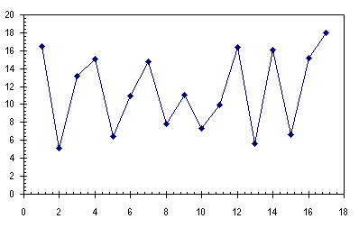
Now we'll create our chart, using the convenient data in A1:B18:
Let's create dynamic ranges. Press Ctrl-F3 or go to Insert menu > Name > Define. Here I've created the Name myXvalues and temporarily selected the Refers To range A1:A18 with the mouse. Instead of using the mouse, you can type in your own definition.
Note for Excel 2007 users: This technique will fail if your Names begin with the word "Chart". Use a name like ChtData instead of ChartData. Depending on your requirements, alternative definitions for myXvalues may include: =OFFSET('How To'!$A$2,0,0,COUNTA('How To'!$A:$A)-1,1)
which means start at $A$2, move down 0 rows and over 0 columns, and include COUNTA('How To'!$A:$A)-1 rows and 1 column. COUNTA counts all the non-blanks in a given range, so we subtract 1 for the header. COUNT includes all numeric values in a range; we could have used this, if we were sure there were no non-numeric values to confound us. As more data is added to the range, COUNTA increments, and a chart plotting this range will expand accordingly. =OFFSET('How To'!$A$1,'How To'!$C$2,0,'How To'!$D$2+1-'How To'!$C$2,1)
Which means start at A1, move down 4 rows (the number in C2) and over 0 columns, and include 13 rows (D2+1-C2), and 1 column. If you recall your algebra, you'll see it starts at the 4th point and ends at the 16th. A simple way to define myYvalues is: =OFFSET(myXvalues,0,1) which means take the range 1 column to the right of myXvalues. Now let's adjust the plotted series. Click on the series and look at the series definition formula in the formula bar above the column letters: =SERIES('How To'!$B$1,'How To'!$A$2:$A$18,'How To'!$B$2:$B$18,1)
This means the series name is in B1, the X values are in A2:A18, the Y values are in B2:B18, and the series is the first plotted in this chart. Edit the series definition formula. Right in the formula bar, edit this formula to read: =SERIES('How To'!$B$1,'How To'!myXvalues,'How To'!myYvalues,1)
When you click Enter, Excel is likely to change this to read as follows, which should make no difference:
=SERIES('How To'!$B$1,'DynamicCharts.xls'!myXvalues,
     'DynamicCharts.xls'!myYvalues,1)
For now, the dynamic chart appears the same as our original chart, but it will adjust to added or removed data. For a zipped workbook that shows this technique, click here. Here are more Dynamic Chart resources on this web site: Several examples of dynamic charts:
Alse see Dynamic Charts on the PTS Blog. |

Peltier Technical Services, Inc.Excel Chart Add-Ins | Training | Charts and Tutorials | PTS BlogPeltier Technical Services, Inc., Copyright © 2017. All rights reserved. |