|
|
|
Roll Your Own Excel Combination Charts.Excel offers a very small number of combination charts from the Custom Charts tab of the Chart Wizard: Column-Area and a few Line-Column varieties. But these are limited, with only a few series permitted, and you have to arrange the series in the right order on your worksheet. You aren't limited to the default collection provided by Excel, however. You can create your chart, then one-by-one change the style of each series to get the unique combinations you want. To show the technique, I took the following sample data, and created a number of different combination charts. The first chart is a simple line chart using the sample data.
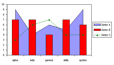
Then I selected Series A, went back to the Chart menu, selected Chart Type, and picked out an unstacked Area chart style. The result is a little funny, because now the first and last bars straddle the ends of the plot area.
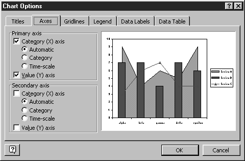
To fix this, I followed a two step process. First I selected the area chart series (Series A), picked Selected Data Series... from the Format menu, and on the Axes tab, selected Secondary Axis. Then I selected the entire chart, selected Chart Options from the Chart menu, and on the Axes tab, I unchecked the secondary axis boxes (see below).
I couldn't imagine why you would need a combination Line-Column-Area chart. This was just intended as a demonstration of the techniques needed to make a customized combination chart in Excel. But a reader of this site wrote to me and remarked that an area chart series is a handy way to add a fill to the background of a chart. Since the area series is always plotted beneath other series types (column, bar, line, scatter), the fill pattern is always behind the other chart data. Or you could omit the fill (Format menu > Format Selected Series... > Patterns tab > Area: None), and use the border line as a custom gridline behind the other charted series. Although some types of charts cannot be combined in this way, with this technique you should be able to coerce Excel into generating many types of combination chart you might need. |
Peltier Technical Services, Inc.Excel Chart Add-Ins | Training | Charts and Tutorials | PTS BlogPeltier Technical Services, Inc., Copyright © 2017. All rights reserved. |