|
|
|
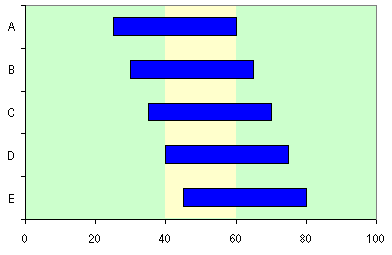
Colored Vertical Band Across an Excel Chart.This page shows how to put a vertical band on a chart, highlighting a certain region. The technique can be used, for example, to highlight a certain time period in the background of a gantt chart. In this example, I'm using a stacked (floating) bar construction on the primary axes as the background pattern, with a stacked (floating) bar series on the secondary axes as my main data. Arrangement of the DataTwo data ranges are required for this chart, one for the background, the other for the main data. The background data is shown here. The top left cell is blank, to tell Excel to use the first row as series names and the first column as category labels. The Width value is the difference between the Right Edge value and the Left Edge value. The yellow highlighted cells are used in the chart.
The main data is shown below. Again, the top left cell is blank, to tell Excel to use the first row as series names and the first column as category labels. Cells with a yellow background include formulas, while those in white are entered as numbers or text. The Span values are the difference between the High values and the Low values. The yellow highlighted cells are used in the chart.
Constructing and Formatting the ChartSelect the yellow highlighted region of the background data (the first table above), including the top row and left column of labels. Use the chart wizard to construct a stacked bar chart, with series in columns.
Copy the yellow shaded cells in the main data range (the second table above), select the chart, and choose Paste Special from the Edit menu. Select the New Series, Series Names in First Row, and Categories in First Column options.
Double click one new series, click on the Axes tab, and select Secondary. Select the other new series, and press the F4 key to repeat this action.
Right click one new series, and select Chart Type from the popup menu. Select the Stacked bar subtype.
Double click the bottom value axis, and click on the Scale tab. Choose the Category Axis Crosses at Maximum Value option.
Right click on the chart, select Chart Options from the popup menu, and click on the Axes tab. Uncheck the Secondary Value (Y) axis, and check the Secondary Category (X) axis.
Now it's all formatting. Make the supporting bars invisible (the Low and Left Edge series) by double clicking one, clicking on the Patterns tab, and selecting None for Border and for Area. Use appropriate colors for the floating bars (blue bars and yellow band in this chart), and use a contrasting area color (green here) for the plot area. Double click the yellow band, click on the Options tab, and set the Gap Width to 1 (zero blocks the top of the plot area rectangle). Double click vertical axis (with the labels A-B-C-D-E), and click on the Scale tab. Check the Categories in Reverse Order option, and uncheck Value Axis Crosses at Maximum.
You can generate a series of vertical bands by starting with more than two multicolored stacked bars in the first step.
|
Peltier Technical Services, Inc.Excel Chart Add-Ins | Training | Charts and Tutorials | PTS BlogPeltier Technical Services, Inc., Copyright © 2017. All rights reserved. |