|

|
Background and Fill Effects in Excel Charts.
|
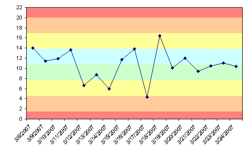
A chart could be made more informative by selectively shading regions of the background with different colors. For example, a run chart may show colored bands to indicate standard deviations of a process value from the mean. Excel only provides the ability to add one color to the background, but multiple colors can be added by creating a combination chart with added area chart series colored as desired. This tutorial shows how to construct such a chart.
Top of Page |
|
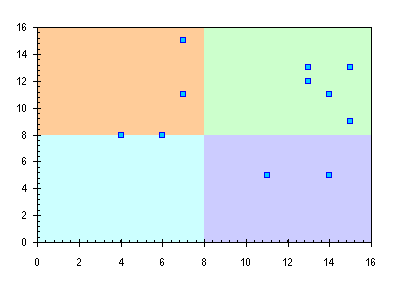
I was recently asked, "I have an XY scatter chart that gets divided into 4 quadrants and each quadrant needs a different color. Any ideas?" I love a good challenge, so I came up with the procedure in this page.
Top of Page
|
|
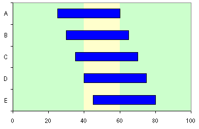
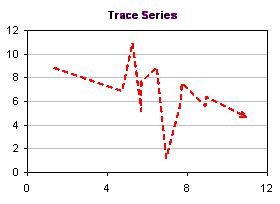
This page shows how to put a vertical band on a chart, highlighting a certain region. The technique can be used, for example, to highlight a certain time period in the background of a gantt chart.
Top of Page
|
|

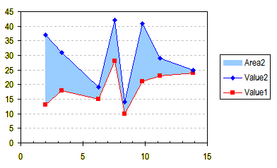
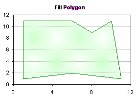
Did you ever want to fill the area under an XY series? You tried an Area chart, but that didn't work; the X axis didn't scale properly, and you couldn't get the lines and markers you wanted. You can fill the area under an XY series by using a combination XY - Area chart, plus a little creative treatment of the X values of the Area series and of the scaling of the secondary X axis.
Top of Page |
|
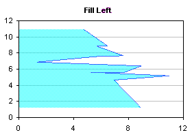
Did you ever want to fill the area between two XY series? You tried Stacked Area charts, but that didn't work; the X axis didn't scale properly, and you couldn't get the lines and markers you wanted. You can fill the area between XY series by using a combination XY - Stacked Area chart, plus a little creative treatment of the X values of the Area series and of the scaling of the secondary X axis.
Top of Page |
|
Excel charts offer a wide variety of formats, but you can use Excel's drawing tools to enable even more formatting choices. It's possible to draw shapes on the chart to produce these formats, using the polygon drawing tool. This allows more line formats, by enabling more choices of line thickness and by making it easier to read dashed lines. More fill possibilities are made possible than merely filling below a series, as in an area chart: the fill can go below or to the side of the series, and in fact, an enclosed region in the chart can be filled. The fill can be made transparent too, allowing gridlines to show through the shape.
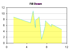 
This article presents VBA procedures that automate the polygon drawing tool, and gives hints about the kinds of formatting which may be achieved. A sample procedure has been recently added to show how to use this technique for charts that have multiple series.
Top of Page
|
|
Excel charts offer a wide variety of formats, but you can use Excel's drawing tools to enable even more formatting choices. Line and Fill Effects in Excel Charts Using VBA shows how to draw shapes on an XY chart to produce these formats, using the polygon drawing tool. This allows more line formats, by enabling more choices of line thickness and by making it easier to read dashed lines. More fill possibilities are made possible, including transparent fills, allowing gridlines and series to show through the shape.
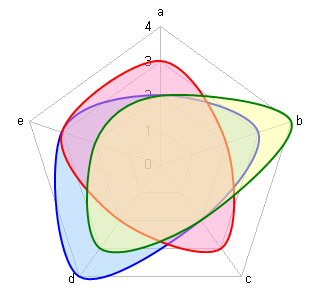
This article extends VBA polygon drawing procedures to radar charts.
Top of Page
|
|
Stacked column charts are commonly used to display proportions of data across different categories. While the height of each stack is proportional to the breakdown of the data in one dimension, standard stacked charts have uniform column widths. A Marimekko chart, also called a matrix chart, enhances a stacked column chart by making the column widths or bar heights proportional to another variable.

This page describes the rearrangement of data required to construct and label a Marimekko chart in Excel.
Top of Page
|
|
|


