|
|
|
Align X Axis to Y=0 on Two Y AxesA common question I'm asked (twice on one recent day) is: I have a chart with data on the primary and secondary Y axes, and both axes range from negative to positive numbers. How do I make the X axis cross each Y axis at X=0?
The trick is knowing what must line up. It all boils down to 7th grade algebra, but try finding a 7th grader when you need one. In order for the X axis to split both Y axes at the same point, the relative amounts above and below must be the same. In terms of the arithmetic: Ymin(pri)/Ymax(pri) = Ymin(sec)/Ymax(sec) Knowing this, you can easily compute the needed axis scale parameters to make the X axis line up with zero on both Y axes. But that's boring. You can write macros to do this automatically. The following code includes four small procedures that invoke a larger one, depending which of the four relevant axis parameters you will allow to vary to make it work.
This makes the axes line up at zero, but it doesn't always produce a nice chart: a more rigorous procedure would adjust the major tick spacing of both Y axes. Sometimes the adjusted axis starts at a silly number, like -3.33333333, because of the fractions. You can then manually adjust the minimum scale or major tick spacing of one of the axes and rerun the macro, changing a different scale parameter. Let's see how the macro works, starting with a simple chart. For clarity I've moved the X axis tick labels to the Low position.
The following charts illustrate the results of running AlignY_PrimaryMaximum (left) and AlignY_SecondaryMaximum (right). In both cases, the axes have aligned nicely with no further adjustments needed. In the real world this is likely to be rare.
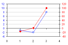
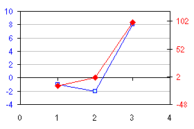
The following charts illustrate the results of running AlignY_PrimaryMinimum (left) and AlignY_SecondaryMinimum (right). In both cases, the axes have aligned their respective Y=0 with the X axis, but the division has resulted in incompatible tick spacings.
The macro above could be refined to adjust tick spacings as well as the axis limits. But in simple cases like this, you can adjust the charts by inspection. For the left-hand chart above, I imposed a primary axis major tick spacing of 3, and let Excel automatically scale the axis endpoints (see the dialog box below). The result was a chart that was nicely aligned without further adjustments (left, below the dialog box).
For the right-hand chart above, I imposed a secondary axis tick spacing of 25, and let Excel scale the maximum and minimum values itself. This disrupted the alignment, so I ran AlignY_SecondaryMinimum again, and the result (below right) is another nice chart.
|
Peltier Technical Services, Inc.Excel Chart Add-Ins | Training | Charts and Tutorials | PTS BlogPeltier Technical Services, Inc., Copyright © 2017. All rights reserved. |