|
|
|
Add a Vertical Line to a Column or Line Chart: Series Method.How do you add a nice vertical line to a column or line chart, to show a target value, or the series average? The method involves adding a new series, applying it to the secondary axes, and making the secondary axes disappear. Use this data to make a column or line chart. The blank cell in the upper left of this range tells Excel that "Value" is the series names, and the dates in the first column are the category (X axis) labels. (I use dates in this example, but you could use any type of category labels.) [blank] Value 11/11/02 15 11/10/02 16 11/9/02 16 11/8/02 10 11/7/02 14 11/6/02 9 11/5/02 10 11/4/02 8 11/3/02 6 11/2/02 4 11/1/02 3 10/31/02 3 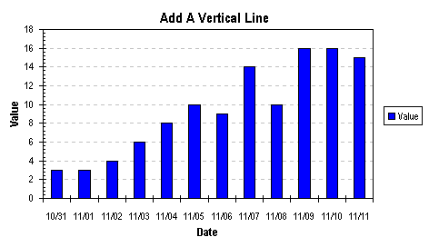 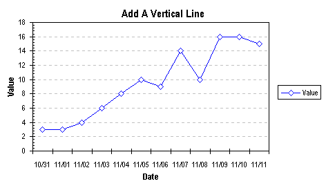 In a free section of your worksheet, set up a range with X and Y values corresponding to the endpoints of your indicator line, shown below. The Y value ranges from 0 to 1; we will use the secondary Y axis for this line, and scale its min and max to 0 and 1.
Note that if you've checked the Categories in Reverse Order checkbox in the X axis scale format dialog, you need to count up to i from right to left. The name for the added series will be "Today," although by the time you read this, the date shown will be well behind us. To keep this value up-to date, enter the formula =TODAY into the appropriate cells. [blank] Today 11/9/02 0 11/9/02 1 Select and copy this range, select the chart, and from the Edit menu, choose Paste Special. Select the New Series, Categories in First Column, and Series Names in First Row options. The new series has the same style (Column or Line) as the first series.   Right click on the new series "Today" and select Chart Type from the pop up menu. Choose the XY Scatter type, subtype Scatter with data points connected by lines without markers. The series changes and secondary axes appear on the chart.   Now it's time to neaten up the axes. Select the secondary X axis and press Delete (or more formally: right click on the chart, choose Chart Options from the Pop Up menu, click on the Axes tab, and uncheck the box for the Secondary X Axis). Double click on the secondary Y axis, and on the Scale tab, set 0 for Minimum and 1 for Maximum. On the Patterns tab, choose None for Major and Minor Tick Marks and for Tick Mark labels to make the axis disappear. An alternative approach is to delete the secondary Y axis, and use the minimum and maximum primary Y axis scale values in place of 0 and 1 for the dummy series Y values. This requires setting the primary Y axis scale parameters manually, however, and changing the scale parameters and the dummy series Y values whenever warranted by changes in the primary series' data. This approach is less desirable than using the secondary Y axis, but if the Y axis is being used for other data series, it's handy to know that you could always fall back on this approach.   All that may be left is some fine tuning of the line position. Up until now my example has used the target date to position the line on top of the target column or marker. These two charts show the effect of using the target date minus 0.5 and plus 0.5 for before and after the target date. 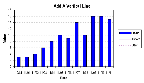 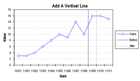 VertizontalLine.zip is a zipped workbook that shows this technique and others for reliably placing a vertical or horizontal line on your column or line chart, using a dummy series or a dummy error bar. Here are some related pages on this site: Add a Horizontal Line to a Column or Line Chart: Series Method. Add a Horizontal Line to a Column or Line Chart: Error Bar Method. Add a Vertical Line to a Column or Line Chart: Error Bar Method. |
Peltier Technical Services, Inc.Excel Chart Add-Ins | Training | Charts and Tutorials | PTS BlogPeltier Technical Services, Inc., Copyright © 2017. All rights reserved. |